Home>Blogs>Charts and Visualization>Ring Chart in Excel
Ring Chart in Excel
Charts and Visualization

Ring Chart in Excel

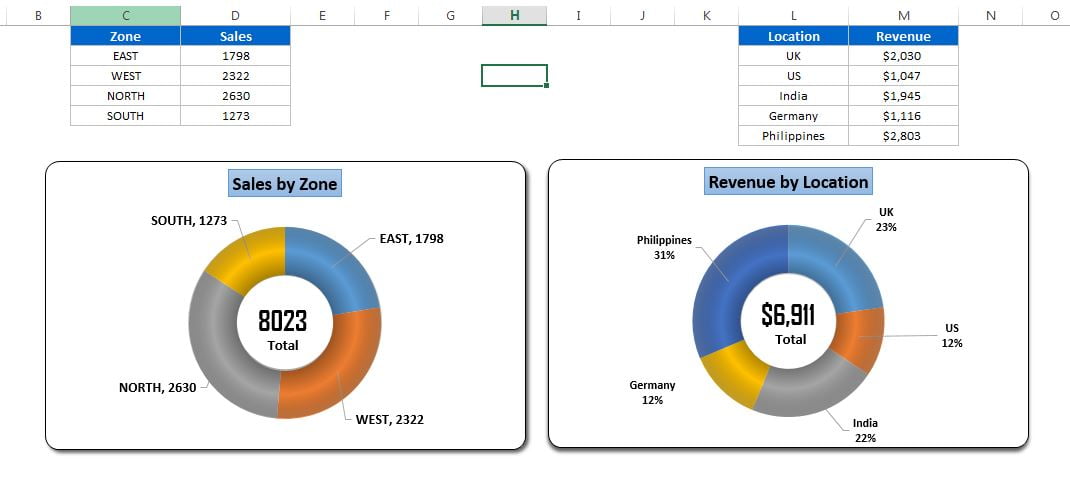
Ring Chart is very beautiful and attractive visual in MS Excel. This chart has been designed by me and my team. Ring chart is basically a doughnut chart and we have given the ring shape to this doughnut by using and Excel auto shapes. This beautiful visual can be used in business dashboard, presentation or reports.

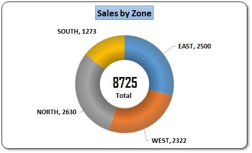
You can use this chart to display the sales bifurcation.


Ring Chart in Excel
Ring Chart in Excel

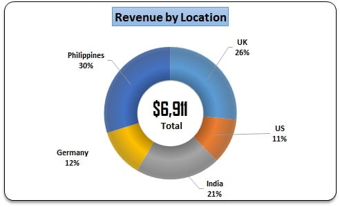
You can also use this chart to display revenue contribution.


Ring Chart for revenue contribution


Visit our YouTube channel to learn step-by-step video tutorials

Youtube.com/@PKAnExcelExpert

Step by step Video tutorial for Ring Chart in Excel-

PK
Meet PK, the founder of PK-AnExcelExpert.com! With over 15 years of experience in Data Visualization, Excel Automation, and dashboard creation. PK is a Microsoft Certified Professional who has a passion for all things in Excel. PK loves to explore new and innovative ways to use Excel and is always eager to share his knowledge with others. With an eye for detail and a commitment to excellence, PK has become a go-to expert in the world of Excel. Whether you're looking to create stunning visualizations or streamline your workflow with automation, PK has the skills and expertise to help you succeed. Join the many satisfied clients who have benefited from PK's services and see how he can take your Excel skills to the next level!
https://www.pk-anexcelexpert.com

Leave a Reply