In today’s ever-changing business environment, managing risks is not just a task—it’s a necessity. Businesses face a wide range of uncertainties, from operational risks to financial instability and even external threats like market downturns. If you’re running a business or managing a project, understanding the risks involved and measuring them effectively is key to preventing unexpected setbacks. That’s where a Risk Management KPI Dashboard comes into play.
In this comprehensive guide, we’ll explore everything you need to know about creating and using a Risk Management KPI Dashboard. We’ll break down key performance indicators (KPIs), their units, how to aggregate them, and most importantly, whether a higher or lower value is better. We’ll also go over the advantages, opportunities for improvement, and best practices for using this tool effectively.
What is a Risk Management KPI Dashboard?
Simply put, a Risk Management KPI Dashboard is a tool that helps businesses track, assess, and manage the risks they face. It provides a visual snapshot of your business’s risk landscape by compiling KPIs related to potential risks and uncertainties. From operational hiccups to financial risks, this dashboard consolidates all the necessary metrics in one place, making it easier for decision-makers to take quick, informed actions.
This dashboard is especially valuable for identifying trends, measuring how risks evolve over time, and helping you respond proactively.
Key Features of a Risk Management KPI Dashboard
To build an effective Risk Management KPI Dashboard, it’s essential to have a clear structure. Below are the key features of the dashboard:
- Home Sheet
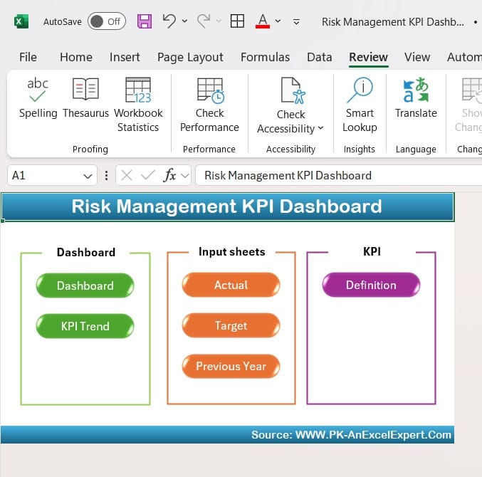
The Home Sheet acts as an index for the dashboard, making it easy to navigate through different sections. It contains six buttons, each of which takes you to a different part of the dashboard.
Click to buy Risk Management KPI Dashboard in Excel
- Dashboard Sheet
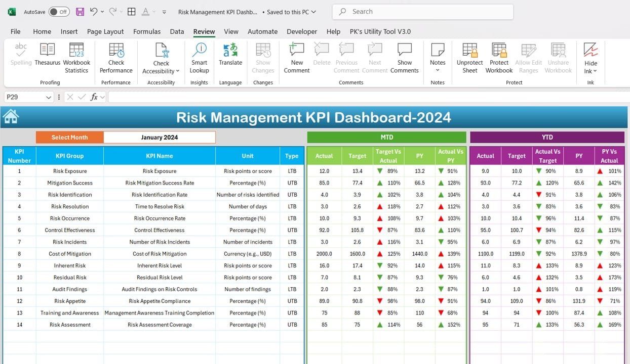
The Dashboard Sheet is where the main action happens. This is where you’ll monitor all KPIs in real time. You can select the desired month using the dropdown in cell D3, which changes all the dashboard numbers accordingly. Key performance data such as:
MTD (Month-to-Date) Actuals
YTD (Year-to-Date) Actuals
Targets
Previous Year Data
All of these are displayed along with visual cues like conditional formatting arrows that show trends (e.g., Target vs Actual, PY vs Actual). You can instantly see whether you’re meeting your risk mitigation targets.
Click to buy Risk Management KPI Dashboard in Excel
- KPI Trend Sheet
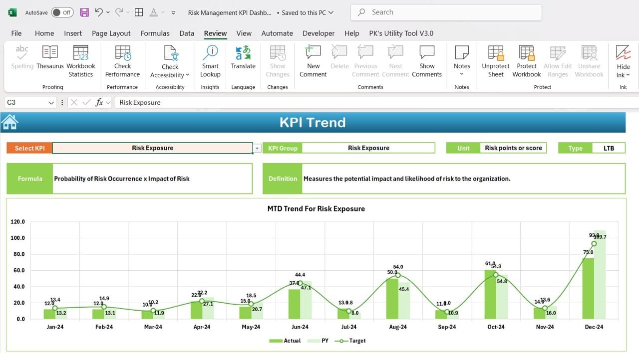
In the KPI Trend Sheet, you can select any KPI from the dropdown menu in C3. Here, you’ll find:
KPI Group
Unit of Measurement
Type of KPI (Is a lower value better or is a higher value ideal?)
Formula for Aggregation
Definition of the KPI
This sheet allows you to explore each KPI in more depth and track its performance over time.
Click to buy Risk Management KPI Dashboard in Excel
- Actual Numbers Sheet
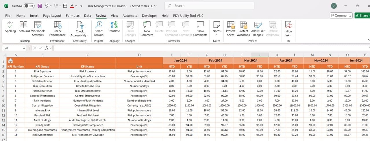
The Actual Numbers Sheet is where you input your MTD and YTD performance data for each KPI. Simply select the month in E1 and enter the actual numbers for that period. This real-time input ensures that your dashboard remains accurate and up-to-date.
Click to buy Risk Management KPI Dashboard in Excel
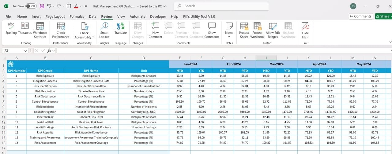
- Target Sheet
In the Target Sheet, you’ll enter the MTD and YTD targets for each KPI. Having a clear benchmark helps you easily compare your actual results to what was expected.
Click to buy Risk Management KPI Dashboard in Excel
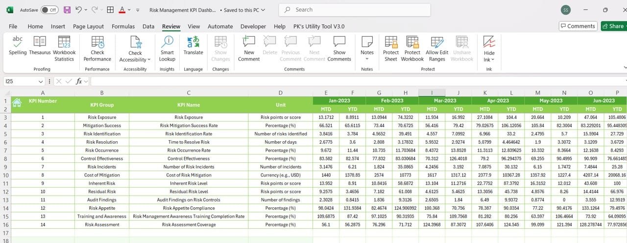
- Previous Year Numbers Sheet
The Previous Year Numbers Sheet allows you to input data from the previous year, enabling you to make year-over-year comparisons. This is vital for measuring improvement or regression in risk management over time.
Click to buy Risk Management KPI Dashboard in Excel
- KPI Definition Sheet
The KPI Definition Sheet serves as a detailed reference for all the KPIs you’re tracking. It includes:
KPI Name
KPI Group
Unit of Measurement
Formula
Definition
This ensures that everyone on your team understands each KPI’s importance and how it contributes to risk mitigation.
These KPIs cover a wide range of risks, from operational and financial risks to compliance and third-party risks. By tracking these indicators, you’ll be able to gauge your company’s overall risk exposure and the effectiveness of your risk management strategies.
Advantages of Using a Risk Management KPI Dashboard
A well-constructed Risk Management KPI Dashboard offers numerous benefits to any organization. Here are some key advantages:
- Better Visibility into Risks
With all your key metrics in one place, the dashboard provides a clear, real-time view of your risk landscape. Whether you’re worried about operational risks or financial exposure, everything is visible at a glance.
- Improved Decision-Making
The ability to see real-time data on how your risk mitigation strategies are performing enables you to make smarter, quicker decisions. For example, if Risk Exposure suddenly increases, you can take immediate action to mitigate it.
- Proactive Risk Management
Tracking KPIs like Incident Response Time and Control Effectiveness allows you to manage risks before they become critical issues. This proactive approach helps in reducing the overall impact of risks.
- Increased Accountability
With clearly defined KPIs and targets, it’s easier to assign responsibility for different aspects of risk management. Teams can see their performance and work towards achieving their specific goals.
- Continuous Improvement
The dashboard doesn’t just help you track current risks; it also allows you to compare past and present data. This makes it easier to identify trends and areas where your risk management strategy can improve.
Best Practices for Using a Risk Management KPI Dashboard
To get the most value from your Risk Management KPI Dashboard, here are some best practices you should follow:
- Set Clear, Achievable Targets
While it’s important to aim high, make sure your targets are realistic. Setting overly ambitious goals can lead to frustration, while easy targets won’t drive improvement.
- Regularly Update Your Data
Your dashboard is only as good as the data you put into it. Regular updates ensure that your dashboard reflects the current state of your risk management efforts, making it more reliable.
- Use Data from Previous Years
Don’t just focus on the present—use historical data to track trends over time. This can help you identify areas for improvement and measure the effectiveness of past risk management efforts.
- Customize the Dashboard to Fit Your Needs
Not all risks are the same, and neither are all businesses. Make sure to customize the dashboard to include KPIs that are most relevant to your business, whether that’s operational risks, financial risks, or vendor risks.
- Use Visual Cues
Conditional formatting such as color-coding and arrows makes it easier to see at a glance whether you’re meeting your targets. This helps your team quickly understand where improvements are needed.
Opportunities for Improvement in a Risk Management KPI Dashboard
Even though the Risk Management KPI Dashboard is a powerful tool, there’s always room for improvement. Here are some suggestions:
- Automating Data Collection
Currently, most dashboards require manual data entry, which can be time-consuming and error-prone. Automating this process by integrating the dashboard with other business systems would improve efficiency and accuracy.
- Making the Dashboard Mobile-Friendly
In today’s mobile-first world, having access to the dashboard on the go can be a game-changer. A mobile-friendly version would allow managers to check real-time risk data even when they’re off-site.
Visit our YouTube channel to learn step-by-step video tutorials
Click to buy Risk Management KPI Dashboard in Excel


