In today’s competitive landscape, delivering exceptional service while keeping a close eye on performance metrics is more crucial than ever. That’s where a Sales and Marketing Service Delivery KPI Dashboard in Excel becomes your secret weapon. Whether you’re tracking customer satisfaction, response times, or sales conversion rates, a well-structured KPI dashboard can keep your entire team aligned and on track.
In this article, you’ll learn everything you need to know about building and using a Sales and Marketing Service Delivery KPI Dashboard in Excel. We’ll walk you through its structure, features, benefits, best practices, and frequently asked questions. If you’re looking to enhance your decision-making, performance monitoring, or reporting process — you’re in the right place!
Click to Purchases Sales and Marketing Service Delivery KPI Dashboard in Excel
What is a Sales and Marketing Service Delivery KPI Dashboard?
A KPI Dashboard is a visual representation of key metrics that help organizations monitor performance and make data-driven decisions. In the context of Sales and Marketing Service Delivery, it tracks important indicators like on-time delivery, sales cycle time, service resolution rates, lead response time, customer satisfaction, and more.
Using Microsoft Excel, you can build a dynamic and interactive dashboard that is both powerful and user-friendly, without needing complex software or coding skills.
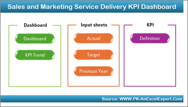
Inside the Sales and Marketing Service Delivery KPI Dashboard Template
We’ve created a ready-to-use Excel template with seven thoughtfully designed worksheet tabs. Each tab serves a unique purpose and collectively they give you full control over your service delivery tracking.
Home Sheet Tab
- This is your dashboard’s index page. It includes:
- Six navigation buttons that take you to different worksheet tabs with a single click.
- A clean and user-friendly layout that simplifies dashboard navigation.
- Quick Tip: Always design the Home sheet as your control center for a better user experience.
Dashboard Sheet Tab
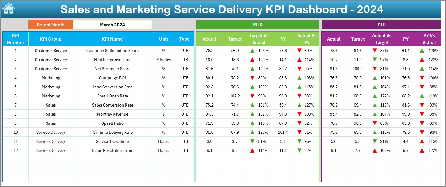
This is the main visual panel where the magic happens.
Key Features:
- Month Selection Drop-Down at cell D3 to dynamically update the entire dashboard.
- MTD (Month-to-Date) and YTD (Year-to-Date) performance against:
- Targets
- Previous Year (PY) Values
- Conditional Formatting using up and down arrows to instantly identify improvement or decline.
- Visual Insights Provided:
- Target vs Actual performance comparison
- Current performance vs previous year benchmarks
- Real-time tracking with color-coded cues for faster understanding
KPI Trend Sheet Tab
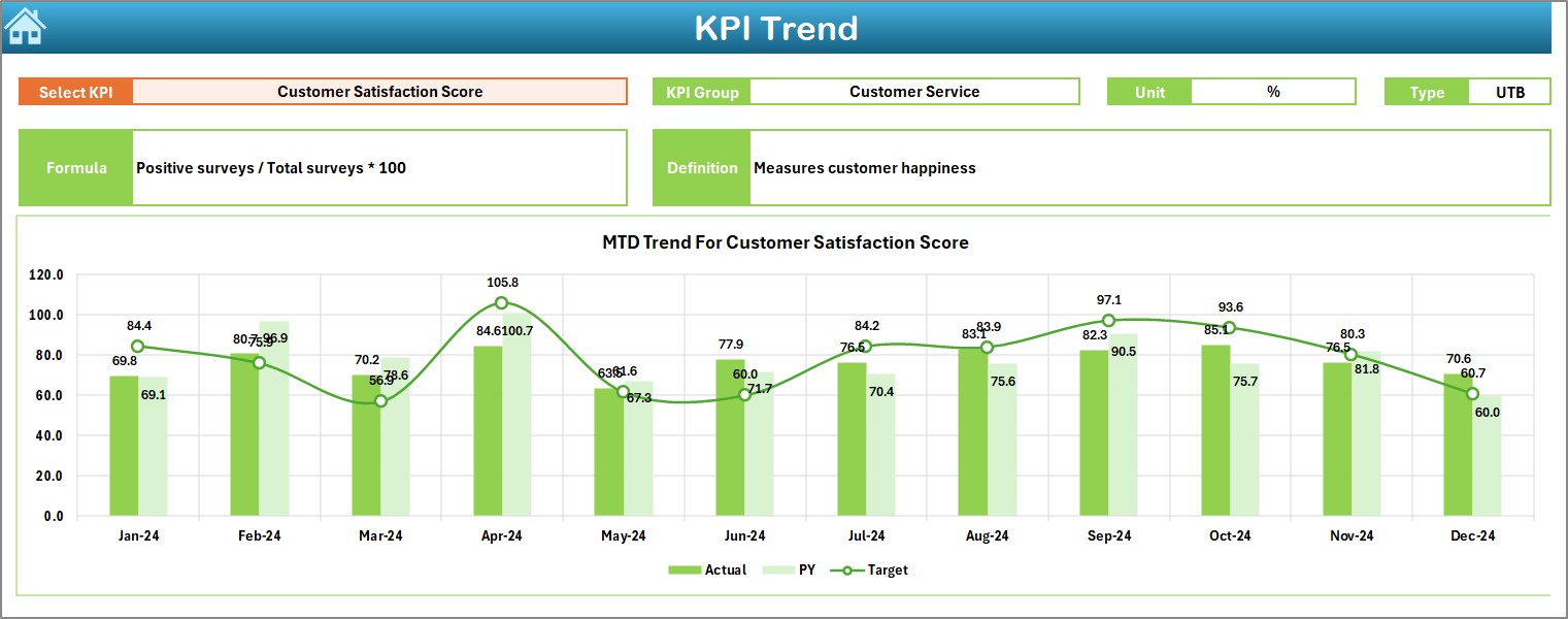
Need to see how a KPI has evolved over time? This sheet is your go-to.
Highlights:
Drop-down selector for KPI Name (cell C3)
Displays:
- KPI Group
- Unit of Measurement
- Type: UTB (Upper the Better) or LTB (Lower the Better)
Formula & Short Definition
Trend Charts for MTD and YTD values showing Actual vs Target vs Previous Year
This visual trend analysis helps spot patterns, anomalies, or areas for attention.
Click to Purchases Sales and Marketing Service Delivery KPI Dashboard in Excel
Actual Numbers Input Sheet Tab
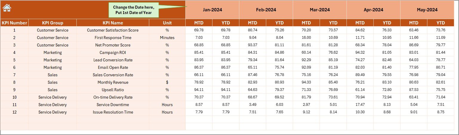
This is where you enter your real performance data.
How it Works:
- Select the starting month of the fiscal year in cell E1.
- Input monthly actual numbers for MTD and YTD for each KPI.
- Your input here drives all the analytics in the dashboard.
Keeping this updated ensures accurate and timely insights.
Target Sheet Tab
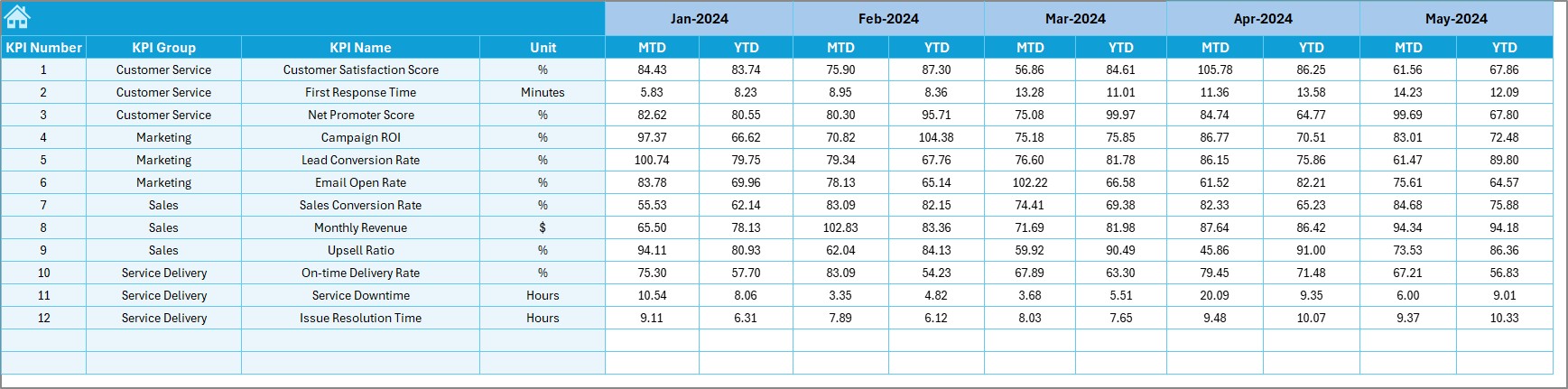
A plan without a target is just a wish. This sheet lets you define your goals.
What to Do:
- Enter
- Include both MTD and YTD targets to support rolling performance tracking.
- Clear targets improve team focus and accountability.
Previous Year Number Sheet Tab
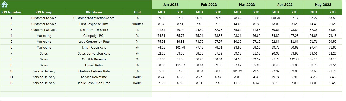
Use this tab to benchmark current performance against last year’s data.
Use Case:
- Enter historical data similar to the actual and target formats.
- The dashboard will automatically compare PY vs Actual using this data.
Historical insights give context to performance shifts.
KPI Definition Sheet Tab
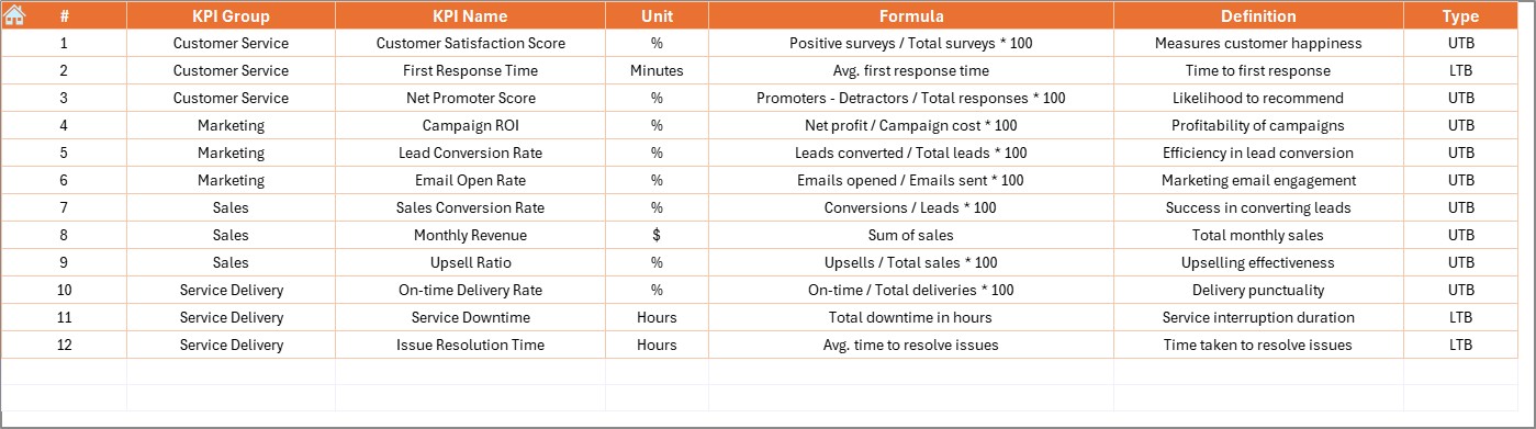
Clarity starts with definition. This sheet captures all the KPI metadata.
Fields to Fill:
- KPI Name
- KPI Group
- Unit
- Formula
- Definition
- Type (UTB or LTB)
This tab acts as a reference point for understanding each KPI’s purpose and calculation.
Advantages of Using a KPI Dashboard in Excel
Why should you rely on Excel-based dashboards? Let’s explore the major benefits.
✅ Cost-Effective and Accessible
You don’t need expensive software or licenses. Excel is already available in most organizations.
✅ Easy Customization
You can tailor every part — from KPIs to visual elements — without any programming.
✅ Real-Time Decision Making
With dynamic formulas and charts, you get real-time performance updates.
✅ Centralized Monitoring
All your KPIs — from lead generation to service delivery — are in one view.
✅ Enhanced Accountability
Targets, trends, and comparisons make it easier to hold teams accountable for outcomes.
Best Practices for Building a Service Delivery KPI Dashboard
To get the most out of your Excel dashboard, follow these practical tips:
- Start With Clear Objectives: Define what you want to monitor — customer satisfaction, resolution time, conversion rate, etc.
- Keep It Visual: Use color coding, data bars, and arrows for easy scanning and immediate interpretation.
- Limit the Number of KPIs: Stick to 10–15 highly relevant KPIs. Too many indicators can clutter your dashboard.
- Make it Interactive: Drop-downs and slicers enhance usability and allow users to explore data effortlessly.
- Use Consistent Formatting: Maintain uniform colors, fonts, and styles for a polished look and feel.
- Protect Your Formulas: Use Excel protection features to avoid accidental changes in calculated fields.
Final Thoughts
A Sales and Marketing Service Delivery KPI Dashboard in Excel can dramatically improve how you measure, track, and enhance performance. It’s intuitive, affordable, and highly effective when designed well.
Whether you’re a small business or a large enterprise, Excel dashboards empower your team to stay aligned, act quickly, and optimize your service delivery strategies.
So, why wait? Start transforming your data into actionable insights today!
❓Frequently Asked Questions (FAQs)
Can I add more KPIs to the template?
Yes! You can add as many KPIs as you need — just make sure to extend the formulas and charts accordingly.
Is the dashboard usable in Google Sheets?
While most Excel features work in Google Sheets, you may lose some VBA or conditional formatting effects. It’s best used in Microsoft Excel.
How do I protect data from accidental edits?
Use Excel’s Protect Sheet feature to lock formula cells and prevent unintentional changes.
Can I customize the charts?
Absolutely. You can change chart types, colors, labels, and styles to match your brand or presentation needs.
How frequently should I update the dashboard?
We recommend monthly updates for MTD and YTD performance tracking, although you can refresh it weekly if needed.
Click to Purchases Sales and Marketing Service Delivery KPI Dashboard in Excel
Visit our YouTube channel to learn step-by-step video tutorials