Power BI is a powerful tool for data visualization and performance tracking, and creating a Sales KPI Dashboard in Power BI can transform how you monitor your sales performance. This guide will walk you through the features, advantages, and best practices for building and utilizing a Sales KPI Dashboard in Power BI, ensuring your team stays on track with critical sales metrics.
Click to Sales KPI
What is a Sales KPI Dashboard in Power BI?
A Sales KPI Dashboard in Power BI is a dynamic, interactive report that tracks and visualizes key performance indicators (KPIs) for your sales team. It consolidates data from multiple sources, such as Excel files, and presents it in an easy-to-read format with visual aids like charts, slicers, and icons.
Key Features of the Sales KPI Dashboard
Three Pages in the Dashboard
- The Power BI file comprises three key pages:
Click to Sales KPI
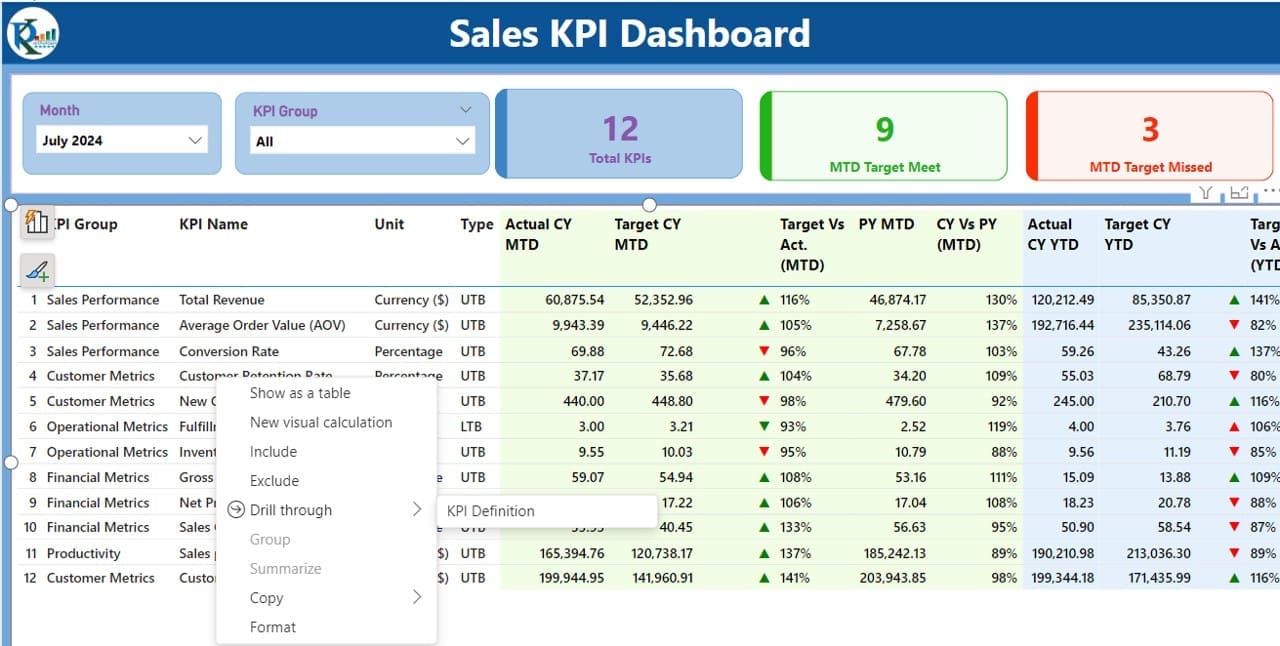
Summary Page
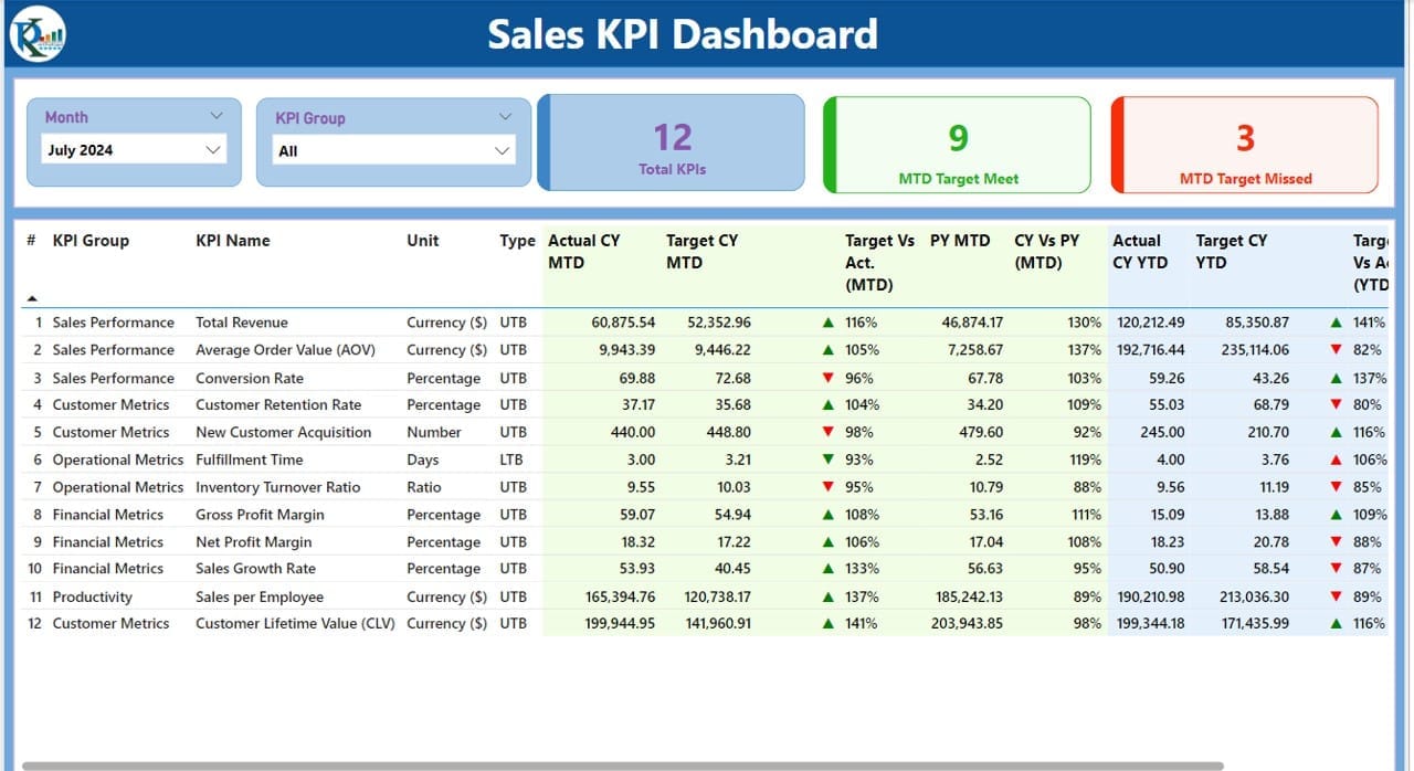
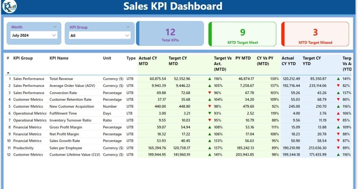
- Overview of KPIs: This page provides a top-level summary of all KPIs.
- Interactive Slicers: Slicers for Month and KPI Group allow filtering the data dynamically.
- KPI Cards:
- Total KPIs Count.
- MTD Target Met Count.
- MTD Target Missed Count.
- Detailed KPI Table: Displays essential KPI details:
- KPI Number: Sequence identifier for each KPI.
- KPI Group: Categorization of the KPI.
- KPI Name: Specific KPI being tracked.
- Unit: Unit of measurement (e.g., percentage, count).
- Type: Whether “Lower is Better” (LTB) or “Upper is Better” (UTB).
- Actual vs Target Metrics:
- Current MTD: Actual and Target values for the current month.
- MTD Icon: Visual indicators (▲ for above target, ▼ for below target).
- Target vs Actual (MTD): Formula: Actual / Target.
- Current YTD: Year-to-date values.
- YTD Icon: Status indicators for YTD performance.
- Target vs Actual (YTD): Formula: Actual / Target.
- Comparison with Previous Year: Metrics for both MTD and YTD.
Click to Sales KPI
KPI Trend Page
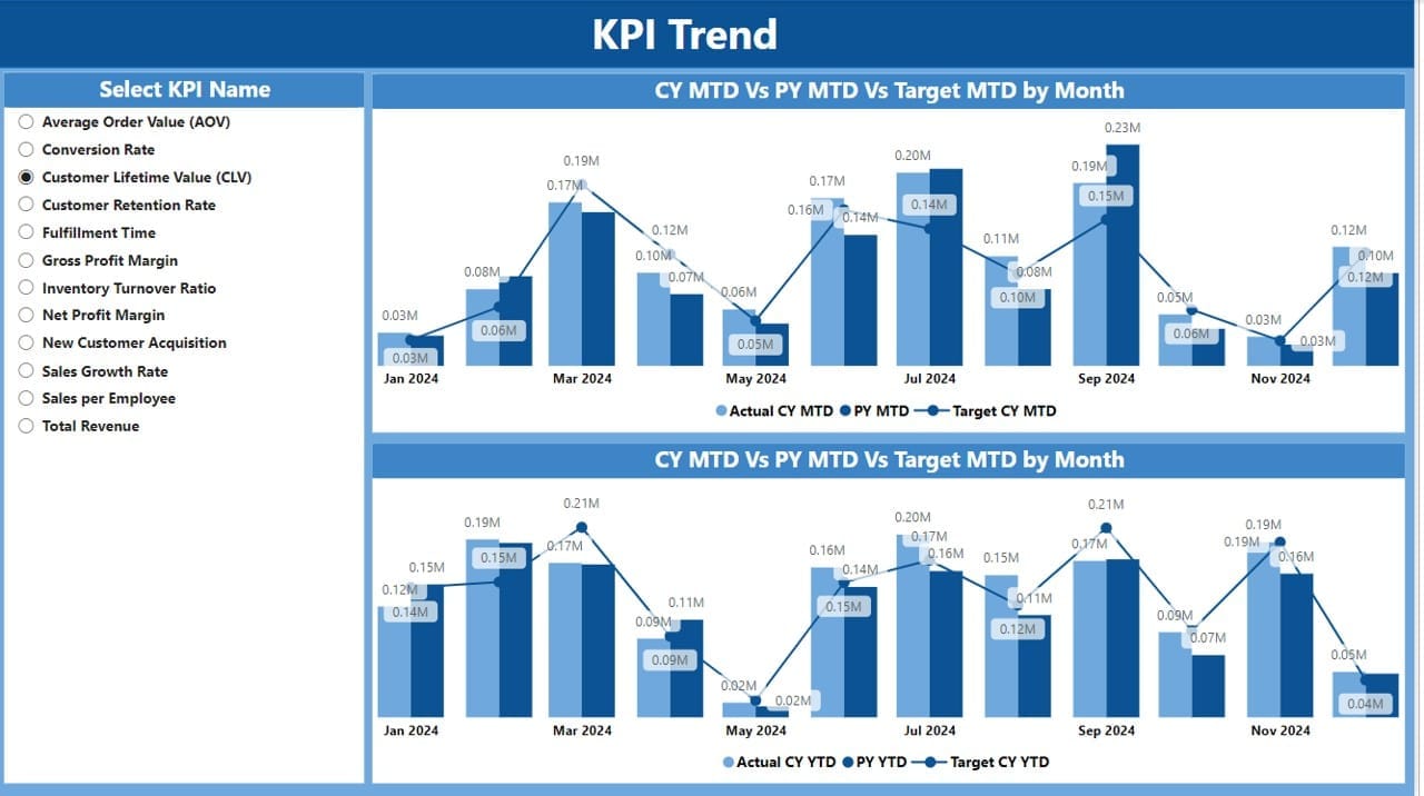
- Visualizations: Two combo charts show the current year, previous year, and target metrics for MTD and YTD.
- Interactive Slicers: Allows users to select specific KPI names for trend analysis.
KPI Definition Page

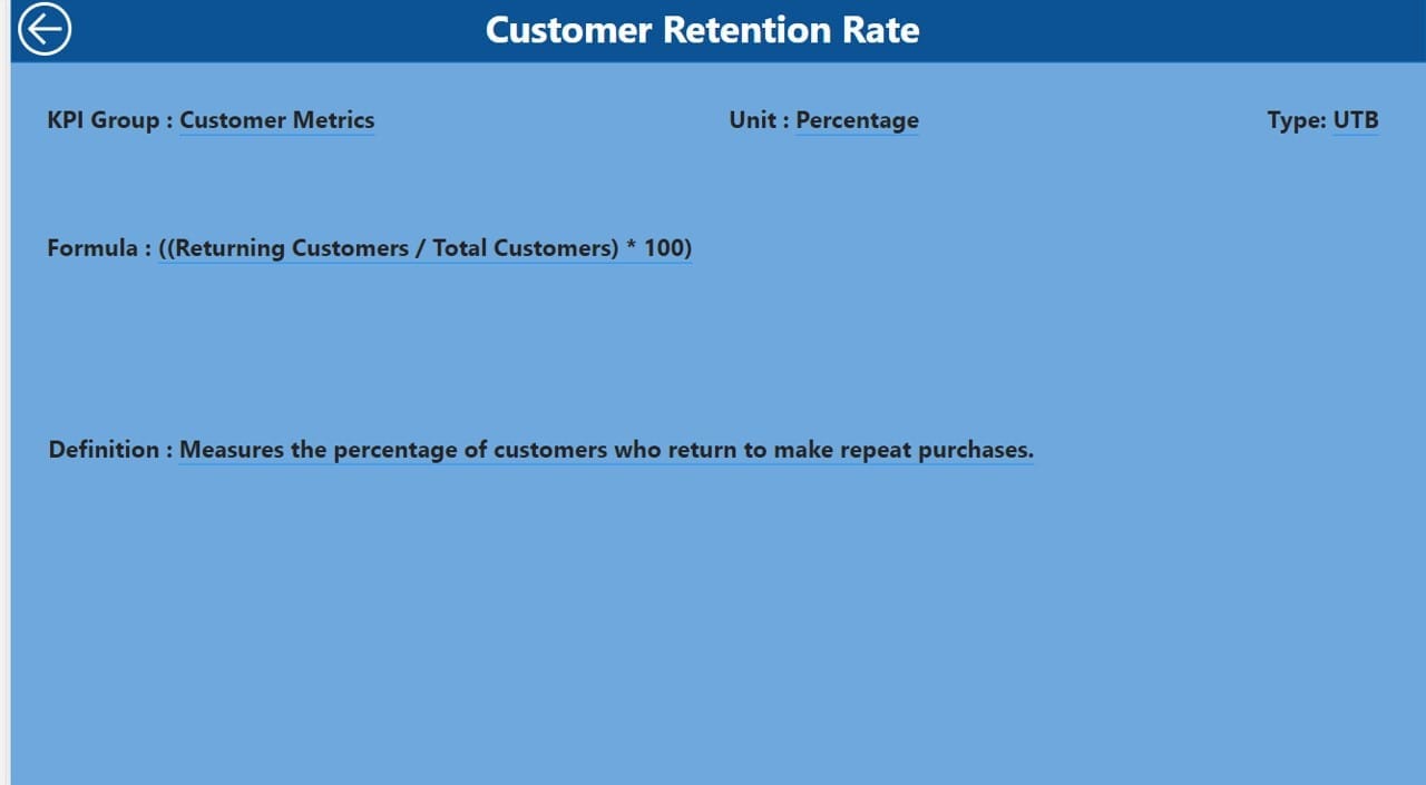
Drill-through Page:
- This hidden page provides detailed information on:
- KPI Formula.
- KPI Definition.
Navigation:
Use the back button to return to the summary page.
Excel Data Integration
- The dashboard uses data from an Excel file with three key worksheets:
Click to Sales KPI
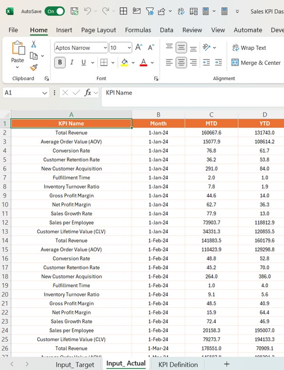
Input Actual:
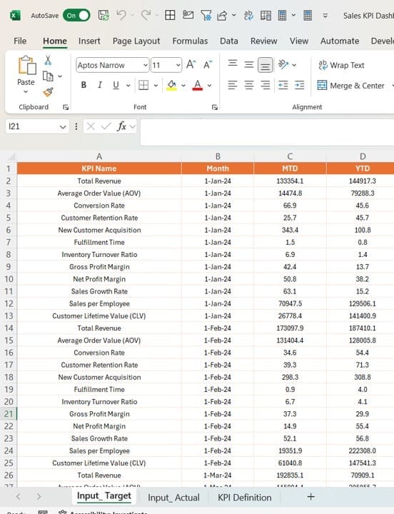
- Records the actual numbers for each KPI (MTD and YTD).
Input Target:
- Captures target values for each KPI (MTD and YTD).
Click to Sales KPI
KPI Definition:
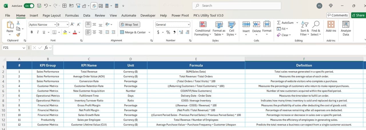
- Contains metadata like KPI Group, Formula, Unit, and Type.
Advantages of the Sales KPI Dashboard in Power BI
Why should you create a Sales KPI Dashboard? Let’s explore its benefits:
- Centralized Data Analysis: Combining data from multiple sources, the dashboard presents all relevant KPIs in a single location.
- Enhanced Decision-Making: Interactive visualizations and drill-through capabilities allow teams to pinpoint trends and address issues promptly.
- Improved Team Accountability: Detailed performance insights foster a culture of accountability by clearly defining success metrics.
- Time-Saving: Automating the data flow from Excel to Power BI reduces manual reporting time significantly.
- Customizable Metrics: You can modify slicers, icons, and formulas to suit your organization’s specific needs.
Best Practices for Creating a Sales KPI Dashboard in Power BI
Design for Clarity
- Use intuitive layouts for ease of understanding.
- Highlight key metrics with cards and visual icons.
Utilize Power BI Features
- Leverage slicers for dynamic filtering.
- Employ drill-through pages for in-depth analysis without cluttering the main dashboard.
- Keep Data Updated: Automate data updates from Excel files to ensure the dashboard reflects real-time performance.
- Focus on Actionable Insights: Ensure metrics provide actionable insights, not just data points.
- Test for Usability: Share the dashboard with a test audience to gather feedback before deployment.
Click to Sales KPI
How to Use the Sales KPI Dashboard in Power BI
Input Data in Excel
- Fill the Actual sheet with current performance metrics.
- Populate the Target sheet with expected values.
- Define each KPI in the KPI Definition sheet.
Load Data into Power BI
- Import the Excel file into Power BI and connect the data sources.
Explore Dashboard Pages
- Use slicers and icons on the Summary Page for an overview.
- Dive into the KPI Trend Page for detailed visualizations.
- Drill through to the KPI Definition Page for a deeper understanding of each KPI.
Frequently Asked Questions (FAQs)
Q. What is a KPI in Sales?
A KPI (Key Performance Indicator) in sales is a measurable value that shows how effectively a salesperson or team achieves business objectives. Examples include MTD sales growth, YTD revenue, and customer acquisition rate.
Q. Why use Power BI for KPI Dashboards?
Power BI offers robust visualization and data modeling tools, making it ideal for creating dynamic, interactive dashboards that provide actionable insights.
Q. How do I update the data in this dashboard?
Update the respective Excel sheets (Actual, Target, KPI Definition), and refresh the Power BI data connection to see the latest metrics.
Q. Can I customize the dashboard?
Yes, you can customize slicers, charts, and KPI definitions to align with your organization’s specific goals.
Q. What are LTB and UTB types in KPIs?
- LTB (Lower the Better): Lower values indicate better performance (e.g., cost per lead).
- UTB (Upper the Better): Higher values indicate better performance (e.g., revenue growth).
Click to Sales KPI
Conclusion
A Sales KPI Dashboard in Power BI is an invaluable tool for monitoring and analyzing sales performance. By combining Excel’s data management capabilities with Power BI’s visualization power, this dashboard offers clarity, insights, and actionable metrics. Implementing best practices ensures it remains a critical asset for driving your organization’s sales success.
Click to Sales KPI
Visit our YouTube channel to learn step-by-step video tutorials
https://www.linkedin.com/feed/update/urn:li:activity:7270032250753155072
