Managing shared services effectively requires constant monitoring and analysis of key performance indicators (KPIs). A well-designed Shared Services KPI Dashboard in Excel can streamline this process, offering an interactive, user-friendly tool to track performance metrics, identify trends, and make data-driven decisions.
Click to Shared Services KPI
This article will guide you through the features, advantages, best practices, and key considerations for creating and using a Shared Services KPI Dashboard in Excel.
Key Features of the Shared Services KPI Dashboard
- The Shared Services KPI Dashboard comprises seven key worksheets, each serving a specific purpose. Here’s a breakdown of these sheets and their functionalities:
Click to Shared Services KPI
Home Sheet
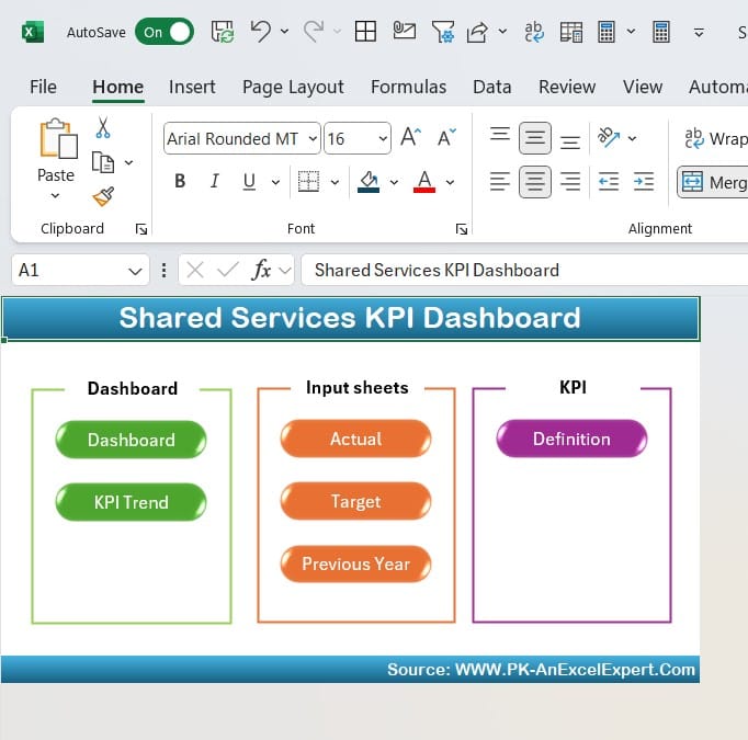
- The Home sheet acts as the index or navigation hub for the dashboard. It includes six clickable buttons to jump directly to specific worksheets, making it easier to navigate through the dashboard.
Dashboard Sheet Tab
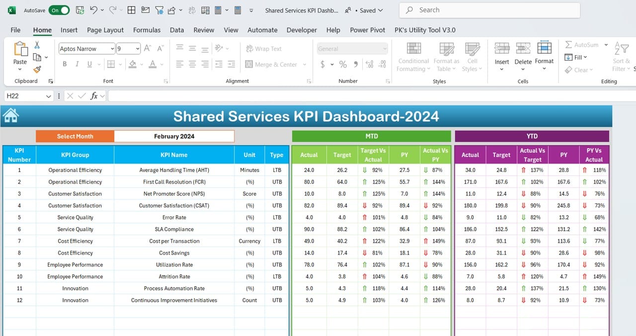
The Dashboard sheet is the central hub where all KPI-related information is displayed.
- Dynamic Month Selection: A drop-down menu at cell D3 allows users to select a specific month, instantly updating all dashboard data for that period.
- Data Display:
- MTD Metrics: Displays Month-to-Date Actuals, Targets, and Previous Year data.
- YTD Metrics: Includes Year-to-Date Actuals, Targets, and Previous Year data.
- Visual Insights: Target vs. Actual and PY (Previous Year) vs. Actual comparisons are highlighted with conditional formatting and directional arrows, giving immediate insights into performance trends.
Click to Shared Services KPI
KPI Trend Sheet Tab
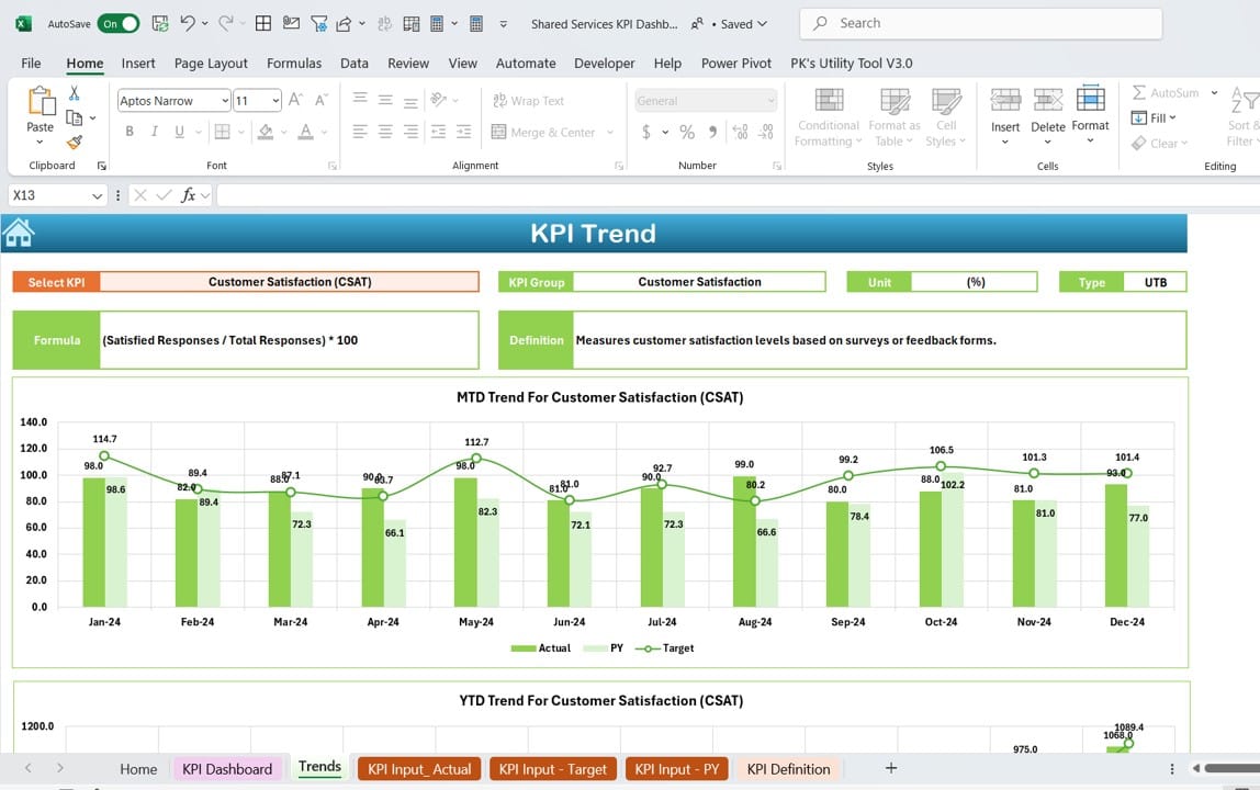
- This sheet provides a more detailed view of KPI trends.
- KPI Selection: A drop-down at cell C3 allows users to choose a KPI to analyze.
- Displayed Details:
- KPI Group, Unit, Type (e.g., Lower is Better or Upper is Better), Formula, and Definition.
- MTD and YTD trend charts showcasing Actual, Target, and Previous Year metrics.
Click to Shared Services KPI
Actual Numbers Input Sheet
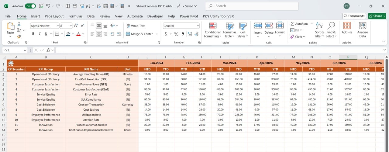
This sheet is used to input monthly data.
- Dynamic Month Updates: Change the first month of the year at cell E1 to automatically adjust the input range.
- Input Requirements: Enter MTD and YTD Actuals for each KPI monthly.
Target Sheet Tab
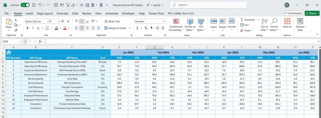
This worksheet requires users to input monthly target values.
- MTD and YTD Targets: Separate fields for monthly and year-to-date targets ensure comprehensive tracking.
Click to Shared Services KPI
Previous Year Numbers Sheet Tab
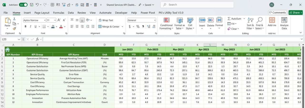
This sheet contains data from the previous year.
- Historical Data Entry: Enter monthly data for the previous year, mirroring the format of current-year inputs.
KPI Definition Sheet Tab
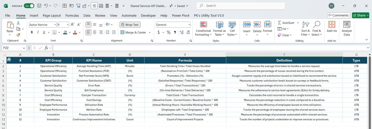
This tab is the reference guide for all KPIs in the dashboard.
- KPI Metadata: Includes KPI Name, Group, Unit, Formula, and Definition to ensure clarity and consistency in KPI tracking.
Advantages of a Shared Services KPI Dashboard
Creating a Shared Services KPI Dashboard in Excel offers numerous benefits:
- Centralized Data Management: The dashboard consolidates all KPI-related data into a single tool, eliminating the need for scattered spreadsheets and reports.
- Improved Decision-Making: The dashboard provides clear insights into performance trends, enabling leaders to make timely, data-driven decisions.
- Customizable and Scalable: Since the dashboard is built in Excel, it can be easily customized to meet specific organizational needs and expanded as requirements evolve.
- Enhanced Collaboration: With clearly defined metrics and easily shareable sheets, the dashboard promotes transparency and collaboration among team members.
- Visual Representation: Dynamic charts, conditional formatting, and trend analysis make it easier to interpret data at a glance.
Click to Shared Services KPI
Best Practices for Using a Shared Services KPI Dashboard
To maximize the effectiveness of your Shared Services KPI Dashboard, follow these best practices:
- Define Clear KPIs: Ensure all KPIs are well-defined, relevant, and aligned with organizational goals. Use the KPI Definition sheet to provide clarity.
- Maintain Accurate Data: Regularly update the Actual Numbers, Targets, and Previous Year data to ensure accuracy.
- Use Dynamic Features: Take advantage of Excel’s dynamic capabilities, such as drop-down lists, conditional formatting, and charts, to make the dashboard interactive and user-friendly.
- Validate Input Data: Set up data validation rules to minimize errors during data entry.
- Monitor Trends: Regularly review the KPI Trend sheet to identify patterns and take proactive measures to address any issues.
- Regularly Review and Update: Periodically review the KPIs and dashboard structure to ensure they remain relevant and useful.
How to Create a Shared Services KPI Dashboard in Excel
- Set Up the Worksheets: Create individual sheets for Home, Dashboard, KPI Trend, Actual Numbers, Targets, Previous Year Numbers, and KPI Definitions.
- Design the Dashboard Layout: Use tables, charts, and slicers to create an intuitive and visually appealing layout.
- Implement Drop-Downs: Use data validation to create drop-down lists for month and KPI selection.
- Add Conditional Formatting: Use conditional formatting to highlight trends, such as performance improvement or decline.
- Build Dynamic Charts: Create charts that update automatically based on selected data.
- Test Functionality: Ensure all links, formulas, and drop-downs work correctly before deployment.
Click to Shared Services KPI
Common Challenges and Solutions
- Data Inconsistencies: Use data validation and cross-check entries regularly.
- Complex Formulas: Break complex formulas into smaller steps and test them individually.
- Slow Performance: Optimize formulas, use efficient chart types, and limit the number of rows and columns processed.
Conclusion
A Shared Services KPI Dashboard in Excel is an essential tool for organizations looking to streamline performance tracking and improve decision-making. By combining dynamic features, user-friendly navigation, and customizable options, this dashboard can help your shared services team achieve its goals efficiently.
Click to Shared Services KPI
Frequently Asked Questions (FAQs)
Q. What is a Shared Services KPI Dashboard?
A Shared Services KPI Dashboard is a tool that tracks key performance indicators for shared services teams, providing insights into performance metrics and trends.
Q. Can I customize the KPI Dashboard?
Yes, the dashboard is built in Excel, making it fully customizable to meet specific organizational needs.
Q. How do I update the dashboard for a new month?
Simply select the desired month from the drop-down in the Dashboard sheet. Update Actual Numbers, Targets, and Previous Year data in their respective sheets.
Q. What are the benefits of using conditional formatting in the dashboard?
Conditional formatting highlights trends and anomalies, making it easier to interpret data and take corrective actions.
Q. Do I need advanced Excel skills to use this dashboard?
While basic Excel knowledge is sufficient for regular use, creating or customizing the dashboard may require intermediate Excel skills.
This article provides a complete guide to building and using a Shared Services KPI Dashboard in Excel. By implementing the outlined steps and best practices, you can create a powerful tool to enhance efficiency and drive success in shared services management.
Click to Shared Services KPI
Visit our YouTube channel to learn step-by-step video tutorials
View this post on Instagram

