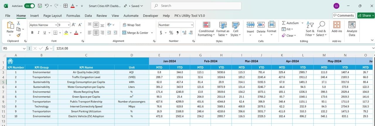
In today’s fast-paced, data-driven world, cities are becoming smarter, leveraging technology and data to enhance sustainability, safety, and overall quality of life. To achieve this, Smart Cities need comprehensive tools to monitor, measure, and manage their performance. Enter the Smart Cities KPI Dashboard—a centralized tool that offers real-time insights into a city’s key performance indicators (KPIs), helping city managers make informed decisions.
This article will walk you through the essential aspects of the Smart Cities KPI Dashboard, its features, advantages, best practices, and opportunities for improvement, ensuring a clear understanding of how this tool revolutionizes urban planning.
What is a Smart Cities KPI Dashboard?
Click to Smart Cities KPI
A Smart Cities KPI Dashboard is an integrated tool designed to track and measure a city’s performance across various metrics. These metrics, or KPIs, span multiple domains such as energy consumption, traffic flow, waste management, public safety, and citizen satisfaction. The dashboard provides actionable insights to improve urban efficiency, sustainability, and quality of life.
Key Features of the Smart Cities KPI Dashboard
This Smart Cities KPI Dashboard is a ready-to-use template designed specifically for tracking key performance indicators. Below are the standout features that make it a must-have tool for modern cities:
Home Sheet
The Home Sheet acts as the central hub of the dashboard. This index sheet features six interactive buttons, allowing users to navigate quickly to other sections. It offers a user-friendly way to jump directly to specific worksheets, saving time and increasing efficiency.

Click to Smart Cities KPI
Dashboard Sheet Tab
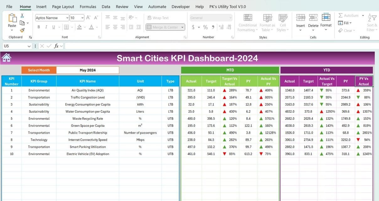
This is the core of the dashboard. It provides a comprehensive overview of all KPIs for the selected month. Key functionalities include:
Dropdown Menu (Cell D3): Select a specific month to view its data. The dashboard dynamically updates all metrics for that month.
MTD and YTD Data: Displays Month-to-Date (MTD) and Year-to-Date (YTD) actuals, targets, and previous year values.
Conditional Formatting: Includes up/down arrows to highlight deviations from targets and the previous year’s performance, making it visually intuitive.

Click to Smart Cities KPI
KPI Trend Sheet Tab
Here, users can analyze trends for individual KPIs. Key features include:
Dropdown Selection (Cell C3): Select a KPI to display its group, unit, formula, type (whether “Lower is better” or “Upper is better”), and detailed definition.
Trend Visualization: See how the KPI performs over time to identify patterns and anomalies.

Click to Smart Cities KPI
Actual Numbers Sheet Tab
This sheet allows users to input the actual MTD and YTD values for each KPI:
Dynamic Month Selection (Cell E1): Change the starting month dynamically by entering the first month of the year.
Real-Time Data Updates: Enter actual numbers for the selected month and watch the entire dashboard refresh accordingly.

Click to Smart Cities KPI
Target Sheet Tab
Set your performance benchmarks here. This sheet includes:
MTD and YTD Targets: Input specific target values for each KPI for the selected month.
Goal Tracking: Compare actuals against these targets in the main dashboard.

Click to Smart Cities KPI
Previous Year Numbers Sheet Tab
Track progress by comparing it to past performance:
Historical Data: Enter the previous year’s MTD and YTD values for all KPIs. This ensures a robust comparison framework for continuous improvement.

Click to Smart Cities KPI
KPI Definition Sheet Tab
Define and document your KPIs in detail. This sheet includes:
KPI Name, Group, and Unit: Clearly categorize each KPI.
- Formula: Provide the calculation method for transparency.
Definition: Ensure everyone understands what each KPI represents.

Click to Smart Cities KPI
Advantages of Using a Smart Cities KPI Dashboard
- Centralized Data Management: The dashboard consolidates data from multiple domains into a single platform, eliminating the need for scattered spreadsheets and reports.
- Real-Time Insights: Dynamic updates for MTD and YTD metrics allow city planners to react to issues as they arise, ensuring timely interventions.
- Improved Decision-Making: With clear visualizations and conditional formatting, decision-makers can quickly identify areas that need attention and allocate resources more effectively.
- Enhanced Accountability: By tracking targets versus actuals, the dashboard fosters a culture of accountability among departments and stakeholders.
- Customizable Features: Dropdown menus and dynamic formulas make the dashboard adaptable to various cities and projects, accommodating unique needs.
Best Practices for Using a Smart Cities KPI Dashboard
- Define Clear and Relevant KPIs: Ensure your KPIs align with the city’s goals. For example, include metrics for energy efficiency, public safety, and waste management to address sustainability.
- Regularly Update Data: Input actual, target, and historical data consistently to maintain the accuracy and reliability of the dashboard.
- Engage Stakeholders: Involve relevant stakeholders when defining KPIs and reviewing performance. This ensures a holistic approach to urban management.
- Leverage Conditional Formatting: Use visual cues like color coding and arrows to highlight performance gaps. This makes the dashboard intuitive for all users.
- Monitor Trends; Analyze trends over time to identify recurring issues or opportunities for improvement, allowing for proactive planning.
Opportunities for Improvement in the Smart Cities KPI Dashboard
While the Smart Cities KPI Dashboard is a powerful tool, there is always room for improvement. Here are some opportunities:
- Integration with IoT Devices
Enhance the dashboard by integrating it with IoT devices for real-time data collection, such as sensors for air quality, traffic, and energy usage.
- Automated Data Input
Reduce manual errors by automating data input from municipal systems and databases.
- Advanced Analytics
Incorporate predictive analytics to forecast future trends based on historical data, enabling better planning and resource allocation.
- Mobile Accessibility
Make the dashboard mobile-friendly so city planners can access it on the go.
- Enhanced Visualization
Add advanced charts and infographics to make the data more visually engaging and easier to interpret.
- List of Smart Cities KPIs
Below are key KPIs for Smart Cities, along with their unit, formula, definition, and whether a higher or lower value is desirable:
How to Build and Maintain a Smart Cities KPI Dashboard
Building and maintaining a Smart Cities KPI Dashboard requires careful planning and execution. Follow these steps:
- Identify Objectives: Understand the city’s goals and select KPIs that align with these objectives.
- Choose the Right Tools: Use software like Microsoft Excel, Power BI, or Tableau for building the dashboard.
- Engage Experts: Collaborate with data analysts, urban planners, and IT professionals to design and implement the dashboard.
- Test and Validate: Ensure the dashboard functions as expected by testing it with historical data before full implementation.
- Train Users: Conduct training sessions for city planners and stakeholders to maximize the dashboard’s utility.
Conclusion
The Smart Cities KPI Dashboard is an indispensable tool for modern urban management. It offers centralized, real-time insights into a city’s performance, enabling data-driven decision-making and continuous improvement. By adopting this tool, cities can achieve greater efficiency, sustainability, and citizen satisfaction.
Frequently Asked Questions (FAQs)
- What is a Smart Cities KPI Dashboard?
A Smart Cities KPI Dashboard is a tool designed to track and measure a city’s performance across various metrics, such as energy consumption, public safety, and waste management.
- How does the dashboard help city planners?
The dashboard provides real-time insights, trend analysis, and performance comparisons, enabling city planners to make informed decisions and improve resource allocation.
- Can I customize the KPIs in the dashboard?
Yes, the dashboard is fully customizable. You can define KPIs based on your city’s unique goals and challenges.
- What tools can I use to create the dashboard?
You can use tools like Microsoft Excel, Power BI, or Tableau to create and maintain a Smart Cities KPI Dashboard.
- How often should I update the dashboard?
It’s recommended to update the dashboard monthly to ensure accurate and reliable data.
Visit our YouTube channel to learn step-by-step video tutorials
https://www.linkedin.com/feed/update/urn:li:activity:7270397481614475265


