Social service organizations often operate with limited resources and aim to make the most significant impact possible. Effective tracking of KPIs (Key Performance Indicators) can help these organizations achieve their objectives. A well-designed Social Services KPI Dashboard in Excel offers a practical way to manage and monitor crucial metrics, enabling leaders to make data-driven decisions that positively impact the communities they serve. This article delves into creating a Social Services KPI Dashboard in Excel, exploring its essential features, best practices, opportunities for improvement, and frequently asked questions.
Click to buy Social Services KPI Dashboard in Excel
Key Features of the Social Services KPI Dashboard
This Excel-based KPI Dashboard is a comprehensive solution that contains seven distinct sheets, each serving a specific purpose. Here’s a breakdown Social Services KPI Dashboard in Excel:
Home Sheet
Click to buy Social Services KPI Dashboard in Excel
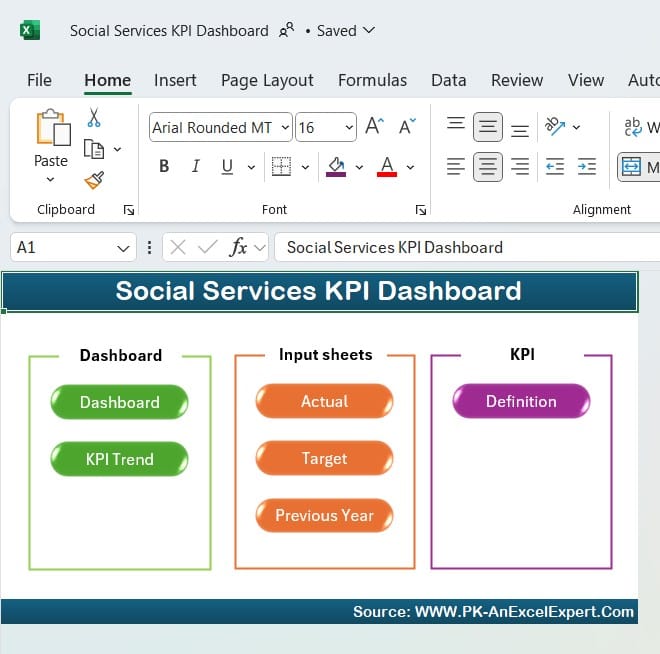
The Home Sheet functions as an index page, allowing easy navigation across the dashboard. It includes six clickable buttons that link to each sheet, making it simple to jump between sections.
Dashboard Sheet Tab
Click to buy Social Services KPI Dashboard in Excel
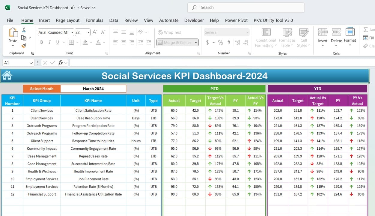
The core of the KPI Dashboard, the Dashboard Sheet, displays all KPI information. A drop-down menu in cell D3 allows users to select a specific month, dynamically updating the dashboard numbers. Key metrics like Month-to-Date (MTD) Actual, Target, Previous Year (PY) data, and comparisons (Target vs. Actual, PY vs. Actual) are showcased with conditional formatting that uses arrows to indicate trends.
KPI Trend Sheet Tab
Click to buy Social Services KPI Dashboard in Excel
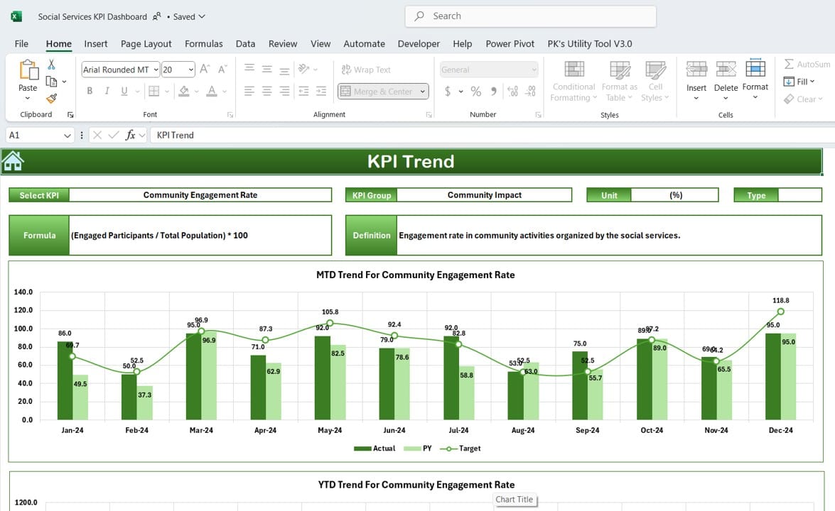
The KPI Trend Sheet provides a more detailed look at each KPI’s performance. Users can select the KPI name in cell C3, displaying details such as KPI Group, Unit, Type (whether a higher or lower value is preferable), Formula, and Definition. The sheet includes charts to visualize MTD and Year-to-Date (YTD) trends for Actual, Target, and PY data.
Actual Numbers Input Sheet
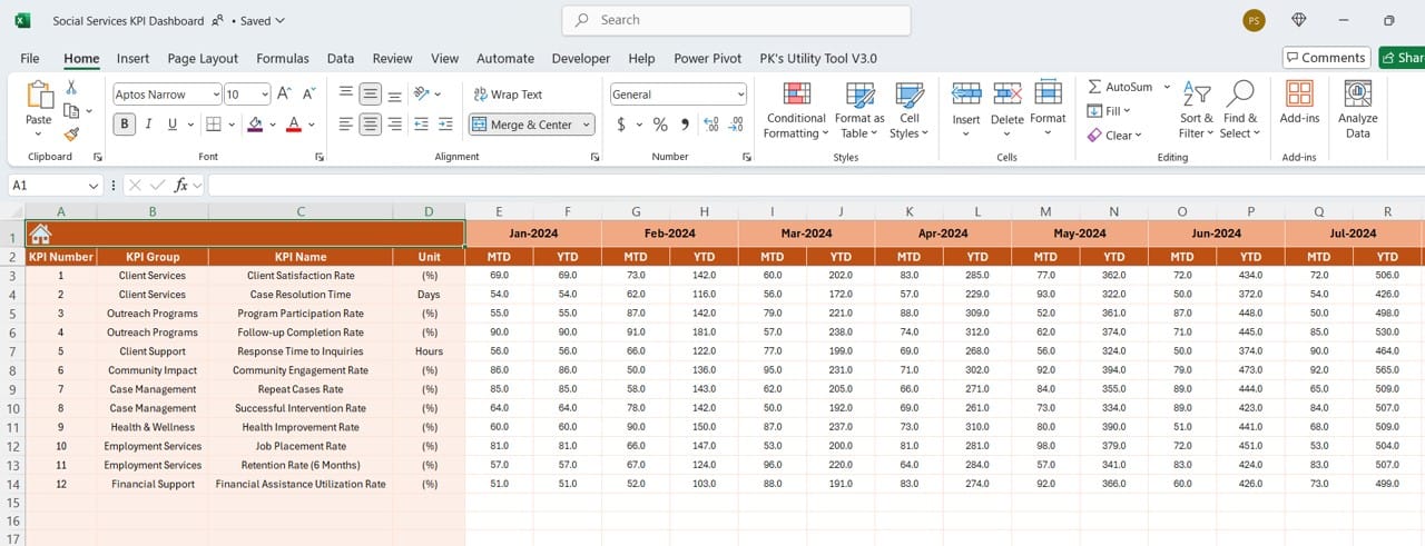
This sheet is for inputting actual numbers for each month’s MTD and YTD. Users can select the month by adjusting cell E1, entering the initial month of the year to simplify tracking.
Target Sheet Tab
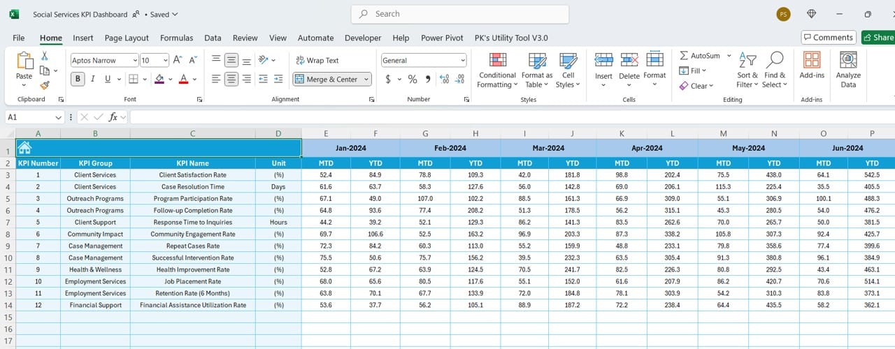
Here, users enter target numbers for each KPI, setting goals for MTD and YTD values by month.
Previous Year Number Sheet Tab
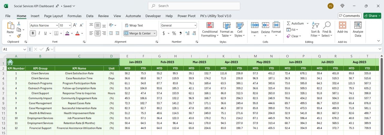
The Previous Year sheet tab allows users to input the prior year’s numbers, ensuring a basis for comparison with current data.
Click to buy Social Services KPI Dashboard in Excel
KPI Definition Sheet Tab
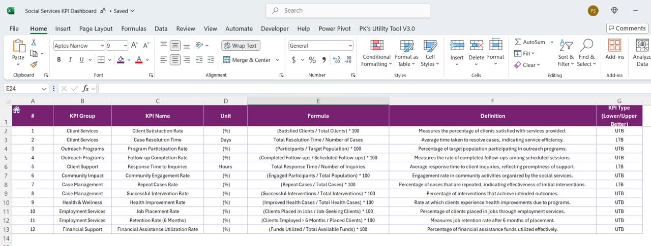
This sheet defines each KPI with fields for KPI Name, Group, Unit, Formula, and Description, helping users understand the metrics they’re tracking.
Advantages of Using a Social Services KPI Dashboard in Excel
Using this KPI Dashboard offers numerous benefits, such as:
- Easy Data Visualization: The dashboard uses conditional formatting and trend charts to provide clear insights into KPI performance, making data easier to interpret.
- Quick Decision-Making: Real-time updates and month-to-month tracking enable quick decisions based on current data.
- Customizable Tracking: Users can easily adjust targets and actuals based on organizational needs and specific KPIs.
- Comparison with Historical Data: With prior year data, organizations can benchmark current performance against historical figures, identifying trends and areas of improvement.
- Enhanced Accountability: By clearly defining KPIs and setting monthly targets, the dashboard holds team members accountable for meeting social service goals.
Best Practices for Using a Social Services KPI Dashboard
To get the most out of your Social Services KPI Dashboard, follow these best practices:
- Set Realistic Targets: Ensure that targets are challenging yet achievable. Unrealistic goals can demotivate teams, while attainable objectives encourage productivity and progress.
- Update Data Regularly: Input actual numbers on a regular basis (e.g., monthly) to keep the dashboard relevant and informative.
- Customize KPIs Based on Organizational Goals: Only track KPIs that align with your organization’s mission. Avoid unnecessary metrics that clutter the dashboard and detract from key performance areas.
- Monitor Trends, Not Just Numbers: Pay close attention to trend charts, as they reveal patterns over time that individual numbers may not indicate.
- Review KPI Definitions Regularly: Definitions should remain relevant and aligned with organizational priorities. Update them as necessary to ensure clarity for all stakeholders.
- Leverage Conditional Formatting: Conditional formatting provides visual cues, making it easier to spot trends and anomalies quickly.
Click to buy Social Services KPI Dashboard in Excel
Opportunities for Improvement in the Social Services KPI Dashboard
Even with a well-designed dashboard, there’s always room for improvement. Here are some ways to enhance the dashboard’s utility:
- Automate Data Entry: Consider linking the Excel dashboard to a data source (like a CRM or project management software) for automatic data updates, reducing manual entry and human error.
- Add a Forecasting Feature: Adding forecasting capabilities could help anticipate future needs, allowing for more proactive resource allocation.
- Improve Accessibility: Make the dashboard accessible to a wider audience by creating a web-based version using tools like Power BI or Google Data Studio, allowing real-time updates and broader access.
- Incorporate Additional KPIs for Comprehensive Tracking: Based on evolving organizational goals, regularly evaluate whether additional KPIs might offer new insights.
- Provide Training for Users: Not everyone may be comfortable interpreting data. Regular training sessions can empower all team members to leverage the dashboard effectively.
Frequently Asked Questions (FAQs)
Q. What are KPIs in social services?
KPIs in social services are specific, measurable metrics used to track the effectiveness of programs, initiatives, and resource allocation. Examples include client satisfaction, service delivery speed, and outcome rates.
Q. How often should I update the KPI dashboard?
Ideally, update the KPI dashboard on a monthly basis to reflect the most current data. However, in high-activity periods, consider more frequent updates.
Q. Can I customize this KPI dashboard for other departments?
Yes, this dashboard can be customized to track KPIs in other departments by adjusting the KPI definitions, units, and targets to suit the specific needs of each department.
Q. What’s the benefit of using Excel for a KPI dashboard?
Excel offers flexibility, ease of use, and powerful analytical tools like conditional formatting, charts, and formulas, making it an accessible solution for many organizations.
Q. How do I decide which KPIs to track?
Choose KPIs based on organizational goals, mission priorities, and areas of critical impact. Avoid tracking too many KPIs to keep the dashboard focused and actionable.
Q. What is the difference between MTD and YTD in the dashboard?
MTD stands for Month-to-Date, showing data accumulated from the start of the month until now. YTD, or Year-to-Date, includes data from the beginning of the year to the current date.
Q. Can I use this dashboard to track past performance?
Yes, the dashboard includes a Previous Year tab, allowing you to input historical data for trend comparison.
Q. How can conditionally formatting help in tracking KPIs?
Conditional formatting uses coolers and symbols to indicate changes, making it easier to identify performance trends immediately.
Click to buy Social Services KPI Dashboard in Excel
Conclusion
The Social Services KPI Dashboard in Excel is an invaluable tool for organizations looking to manage, analyses, and improve their performance metrics. By following best practices and focusing on key KPIs, organizations can optimize their efforts and make a more substantial impact on the communities they serve. This guide provides a foundational approach to implementing and customizing the dashboard, empowering social service providers to transform data into meaningful insights.
With continuous updates and adjustments based on feedback and evolving goals, the KPI dashboard becomes a living document, driving the success of social services initiatives.
Visit our YouTube channel to learn step-by-step video tutorials
View this post on Instagram
Click to buy Social Services KPI Dashboard in Excel


