In the bustling realm of social services, data isn’t just numbers—it’s the heartbeat of decision-making. That’s exactly where the Social Services KPI Dashboard in Power BI steps in, transforming raw data into actionable insights. This tool isn’t just handy; it’s a strategic game-changer for managing resources and enhancing service delivery Social Services KPI Dashboard.
Click to buy Social Services KPI Dashboard in Power BI
Why a Power BI Dashboard?
Well, imagine having a superpower that lets you peek into every aspect of your organization’s performance. That’s what this dashboard does. It’s meticulously crafted to cater to social services organizations, empowering them with the data they need to make smart decisions quickly.
Click to buy Social Services KPI Dashboard in Power BI
Key Features You Can’t Miss
- Interactive Pages: The dashboard includes three interactive pages—Summary, KPI Trend, and KPI Definition—each designed to offer specific insights at a glance.
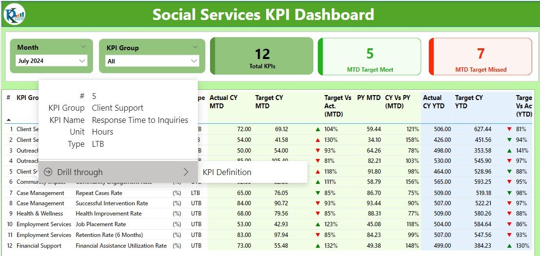
- Dynamic Tools: It comes equipped with slicers to filter data by months or KPI groups and uses color-coded indicators to simplify understanding complex data.
Detailed Insights Across Pages:
Summary Page:
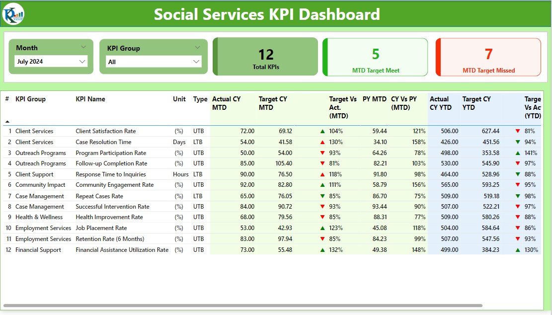
- Track essential metrics, monitor targets with dynamic slicers, and view performance tables showing actual vs. target data and year-over-year comparisons.
Click to buy Social Services KPI Dashboard in Power BI
KPI Trend Page:
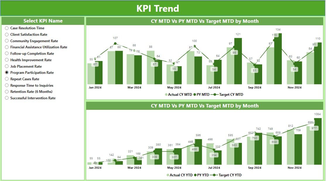
- Features combo charts that compare actual numbers to targets and historical performance, visually breaking down trends.
KPI Definition Page:
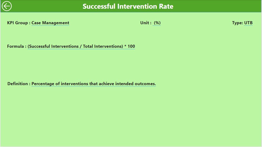
- A hidden gem that offers detailed formulas and definitions, accessible through a drill-through feature for deeper data dives.
The Upsides of Adopting This Dashboard
So, why integrate this dashboard into your workflow? Here’s what it brings to the table:
- Enhanced Oversight: Quickly identify areas that need attention and make adjustments on the fly.
- Increased Accountability: Track performance against historical data to ensure targets are met consistently.
- Data-Driven Decisions: Use solid data to allocate resources efficiently and boost service effectiveness.
Best Practices for Dashboard Mastery
Click to buy Social Services KPI Dashboard in Power BI
To truly leverage the power of the Social Services KPI Dashboard, keep these tips in mind:
- Update Regularly: Keeping your data fresh ensures accuracy in reports and decisions.
- Educate Your Team: Make sure everyone using the dashboard knows how to get the most out of it.
- Seek Feedback: Continuously improve the dashboard by incorporating user feedback to meet evolving needs.
Conclusion
Ultimately, the Social Services KPI Dashboard in Power BI is more than a tool—it’s a pivotal asset for any social service organization aiming to streamline its operations and make impactful decisions based on reliable data.
Frequently Asked Questions
Q1: Can this dashboard be customized for different organizations?
A1: Absolutely! It’s designed to be flexible, catering to the unique needs and KPIs of various groups.
Q2: What’s involved in maintaining the dashboard?
A2: Mainly, it requires regular updates to the Excel sheets that feed data into the dashboard to keep it current and relevant.
Q3: How can I access the KPI Definition page?
A3: You can get there through the drill-through feature on any KPI from the Summary page, which provides a deeper understanding of each metric.
Click to buy Social Services KPI Dashboard in Power BI
Visit our YouTube channel to learn step-by-step video tutorials
View this post on Instagram
Click to buy Social Services KPI Dashboard in Power BI
