With the increasing demand for clean and sustainable energy, monitoring the performance of solar energy systems is more important than ever. A Solar Energy KPI Dashboard provides a structured way to measure, analyze, and optimize solar energy projects. This dashboard consolidates key performance indicators (KPIs) into a user-friendly, visual tool that aids in decision-making and operational efficiency.
In this article, we will explore the features, advantages, opportunities for improvement, and best practices for using a Solar Energy KPI Dashboard. Let’s dive into how this tool can transform solar energy management.
Click to Solar Energy KPI
What Is a Solar Energy KPI Dashboard?
A Solar Energy KPI Dashboard is a dynamic tool designed to track and evaluate the performance of solar energy projects. It enables organizations to measure key metrics like energy production, efficiency, and financial performance. By visualizing data in an interactive format, this dashboard simplifies the decision-making process and ensures projects stay aligned with sustainability goals.
Key Features of the Solar Energy KPI Dashboard
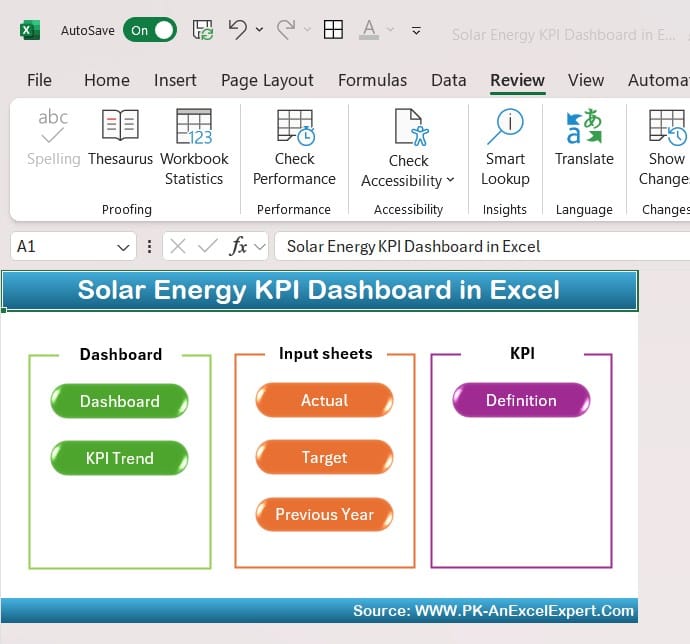
This ready-to-use Excel template is divided into seven worksheets, each designed to streamline KPI tracking.
Home Sheet
Serves as the index of the dashboard.
Includes six navigation buttons for easy access to all other sheets.
Provides a clean and intuitive starting point for users.

Click to Solar Energy KPI
Dashboard Sheet Tab
The primary hub for data visualization and performance insights.
Allows users to select a month dynamically using a dropdown in Range D3.
Displays:
- MTD (Month-to-Date): Actual, Target, and Previous Year (PY) metrics.
- YTD (Year-to-Date): Actual, Target, and PY metrics.
Features conditional formatting with up/down arrows to highlight trends.

Click to Solar Energy KPI
KPI Trend Sheet Tab
Offers detailed insights for selected KPIs via a dropdown in Range C3.
- Displays:
- KPI Group
- Unit
- Performance Type: Lower is better or Upper is better.
- Formula
- Definition

Click to Solar Energy KPI
Actual Numbers Sheet Tab
Input actual MTD and YTD values for each KPI.
Month selection in Range E1 dynamically adjusts the entries for easy data management.

Click to Solar Energy KPI
Target Sheet Tab
Record target values for each KPI on a monthly and yearly basis.

Click to Solar Energy KPI
Previous Year Numbers Sheet Tab
Maintain historical data for accurate year-over-year comparisons.

Click to Solar Energy KPI
KPI Definition Sheet Tab
A repository of all KPI details, including names, groups, units, formulas, and definitions.

Click to Solar Energy KPI
Advantages of the Solar Energy KPI Dashboard
Implementing this dashboard offers numerous benefits:
- Centralized Data Management: Consolidate all key metrics into one easy-to-access tool.
- Actionable Insights: Quickly identify inefficiencies and opportunities for improvement.
- Improved Decision-Making: Use real-time data to guide strategic decisions.
- Cost Optimization: Monitor costs and ROI to enhance financial performance.
- Enhanced Sustainability: Track metrics like carbon offset to align with green energy goals.
Best Practices for Using the Solar Energy KPI Dashboard
To maximize the value of your dashboard, follow these simple practices:
- Define Relevant KPIs: Choose KPIs that align with your project’s objectives and operational goals.
- Regularly Update Data: Ensure accuracy by inputting data weekly or monthly.
- Leverage Conditional Formatting: Use visual cues to highlight deviations from targets.
- Analyze Trends: Evaluate data over time to identify recurring issues or opportunities.
- Collaborate Effectively: Share insights with stakeholders to encourage informed decision-making.
Opportunities for Improvement in the Solar Energy KPI Dashboard
No tool is perfect, and this dashboard is no exception. Here are a few ways to enhance its functionality:
- Automated Data Integration: Connect the dashboard to IoT devices or monitoring systems for real-time updates.
- Mobile-Friendly Interface: Optimize the template for smartphones and tablets.
- Third-Party Tool Integration: Integrate with software like Power BI or Tableau for advanced analytics.
- Interactive Features: Add drill-down capabilities for in-depth analysis of specific metrics.
- Custom Alerts: Set up notifications for KPIs that fall below acceptable thresholds.
How to Create Your Solar Energy KPI Dashboard
Building this dashboard doesn’t require advanced technical skills. Follow these steps to create a functional and dynamic template:
Step 1: Plan Your KPIs
Identify the most important KPIs for your solar energy project. Focus on performance, efficiency, and financial metrics.
Step 2: Organize the Worksheets
Structure your Excel workbook with seven tabs: Home, Dashboard, KPI Trend, Actual Numbers, Target, Previous Year Numbers, and KPI Definition.
Step 3: Input Sample Data
Add sample data to test the functionality and ensure all formulas are working correctly.
Step 4: Design Visualizations
Use Excel’s charting tools to create graphs that display trends and comparisons.
Step 5: Add Interactivity
Incorporate dropdown menus and slicers for month selection and KPI filtering.
Step 6: Test and Refine
Share the dashboard with a small group of users for feedback, and make necessary improvements.
Conclusion
A Solar Energy KPI Dashboard is an invaluable tool for tracking and managing the performance of solar energy projects. By consolidating data, offering real-time insights, and promoting informed decision-making, it helps organizations optimize resources, improve efficiency, and achieve sustainability goals. With its user-friendly design and customizable features, this dashboard is ideal for solar energy managers seeking to streamline their operations.
Frequently Asked Questions (FAQs)
- What KPIs are most important for solar energy projects?
Key KPIs include Energy Production, Solar Efficiency, Maintenance Cost Per kWh, Carbon Offset, and ROI.
- How often should the dashboard be updated?
Update the dashboard weekly or monthly to maintain accurate and reliable data.
- Can this dashboard be customized for specific needs?
Yes, the template is fully customizable, allowing users to add or modify KPIs as needed.
- Can I integrate this dashboard with other tools?
Yes, you can connect it with IoT devices, monitoring systems, or software like Power BI for advanced insights.
- Is this dashboard suitable for beginners?
Absolutely! Its intuitive design makes it easy for beginners to use while offering advanced features for experts.
Visit our YouTube channel to learn step-by-step video tutorials


