Space exploration represents one of the most significant achievements of modern science and technology. As missions continue to expand into the universe, managing and tracking the performance of space missions becomes essential for ensuring success. One of the most effective ways to monitor and manage these missions is through the use of a Space Exploration KPI Dashboard in Power BI.
In this article, we will explore how a KPI (Key Performance Indicator) Dashboard in Power BI can help manage, visualize, and optimize space exploration efforts. From tracking mission progress to analyzing data and making real-time decisions, this dashboard serves as a powerful tool for space agencies, engineers, and scientists. We will discuss the dashboard’s key features, how it works, its advantages, and best practices for leveraging it.
What is a Space Exploration KPI Dashboard in Power BI?
A Space Exploration KPI Dashboard in Power BI is an interactive tool used to track key performance metrics in space missions. Powered by Power BI, this dashboard consolidates data into a visual format that makes it easier to monitor the performance of different KPIs in space exploration.
Space agencies and organizations involved in space exploration can utilize this dashboard to monitor critical mission parameters such as:
-
Progress toward mission objectives
-
Achievement of specific targets (e.g., fuel levels, payloads, scientific experiments)
-
Comparisons between current year metrics and previous year data
-
Performance against predefined targets
The integration of KPIs within the dashboard ensures that mission leaders, scientists, and engineers can quickly identify any discrepancies, optimize performance, and address potential challenges before they escalate.
Key Features of the Space Exploration KPI Dashboard in Power BI
Click to buy Space Exploration KPI Dashboard in Power BI
Our Space Exploration KPI Dashboard in Power BI comes with several powerful features that make it a valuable asset for anyone in the space exploration industry. The dashboard is structured to provide clear and actionable insights in a format that is easy to understand. Let’s take a closer look at its key features.
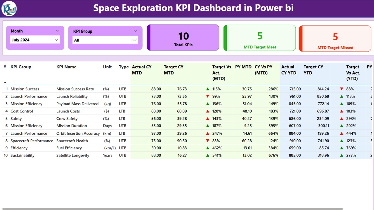
1. Summary Page: The Central Hub
The Summary Page acts as the main interface for the dashboard, where users can view the overall performance of the KPIs and make decisions based on the data presented. Here’s what the Summary Page includes:
Month and KPI Group Slicer: A slicer at the top allows users to select the specific month and KPI group, ensuring that they can filter the data based on their specific needs.
Key KPI Metrics: This section shows the Total KPIs Count, MTD (Month-to-Date) Target Meet Count, and MTD Target Missed Count. This gives a quick overview of how many KPIs are on track and which ones need attention.
Detailed KPI Table: The table below displays detailed information for each KPI, including:
- KPI Number: The sequential number assigned to each KPI.
- KPI Group: The category or group the KPI belongs to.
- KPI Name: The specific name of the KPI being tracked.
- Unit: The unit of measurement for the KPI.
- Type: Whether the KPI is Lower the Better (LTB) or Upper the Better (UTB).
- Actual CY MTD: The actual performance for the current year for Month-to-Date (MTD).
- Target CY MTD: The target value for MTD for the current year.
- MTD Icon: Green and red arrows (▲▼) indicate whether the actual performance is above or below the target for MTD.
- Target vs Actual (MTD): A percentage comparison of the actual value versus the target value for MTD.
- Previous Year MTD (PY MTD): The MTD value for the same period in the previous year.
- CY vs PY (MTD): A comparison of the current year’s MTD value with the previous year’s MTD value.
- Actual CY YTD: The Year-to-Date (YTD) actual performance for the current year.
- Target CY YTD: The YTD target value for the current year.
- YTD Icon: Icons indicating whether the YTD target is met or missed.
- Target vs Actual (YTD): A percentage comparison of actual YTD vs target YTD.
- Previous Year YTD (PY YTD): The YTD value for the same period in the previous year.
- CY vs PY (YTD): A comparison of the current year’s YTD value with the previous year’s YTD value.
Click to buy Space Exploration KPI Dashboard in Power BI
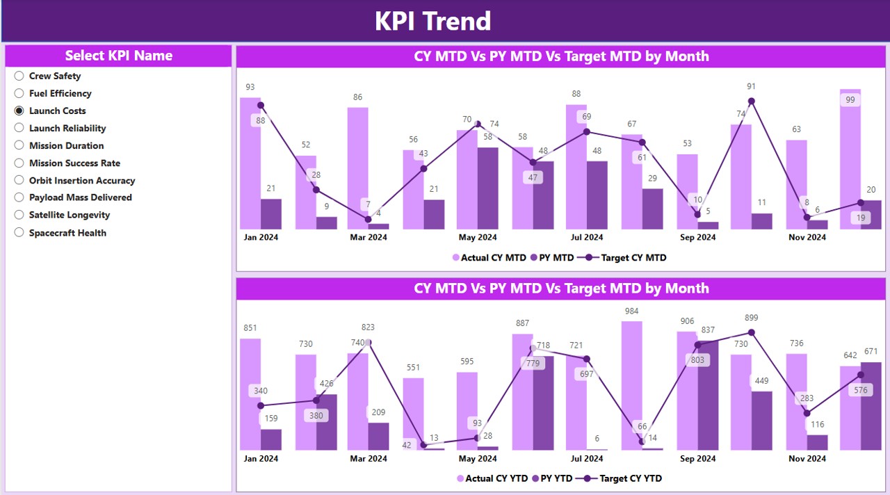
2. KPI Trend Page: Visualizing Performance Over Time
The KPI Trend Page helps users visualize the trends in KPIs over time. The features of this page include:
-
Combo Charts: Two combo charts are displayed to compare Actual Numbers of Current Year, Previous Year, and Targets for both MTD and YTD.
-
KPI Selection: Users can select a specific KPI Name from the slicer on the left side to view the trends of that KPI over time.
Click to buy Space Exploration KPI Dashboard in Power BI
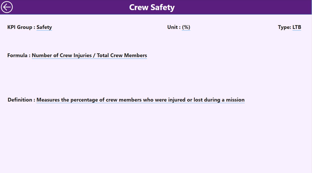
3. KPI Definition Page: In-Depth KPI Details
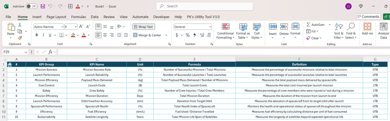
The KPI Definition Page is a drill-through page that provides detailed information about each KPI, such as:
-
Formula: How the KPI is calculated.
-
KPI Definition: A detailed explanation of what the KPI measures and why it is important for the space mission.
This page is hidden but can be accessed by drilling through from the Summary Page.
Click to buy Space Exploration KPI Dashboard in Power BI
4. Excel Data Integration
The dashboard uses an Excel data source, where users must enter the following:
-
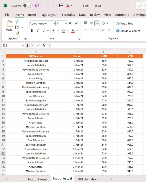
Input_Actual Sheet: Enter the actual numbers for each KPI, including MTD and YTD values for each month.
Click to buy Space Exploration KPI Dashboard in Power BI
-
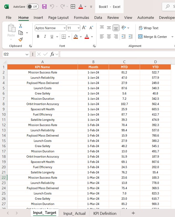
Input_Target Sheet: Enter the target numbers for each KPI, including MTD and YTD values.
Click to buy Space Exploration KPI Dashboard in Power BI
-
KPI Definition Sheet: Fill in the KPI Number, KPI Group, KPI Name, Unit, Formula, Definition, and Type (LTB or UTB).
Click to buy Space Exploration KPI Dashboard in Power BI
Advantages of Using a Space Exploration KPI Dashboard in Power BI
A Space Exploration KPI Dashboard in Power BI offers several advantages, especially when it comes to managing and optimizing space missions. Let’s explore the key benefits:
- Real-Time Data Monitoring: The dashboard provides real-time data monitoring, allowing space agencies to keep track of KPIs as they evolve throughout the year. This enables immediate action in case any KPI deviates from the expected target.
- Data Consolidation in One View: The dashboard consolidates data from different KPIs and presents it in an easy-to-read format. With this tool, managers can get a holistic view of mission performance, reducing the need for multiple reports and manual tracking.
- Improved Decision-Making: By visualizing the data through Power BI’s charts and tables, users can make informed decisions quickly. They can identify which KPIs need attention and whether corrective actions are necessary, helping to keep missions on track.
- Comparisons and Benchmarking: The dashboard allows for benchmarking performance by comparing current year data with previous year data, enabling space organizations to track improvements and identify patterns over time.
- Customizable and Interactive: The dashboard is highly customizable. Users can adjust slicers, apply filters, and view trends for specific KPIs. This flexibility helps ensure the dashboard meets the unique needs of different space missions and organizations.
Opportunities for Improvement in the Space Exploration KPI Dashboard
Click to buy Space Exploration KPI Dashboard in Power BI
While the Space Exploration KPI Dashboard in Power BI is a powerful tool, there are always opportunities for further enhancement. Here are a few areas for improvement:
- Incorporating Predictive Analytics: One potential improvement is the integration of predictive analytics to forecast future trends. By analyzing historical data, Power BI could help predict potential issues with KPIs and suggest corrective actions before problems arise.
- Automating Data Entry: Another improvement could be the automation of data entry from space mission databases or external systems. This would eliminate the need for manual updates, ensuring data is always accurate and up-to-date.
- Integration with Other Tools: The dashboard could be further enhanced by integrating it with other tools, such as mission control software, to pull in real-time data from space missions. This would ensure a seamless flow of information from operations to analysis.
- Enhanced User Permissions: To ensure data integrity, adding role-based user access would be beneficial. Different users could have access to different levels of data, ensuring that only authorized personnel can modify key metrics.
Best Practices for Using the Space Exploration KPI Dashboard
Click to buy Space Exploration KPI Dashboard in Power BI
To get the most out of the Space Exploration KPI Dashboard, here are some best practices:
- Regular Data Updates: Ensure that the dashboard is updated regularly with the latest data. The more up-to-date the data, the more accurate the insights will be.
- Use Slicers for Data Customization: Use the slicers provided in the dashboard to drill into specific KPIs or time periods. Customizing the data view helps you focus on what matters most.
- Monitor Trends Over Time; Don’t just focus on individual data points. Analyze the trends over time to get a deeper understanding of performance patterns and predict future outcomes.
- Collaborate Across Teams: Ensure that different teams involved in the space mission have access to the dashboard. This fosters collaboration and ensures that all departments are aligned on performance goals.
Conclusion
The Space Exploration KPI Dashboard in Power BI is an indispensable tool for managing and tracking the performance of space missions. With features like real-time data monitoring, data visualization, and customizable views, this dashboard provides critical insights into space mission performance. By leveraging these insights, space agencies can ensure that their missions stay on track, achieve their goals, and continue to push the boundaries of exploration.
Frequently Asked Questions
Click to buy Space Exploration KPI Dashboard in Power BI
1. What is a Space Exploration KPI Dashboard in Power BI?
A Space Exploration KPI Dashboard in Power BI is a tool used to monitor and track key performance indicators for space missions. It helps visualize data and monitor mission progress.
2. How does the KPI Dashboard improve decision-making?
The dashboard consolidates all the relevant data in one place, providing real-time insights. This enables decision-makers to quickly identify issues and take corrective actions.
3. Can the Space Exploration KPI Dashboard be customized?
Yes, the dashboard is highly customizable. Users can adjust slicers, filters, and themes to suit their specific needs.
4. How is data entered into the dashboard?
Data is entered into an Excel file, which serves as the data source for the dashboard. Users fill in actual numbers, target numbers, and KPI definitions in the Excel sheets.
5. How can I improve the Space Exploration KPI Dashboard?
Improvements can include automating data entry, incorporating predictive analytics, and integrating the dashboard with other mission management tools.
Visit our YouTube channel to learn step-by-step video tutorials
Click to buy Space Exploration KPI Dashboard in Power BI