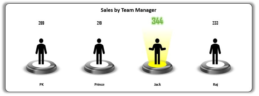
This is the second part of Spotlight visualization. Here we have used spotlight to highlight top performer in the chart. We have created a Column Chart for Team Manager wise sales and highlighted the team manager with the highest sales.
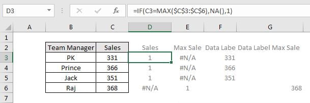
Below is the data which we have used in this chart-
We have created this chart in 2 variants. Below is the snapshot to variant-1.
Click to buy Spotlight Visualization in Excel (Part-2)
Below is the snapshot to variant-2.

Click to buy Spotlight Visualization in Excel (Part-2)
Visit our YouTube channel to learn step-by-step video tutorials
Watch the step by step video tutorial:
Click to buy Spotlight Visualization in Excel (Part-2)