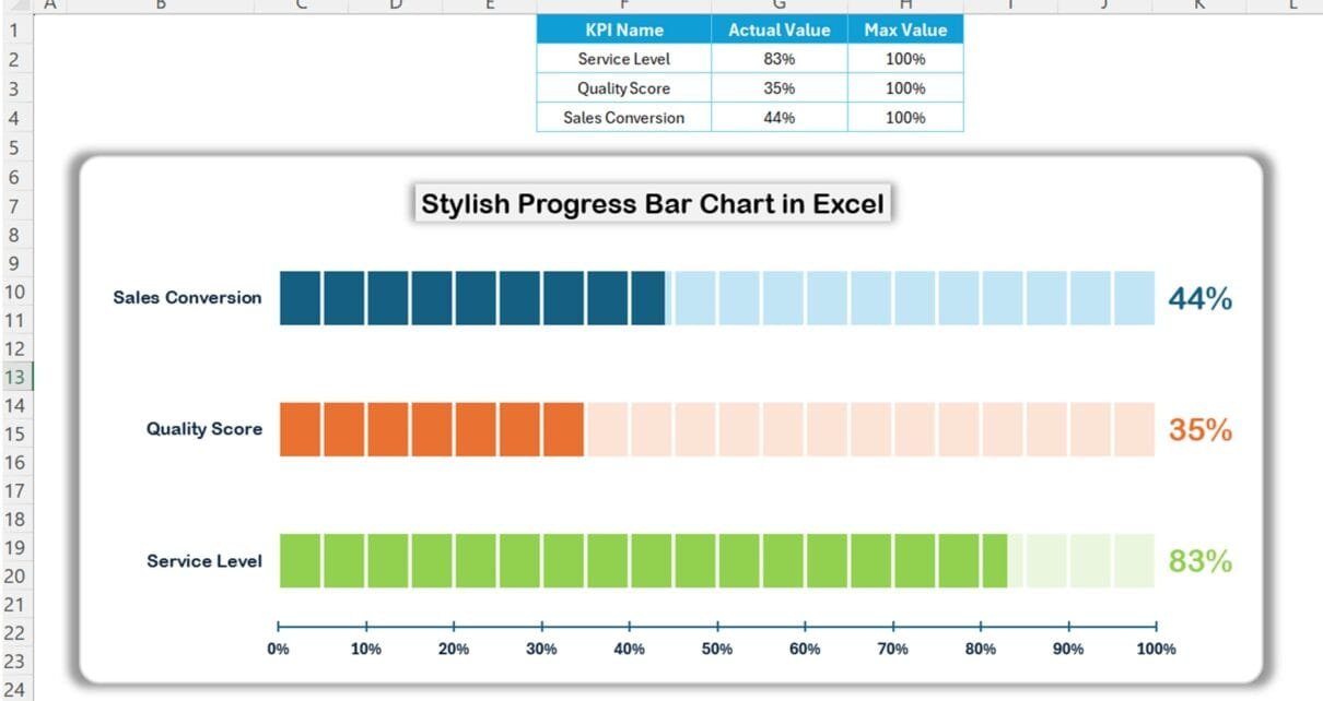
Visualizing data effectively is essential to understanding performance metrics and achieving business goals. Progress bar charts offer a clear, stylish way to represent key performance indicators (KPIs) like service levels, quality scores, and sales conversion rates. In this article, we’ll guide you through creating a stylish progress bar chart in Excel to highlight your KPIs with eye-catching visuals.
Why Use a Stylish Progress Bar Chart?
Progress bar charts offer a visually appealing way to display performance metrics. Unlike traditional charts, a progress bar chart provides a direct view of progress toward 100%, making it easier to analyze and present information quickly. This type of chart is ideal for:
- Tracking performance metrics like service level, quality score, or sales conversion.
- Highlighting targets and actual values in a visually appealing way.
- Providing clarity to your audience, especially in presentations and reports.
Click to buy Stylish Progress Bar chart in Excel
Step-by-Step Guide to Create a Stylish Progress Bar Chart in Excel
Let’s walk through each step to create a dynamic and stylish progress bar chart in Excel using a Clustered Bar Chart and Excel shapes.
Step 1: Prepare Your Data
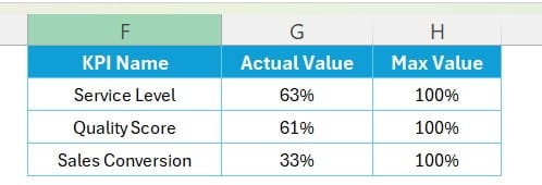
To start, set up your data in an Excel sheet. For this example, we will use three KPIs:

Additionally, create a column named Max % and set each value to 100%:
Click to buy Stylish Progress Bar chart in Excel
Step 2: Insert a Clustered Bar Chart
- Select your data range (including the “Actual %” and “Max %” columns).
- Go to the Insert tab, select Bar Chart, and choose Clustered Bar.
- Excel will generate a basic clustered bar chart with two bars for each KPI—one representing the actual value and the other the maximum value.
Step 3: Format the Chart Bars
For a visually appealing progress bar chart, we will apply formatting and add custom shapes.
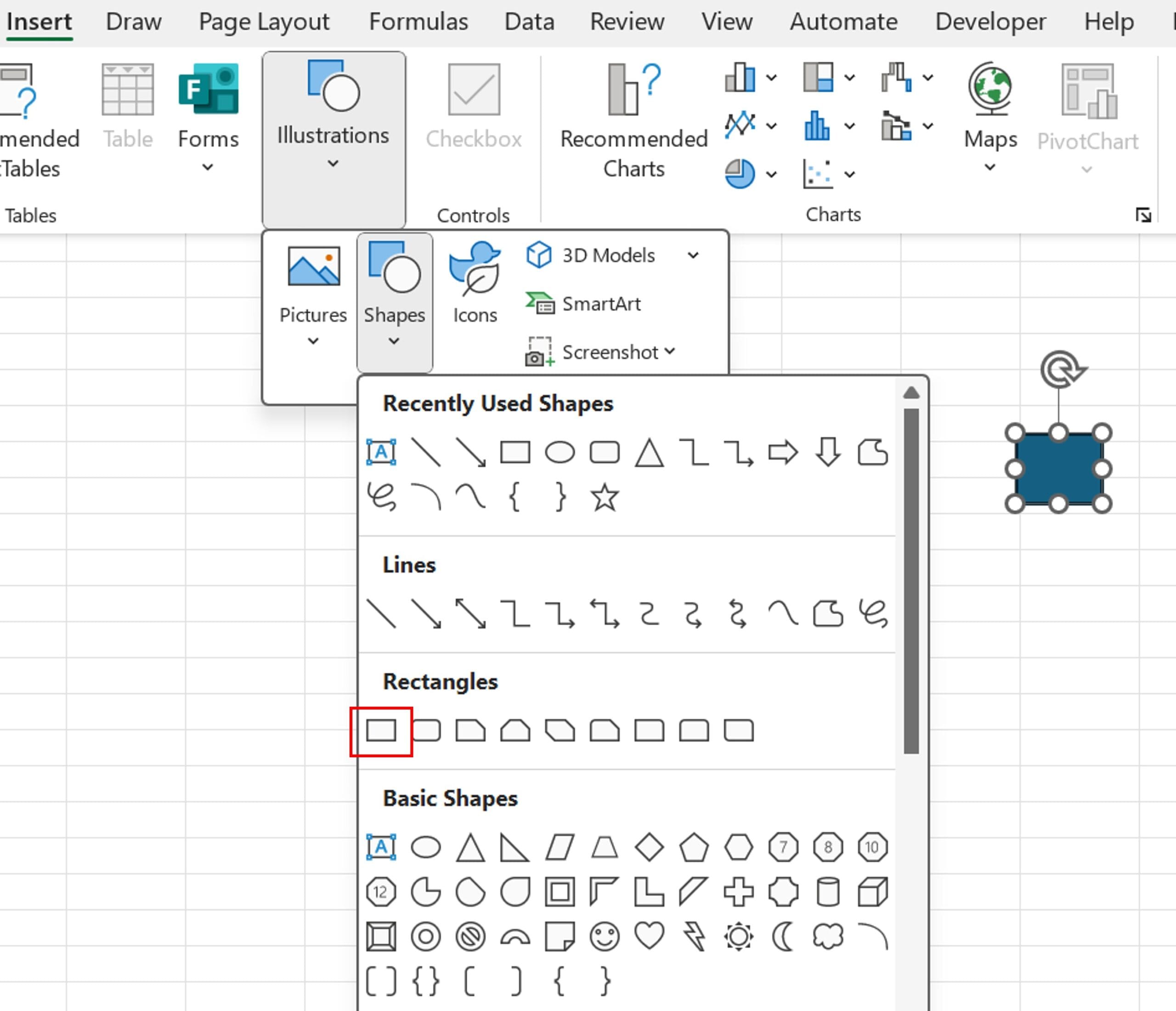
- Add two small rectangle shapes from the Insert > Shapes menu in Excel.
- Fill one rectangle with a dark color (e.g., dark blue) to represent the actual KPI value.
- Fill the other rectangle with a lighter color to represent the maximum value.
Step 4: Apply the Rectangle Shapes to the Chart Bars
- Copy the light color rectangle.
- Right-click the Max % bar in the chart, then select Format Data Series.
- Go to Fill & Line > Fill, select Picture or texture fill, and paste the light-colored rectangle by choosing Clipboard.
- Set the Stack and Scale option to 0.05 under Units/Picture for the desired texture.
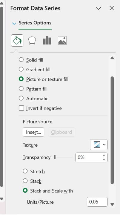
Repeat these steps for the Actual % bar using the dark-colored rectangle.
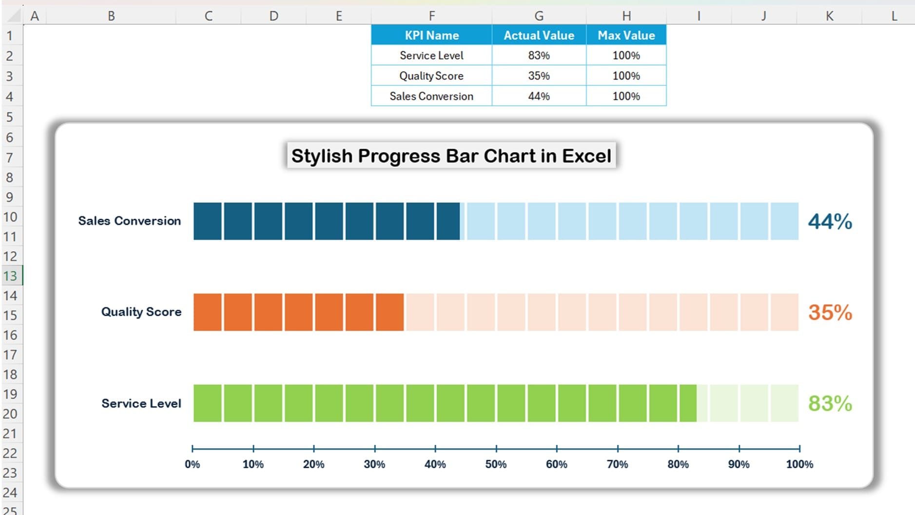
Your chart now displays progress with a dynamic bar style for each KPI metric!
Step 5: Adjust and Finalize Your Chart
Make additional adjustments to improve the overall appearance of your progress bar chart:
- Remove the gridlines for a cleaner look.
- Edit the axis titles to reflect the specific KPI metrics.
- Add data labels to display the actual percentage values above each bar.
Click to buy Stylish Progress Bar chart in Excel
Advantages of a Stylish Progress Bar Chart
Creating progress bar charts in Excel offers several benefits:
- Clear Visual Representation: Progress bar charts allow you to visually represent metrics at a glance.
- Easy Customization: Excel offers flexibility to customize colors, shapes, and sizes according to your style.
- Professional Appeal: A well-designed progress bar chart adds a professional touch to your presentations.
Click to buy Stylish Progress Bar chart in Excel
Best Practices for Creating Progress Bar Charts in Excel
To ensure your chart communicates effectively, follow these best practices:
- Keep it simple: Avoid overcomplicating the chart with too many colors or patterns.
- Use contrasting colors: Make sure the progress bars stand out with distinct colors for actual and max values.
- Add context: Use titles and labels that clearly explain what each bar represents.
Click to buy Stylish Progress Bar chart in Excel
Creating a Progress Bar Tutorial Video
To watch a complete tutorial video on how to create this stylish progress bar in Excel, check out our YouTube video below. This step-by-step guide will provide you with all the tips and tricks to recreate this look with ease.
Click to buy Stylish Progress Bar chart in Excel
Conclusion
A progress bar chart is a powerful way to visualize progress toward targets. With a few formatting tricks, you can create a stylish and impactful chart that communicates essential information. By following this guide, you’ll be able to present data more effectively and engage your audience with dynamic visuals.
Frequently Asked Questions (FAQs)
1. Can I customize the colors in my progress bar chart?
Yes, Excel allows full color customization. You can change the color of each bar and shape in your chart to match your company’s branding or personal preferences.
2. How can I add data labels to my chart?
Simply right-click on a bar, select Add Data Labels, and Excel will display the actual percentage on each bar for clearer communication.
3. Is it possible to automate updates in a progress bar chart?
Absolutely. If your data source updates automatically (e.g., through linked cells), the chart will reflect these changes. You can also use Excel formulas or macros for more complex automation needs.
4. What other types of charts work well for KPIs in Excel?
Besides progress bar charts, try gauges, bullet charts, and pie charts for displaying KPIs in a visually engaging way.
Visit our YouTube channel to learn step-by-step video tutorials
Click to buy Stylish Progress Bar chart in Excel
