This article explores the features, benefits, opportunities for improvement, best practices, and frequently asked questions (FAQs) related to the Logistics KPI Dashboard in Power BI. By the end of this guide, you’ll have a comprehensive understanding of how this tool can drive your supply chain’s success.
Table of Contents
ToggleWhat is a Supply Chain – Logistics KPI Dashboard in Power BI?
A Supply Chain – Logistics KPI Dashboard in Power BI is an interactive, dynamic tool that helps businesses track key performance indicators (KPIs) related to logistics and supply chain activities. This dashboard integrates data from multiple sources to provide a real-time view of your operations, enabling you to monitor key metrics such as delivery times, inventory turnover, and order fulfillment rates.
Built with Power BI, this tool enables you to visualize data in a user-friendly format, making it easier to analyze trends, identify bottlenecks, and improve decision-making.
Key Features of the Supply Chain – Logistics KPI Dashboard in Power BI
The Supply Chain – Logistics KPI Dashboard in Power BI is structured into three primary pages, each serving a unique purpose. These pages allow users to analyze logistics data in a detailed and organized manner.
Summary Page
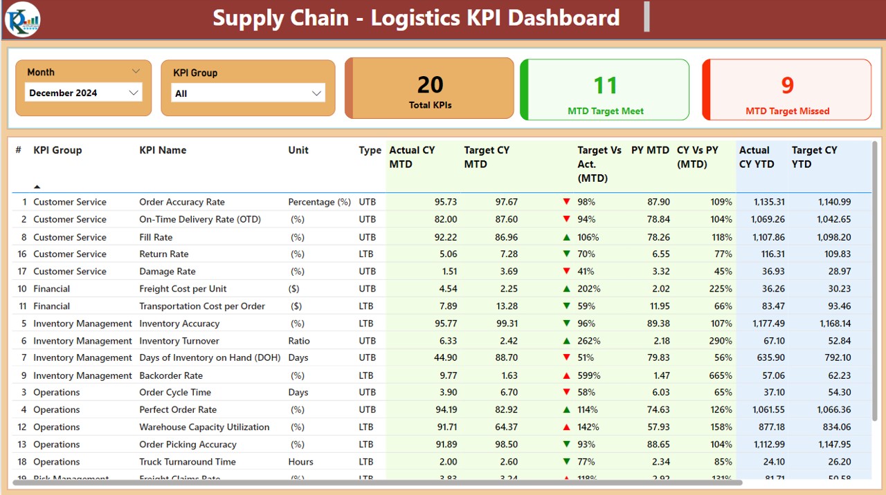
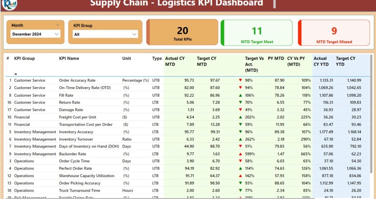
The Summary Page serves as the main hub of the dashboard, providing a high-level overview of all logistics KPIs. The layout includes:
Month and KPI Group Slicers: These slicers allow users to filter the data based on the month and KPI group, ensuring relevant data is displayed.
- KPIs Cards: The summary page features three key cards to track:
- Total KPIs Count
- MTD Target Met Count
- MTD Target Missed Count

Click to Supply Chain – Logistics KPI
Detailed Table: Below the cards, a detailed table shows the following:
- KPI Number: A unique identifier for each KPI.
- KPI Group: The category of the KPI (e.g., Inventory, Shipping).
- KPI Name: The name of the KPI (e.g., Delivery Timeliness).
- Unit: The unit of measurement for the KPI.
- Type: Whether the KPI is LTB (Lower the Better) or UTB (Upper the Better).
- Actual CY MTD: Actual current-year values for Month-to-Date.
- Target CY MTD: Target values for the current year MTD.
- MTD Icon: Green or red arrows indicating whether the actual value meets or misses the target.
- Target vs Actual (MTD): The percentage comparison between actual and target values for MTD.
- PY MTD: The previous year’s MTD values.
- CY vs PY (MTD): The percentage difference between the current and previous year’s MTD values.
- Actual CY YTD: Year-to-Date actual values for the current year.
- Target CY YTD: Year-to-Date target values.
- YTD Icon: Green or red arrows indicating whether the YTD target is met or missed.
- Target vs Actual (YTD): The percentage comparison between actual and target values for YTD.
- PY YTD: Previous year YTD data.
- CY vs PY (YTD): The percentage difference between current year and previous year YTD values.
KPI Trend Page
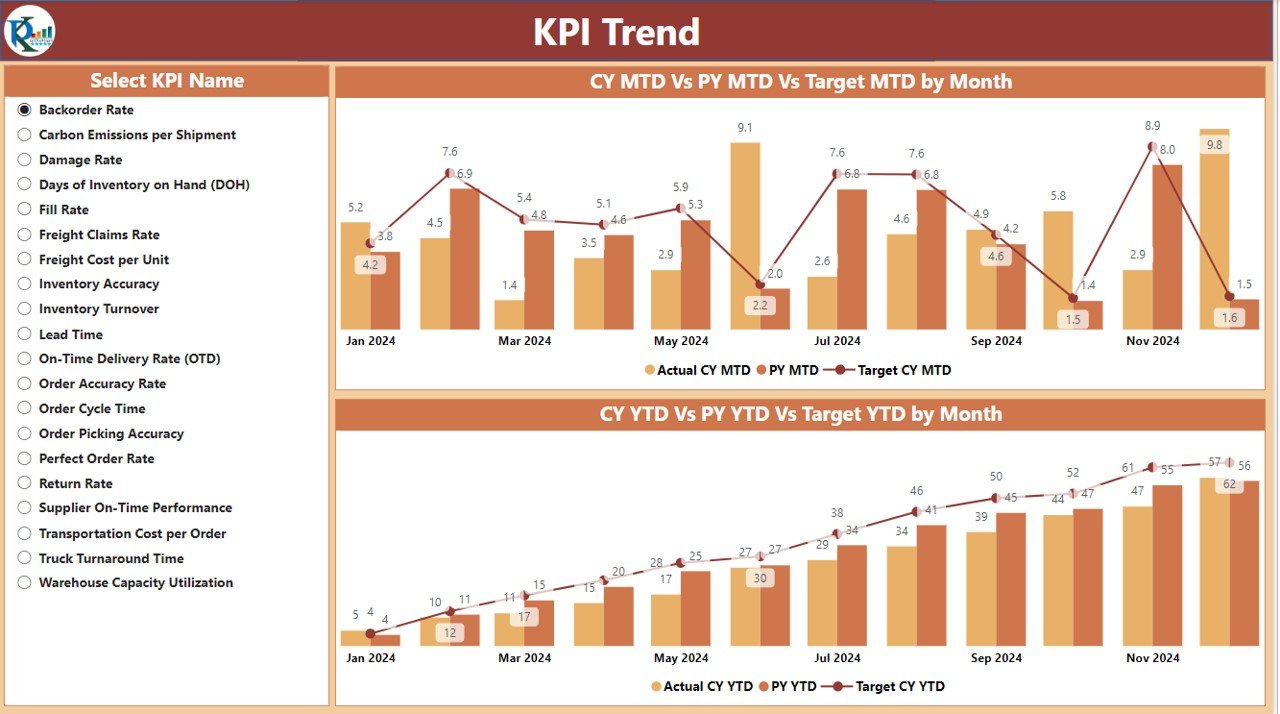
This page provides an in-depth look at the trends over time. It includes:
- Combo Charts: These charts display actual numbers for the current and previous years, as well as the targets for both MTD and YTD.
- KPI Slicer: The slicer on the left allows users to filter data by specific KPIs, providing a focused analysis of individual metrics.

Click to Supply Chain – Logistics KPI
KPI Definition Page
The KPI Definition Page offers detailed information about each KPI, including:

Click to Supply Chain – Logistics KPI
- Formula: The calculation method for the KPI.
- Definition: A clear explanation of what the KPI measures and how it impacts the supply chain process.
- Users can drill through from the Summary Page to access this page for more in-depth insights.

Click to Supply Chain – Logistics KPI
How Does the Dashboard Work?
This dashboard works by integrating data from an Excel file that stores all the necessary logistics KPIs. Each of the three pages mentioned earlier is linked to the data, automatically updating as new data is entered.
Excel Data Integration:
To ensure the dashboard functions smoothly, the following Excel worksheets are used:
- Input_Actual Sheet Tab: Enter the actual values for each KPI, including MTD and YTD numbers.

Click to Supply Chain – Logistics KPI
- Input_Target Sheet Tab: Input the target values for KPIs, including MTD and YTD targets.
- KPI Definition Sheet Tab: Include detailed information about each KPI, such as its number, group, formula, and type.

Click to Supply Chain – Logistics KPI
Advantages of the Supply Chain – Logistics KPI Dashboard in Power BI
The Power BI Logistics KPI Dashboard offers several advantages that can transform how businesses manage their supply chain processes. These include:
- Real-Time Data Monitoring: One of the key benefits of this dashboard is the ability to track performance in real-time. By updating the dashboard automatically as new data is entered, businesses can spot issues early and take quick action to address them.
- Easy-to-Understand Visuals: Power BI’s user-friendly interface makes it easy to interpret complex data. The dashboard’s visual elements, such as cards, tables, and combo charts, allow managers to gain insights at a glance.
- Centralized Data: With all logistics KPIs in one place, the dashboard provides a centralized view of supply chain performance. This eliminates the need for multiple reports and allows businesses to focus on what matters most.
- Improved Decision-Making: With clear visualizations and up-to-date data, business leaders can make informed decisions about inventory management, shipping strategies, and overall logistics improvements.
- Increased Transparency: The dashboard helps create transparency across departments, ensuring that everyone from warehouse managers to senior executives has access to the same information.
Opportunities for Improvement in the Supply Chain – Logistics KPI Dashboard in Power BI
While the Logistics KPI Dashboard in Power BI is an incredibly powerful tool, there are always areas for improvement. Here are some opportunities for enhancing the dashboard’s capabilities:
- Integration with Other Business Systems:
- By integrating the dashboard with other business systems, such as Enterprise Resource Planning (ERP) or Customer Relationship Management (CRM) systems, businesses can streamline data flow and improve accuracy.
- Advanced Predictive Analytics: Incorporating machine learning and predictive analytics into the dashboard can help forecast trends, such as demand fluctuations or inventory shortages, allowing businesses to plan ahead.
- Mobile Accessibility: Making the dashboard accessible on mobile devices can increase flexibility, enabling managers and team members to access critical data while on the go.
- Customizable Alerts: Adding alerts for specific KPIs, such as when inventory levels fall below a certain threshold or when shipping delays occur, could help businesses address problems before they escalate.
Best Practices for the Supply Chain – Logistics KPI Dashboard in Power BI
To get the most out of the Supply Chain – Logistics KPI Dashboard in Power BI, follow these best practices:
- Regular Data Updates: Ensure that the data in the dashboard is updated regularly. Real-time or weekly updates ensure that decision-makers are always working with the most current information.
- Align KPIs with Business Goals: Make sure the KPIs being tracked align with the company’s broader objectives, such as improving delivery times or reducing operational costs. This ensures that the dashboard provides valuable insights that drive business success.
- Use Clear, Simple Visuals: Opt for simple and clear visualizations that are easy to interpret. Avoid cluttering the dashboard with unnecessary details. Focus on the most important KPIs for optimal results.
- Set Clear Targets: Establish clear and realistic targets for each KPI. This gives the team a clear benchmark to strive for and helps evaluate performance effectively.
- Ensure Data Accuracy: Double-check data entries and calculations to ensure accuracy. Incorrect data can lead to poor decision-making and undermine the dashboard’s effectiveness.
Frequently Asked Questions (FAQs)
1. What is a Supply Chain – Logistics KPI Dashboard in Power BI?
A Supply Chain – Logistics KPI Dashboard in Power BI is a tool that helps businesses track and analyze key performance indicators related to logistics and supply chain activities, such as inventory levels, delivery times, and order fulfillment rates.
2. How does the Logistics KPI Dashboard improve decision-making?
By providing real-time, visual data insights, the dashboard enables businesses to make informed, data-driven decisions quickly, optimizing logistics operations and improving overall efficiency.
3. Can the Supply Chain – Logistics KPI Dashboard be customized?
Yes, the dashboard is highly customizable. Users can adjust KPIs, target values, and data sources to meet specific business needs.
4. How can I access the Supply Chain – Logistics KPI Dashboard in Power BI?
The dashboard is available in Power BI and can be integrated with Excel data to automatically update as new information is entered.
5. What are the key features of the dashboard?
The dashboard includes a Summary Page, KPI Trend Page, and KPI Definition Page. It displays KPIs, actual vs. target comparisons, and year-over-year performance metrics.
Conclusion
The Supply Chain – Logistics KPI Dashboard in Power BI is an invaluable tool for businesses looking to optimize their supply chain operations. With its user-friendly interface, real-time data tracking, and clear visualizations, it empowers businesses to make data-driven decisions that improve efficiency, reduce costs, and boost performance. By integrating this dashboard into your logistics operations, you’ll unlock new opportunities for growth and improvement.
Visit our YouTube channel to learn step-by-step video tutorials


