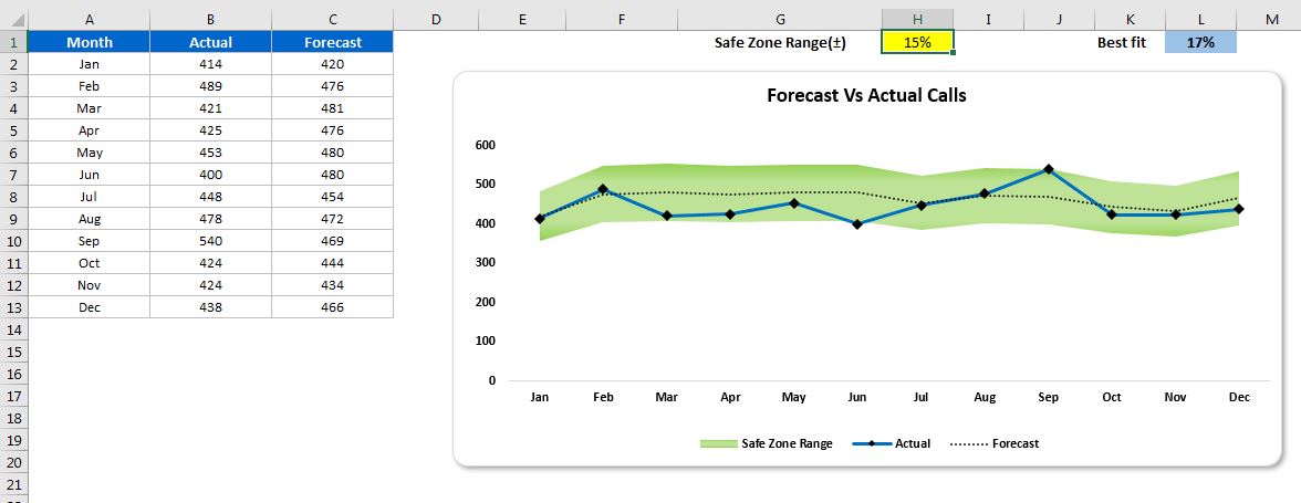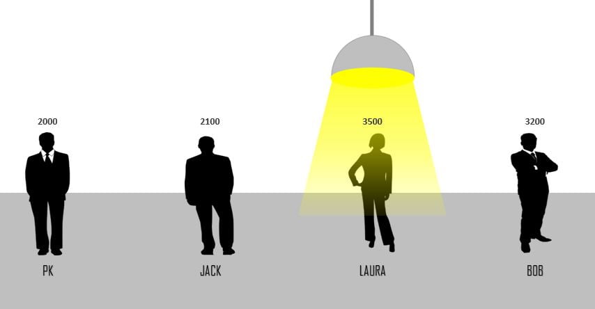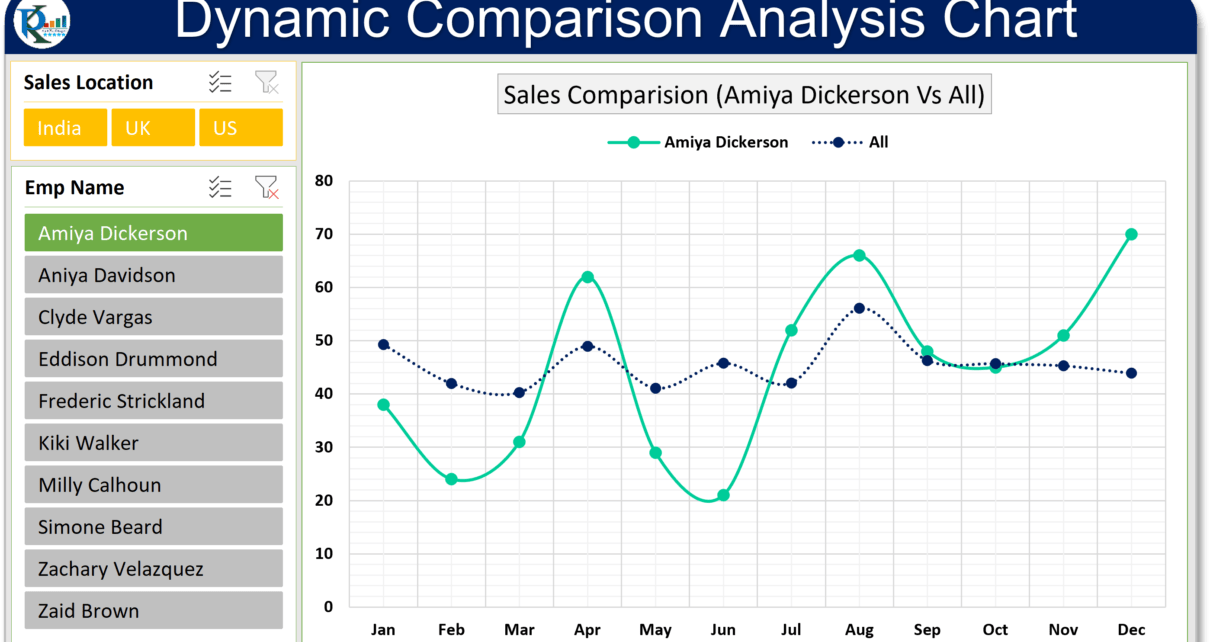
Dynamic Comparison Analysis Chart in Excel
In this article, you will learn how to create a dynamic comparison Analysis Chart in Microsoft Excel. Using this chart you can compare one employee's performance with other all employees
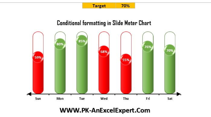
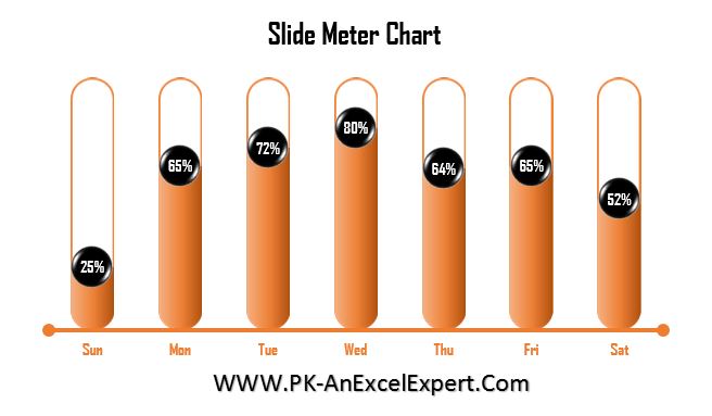
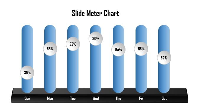
Transforming Data into Decisions