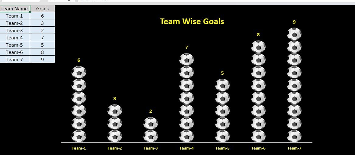
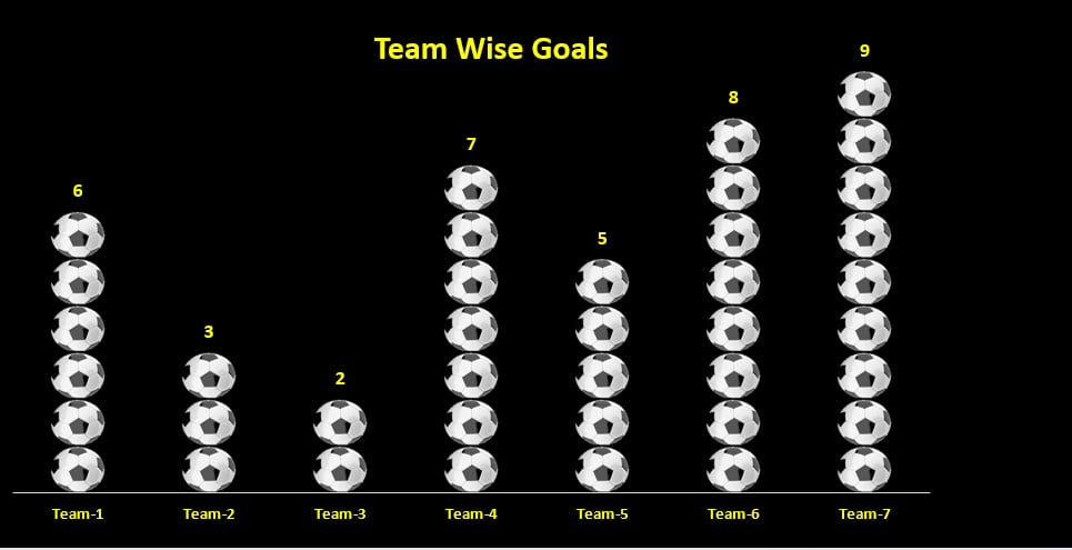
Ever wondered how to make your data presentations stand out? Let’s dive into how you can transform raw data into an engaging Teams Goal Graph with Football icon in Excel. This isn’t just any graph—it’s dynamic and updates automatically when you tweak the goals. Plus, it’s adorned with eye-catching football icons!
Quick Setup: Plug and Play
This template is a breeze to use. Simply input your data, and watch the magic happen:
- Football Icons: Each goal is represented by a football icon, stacking up as goals increase.
- Automatic Updates: Change the goals, and the graph adjusts in real time.
Data Blueprint: What You’ll Need
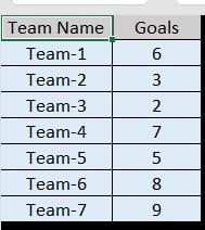
To construct this graph, we’ve organized our data neatly in Excel. Here’s what it looks like:
- Team Name: Slot in the names of different football teams here.
- Goals: Input the number of goals scored.
- Flexible Use Cases: This graph isn’t just for showing goals; it’s versatile enough for tracking sales, service levels, and monthly revenues.
Why You Should Use a Team Goals Graph
Transitioning to a graphical presentation using our Team Goals Graph brings several advantages:
- Visual Appeal: The football icons not only make the chart engaging but also simplify complex data, ideal for presentations.
- Simplicity in Data Interpretation: Glance at the number of icons, and you’ll instantly gauge team performance.
- Real-Time Insights: As data changes, so does your chart, providing up-to-date information without manual tinkering.
- Adaptability: Tailor it to various needs beyond sports, like monitoring business metrics.
- Room for Growth: Enhancing Your Graph
Even the best tools can improve. Here’s how we could take our Team Goals Graph to the next level:
- Interactive Elements: Incorporating tooltips or clickable items could offer deeper insights at a glance.
- Streamlined Data Entry: Connecting the graph to data management systems could automate updates, enhancing efficiency.
- Customization Options: Allowing modifications to icons and colors would align the graph more closely with your branding.
Crafting the Perfect Team Goals Graph: Best Practices
To maximize the effectiveness of your Team Goals Graph, keep these tips in mind:
- Clarity is Key: Avoid clutter. A clean graph communicates more effectively.
- Quality Matters: Use high-resolution icons to maintain a professional appearance.
- Accuracy First: Verify your data to prevent errors from misleading your audience.
- Test Thoroughly: Regularly check that the dynamic aspects of your graph function properly.
- Stay Updated: Keep your graph current to ensure your analysis is relevant.
Conclusion: A Game-Changer for Data Presentation
Creating a Team Goals Graph with football icons in Excel offers a visually compelling and practical way to display team performance data. It’s not just about looking good; it’s about making data accessible and interactive. By following the guidelines we’ve discussed, you can create a customized, dynamic graph that’s as informative as it is attractive. Ready to give it a go?
Visit our YouTube channel to learn step-by-step video tutorials
