In the fast-paced world of telecommunications, staying ahead of key performance indicators (KPIs) is crucial for organizations to monitor their progress, track trends, and make informed decisions. With the increasing reliance on data-driven insights, a Telecommunications KPI Dashboard in Power BI provides a powerful tool to visualize and analyze data, ensuring performance is consistently aligned with business goals.
This article explores the key features, advantages, best practices, and opportunities for improvement of a Telecommunications KPI Dashboard built using Power BI.
Introduction to Telecommunications KPI Dashboard in Power BI
A Telecommunications KPI Dashboard in Power BI serves as a visual representation of critical business metrics, allowing businesses to monitor key data points that drive operational success. Power BI, a business analytics tool by Microsoft, integrates data from various sources, including Excel, enabling users to visualize trends, compare performance over time, and assess the effectiveness of KPIs across multiple levels.
For telecommunications companies, monitoring KPIs such as call completion rates, network uptime, and customer satisfaction is vital. A Telecommunications KPI Dashboard in Power BI allows organizations to track these metrics in real-time and gain actionable insights.
Key Features of the Dashboard
The Telecommunications KPI Dashboard is structured into three main pages within the Power BI Desktop Application. Each page is designed to provide different layers of insights, giving decision-makers an in-depth understanding of their key performance indicators.
Summary Page
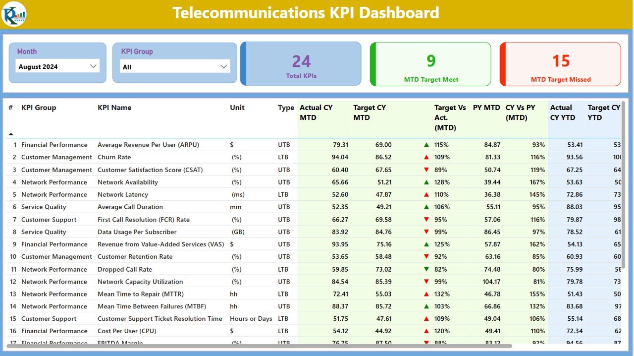
The Summary Page is the central hub of the dashboard, offering a snapshot of the most critical KPIs. Here, users can interact with slicers and view detailed metrics across different periods (Month-to-Date, Year-to-Date). The page contains:
- Slicers: Filter data based on Month and KPI Group for a customized view.
- KPIs Overview: Display of total KPIs, MTD Target Met, and MTD Target Missed.
- Detailed Table: A table that lists various KPIs, showing:
- KPI Number: Sequence of the KPI.
- KPI Group: Categorization of the KPI.
- KPI Name: Specific name of the KPI.
- Unit: The unit of measurement for the KPI (e.g., percentage, count).
- Type (LTB or UTB): Indicator of whether the KPI is “Lower the Better” (LTB) or “Upper the Better” (UTB).
- Actual CY MTD & Target CY MTD: Comparison of the current year’s actual and target values.
- MTD Icon: Green and red icons indicating whether the KPI is on track (▲) or off track (▼) against the target.
- PY MTD: Previous Year’s Month-to-Date value.
- CY vs PY MTD: A percentage comparison between the current and previous year’s MTD values.
- Actual CY YTD & Target CY YTD: Year-to-Date comparison.
- YTD Icon: Status indicators for the YTD figures.
This page allows the user to get a comprehensive, yet detailed overview of key performance metrics across timeframes.

Click to buy Telecommunications KPI Dashboard in Power BI
KPI Trend Page
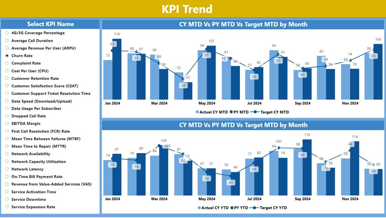
The KPI Trend Page allows users to visualize trends over time for both MTD and YTD. The page features:
- Combo Charts: Display current year, previous year, and target values in a visually impactful way.
- KPI Slicer: Select specific KPIs to track and analyze their performance over time.
This page is essential for analyzing trends and understanding how KPIs evolve, aiding in long-term strategic decisions.

Click to buy Telecommunications KPI Dashboard in Power BI
KPI Definition Page
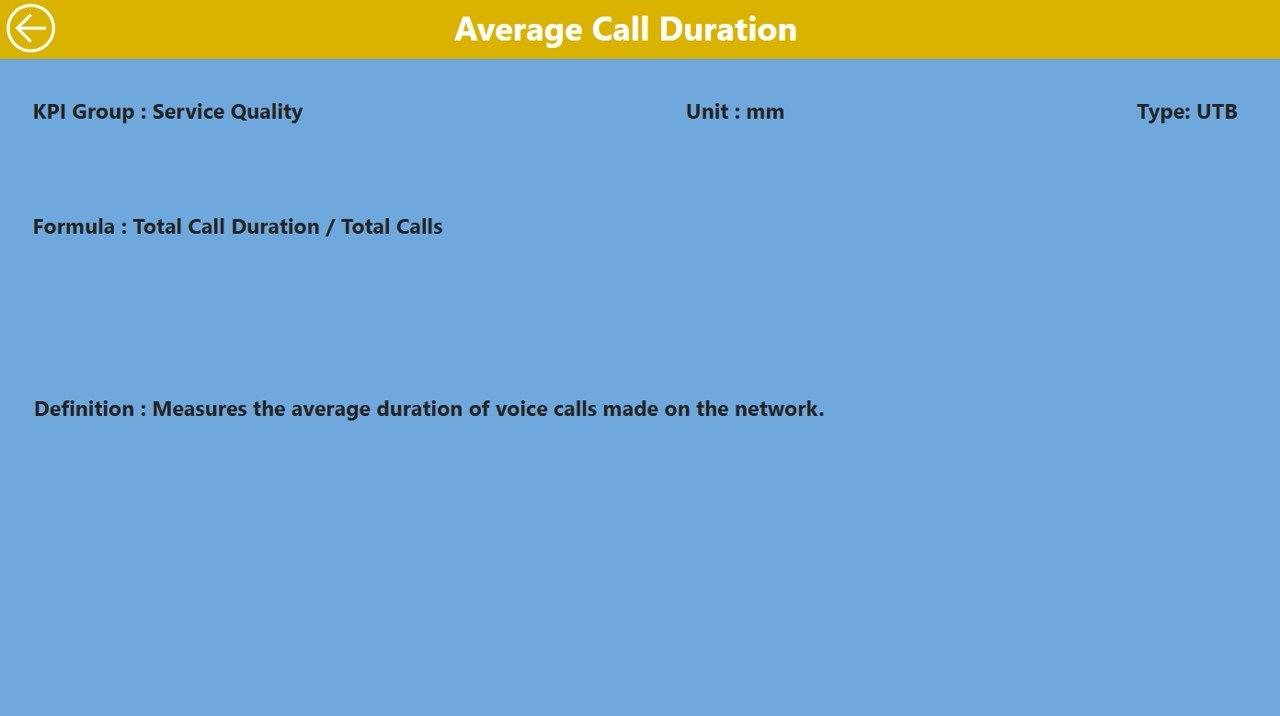
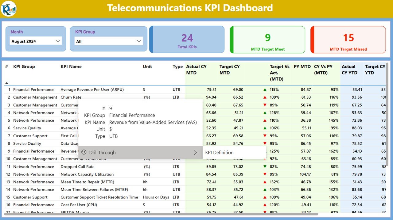
The KPI Definition Page offers an in-depth look at each KPI’s formula and definition. This page is designed for users who want to understand the underlying logic behind each KPI. It is a drill-through page, meaning users can click on specific KPIs from the Summary Page to access the detailed definition.

Click to buy Telecommunications KPI Dashboard in Power BI
This page includes:
- KPI Formula: Explanation of how the KPI is calculated.
- Definition: A detailed description of the KPI and its relevance.

Click to buy Telecommunications KPI Dashboard in Power BI
Advantages of a Telecommunications KPI Dashboard in Power BI
Implementing a Telecommunications KPI Dashboard in Power BI offers numerous benefits for businesses in the telecommunications industry. Here are some key advantages:
- Real-Time Data Monitoring: Power BI allows for real-time data refresh, ensuring that the dashboard always reflects the most up-to-date information. This enables organizations to identify issues as they arise and respond quickly.
- Enhanced Decision-Making: The dashboard provides clear, visual representations of KPIs, making it easier for managers and executives to interpret the data. This leads to better, data-driven decision-making.
- Increased Accountability: By displaying individual KPIs and comparing actual performance to targets, employees and departments are held accountable for their specific metrics. This encourages a culture of responsibility and transparency.
- Improved Strategic Planning: With clear visualizations of performance trends, businesses can identify patterns over time, assess their strategy’s effectiveness, and adjust their goals accordingly.
- Customizable and Flexible: The use of slicers and filters makes the dashboard customizable to individual needs. Different teams within the telecommunications company can focus on the metrics most relevant to their objectives.
Opportunities for Improvement in Telecommunications KPI Dashboards
While Power BI dashboards are powerful, there are several areas where improvements can be made to enhance the effectiveness of a Telecommunications KPI Dashboard:
- Integration with Other Data Sources: The dashboard can benefit from integrating additional data sources such as CRM systems, customer feedback, or network performance monitoring tools. This would provide a more holistic view of business performance.
- Advanced Predictive Analytics: Incorporating predictive analytics and machine learning models into the dashboard can help forecast future trends and potential issues, offering proactive solutions rather than reactive ones.
- Mobile Compatibility: Optimizing the dashboard for mobile devices would allow executives and managers to access key performance metrics while on the go, increasing accessibility and flexibility.
- Custom Alerts and Notifications: Adding custom alerts for when KPIs fall below or exceed predefined thresholds can help teams take immediate action, preventing potential issues from escalating.
Best Practices for Using a Telecommunications KPI Dashboard
To ensure that your Telecommunications KPI Dashboard delivers maximum value, here are some best practices to follow:
- Regular Data Updates: Ensure that the data used for KPIs is regularly updated. MTD, YTD, and PY data should be refreshed periodically to ensure that the dashboard always reflects the most current performance.
- Clear KPI Definitions: Make sure all KPIs are well-defined and understood by all stakeholders. This ensures alignment across teams and prevents misinterpretation of data.
- Tailored Dashboards for Different Teams: While the Summary Page provides an overall view, it’s important to tailor the dashboard for specific teams. Sales, customer service, and operations teams may need to focus on different KPIs.
- Use Visual Elements Effectively: Utilize Power BI’s rich visual elements, such as color-coded icons, combo charts, and tables, to make data interpretation easy. Visual cues such as green and red arrows can help users quickly gauge performance.
- Interactivity: Allow users to interact with the dashboard through slicers and filters to explore the data and gain insights relevant to their specific needs. This makes the dashboard more user-friendly and effective for decision-making.
Frequently Asked Questions (FAQs)
1. What are KPIs in telecommunications?
KPIs in telecommunications refer to the metrics used to measure the performance and efficiency of a telecommunications company. Common KPIs include call completion rate, network uptime, customer satisfaction, and average handling time.
2. How often should the Telecommunications KPI Dashboard be updated?
The dashboard should be updated regularly, ideally on a daily or weekly basis, depending on the business requirements and the data sources being used.
3. Can the Telecommunications KPI Dashboard be accessed on mobile devices?
While Power BI dashboards are typically designed for desktop use, they can be optimized for mobile devices. Mobile accessibility allows managers and executives to monitor performance from anywhere.
4. How do I integrate other data sources with the dashboard?
Power BI allows integration with various data sources, including Excel, SQL databases, CRM tools, and third-party APIs. These can be linked to the dashboard for a more comprehensive analysis.
5. What should I do if my KPIs are not meeting targets?
If your KPIs are not meeting targets, analyze the data to identify root causes. Consider improving processes, investing in training, or making changes to operational strategies to address the issues.
Conclusion
A Telecommunications KPI Dashboard in Power BI is a powerful tool for monitoring performance, making data-driven decisions, and enhancing operational efficiency in the telecommunications industry. By leveraging the features, advantages, and best practices outlined above, organizations can ensure they are on the path to success, continuously improving their key performance metrics.
Visit our YouTube channel to learn step-by-step video tutorials
Click to buy Telecommunications KPI Dashboard in Power BI


