With the rise of telehealth services, healthcare providers need real-time insights into their operations to track performance, improve efficiency, and enhance patient care. A Telehealth KPI Dashboard in Power BI is the perfect solution for monitoring key performance indicators (KPIs) in a structured and data-driven manner.
In this guide, we will explore the key features, advantages, best practices, and frequently asked questions about the Telehealth KPI Dashboard in Power BI.
Click to Telehealth KPI
What is a Telehealth KPI Dashboard?
A Telehealth KPI Dashboard is a visual representation of healthcare performance metrics that helps healthcare administrators monitor essential KPIs related to patient outcomes, telehealth adoption, appointment efficiency, and service quality. Built using Microsoft Power BI, this dashboard provides interactive and dynamic data visualization to help decision-makers drive improvements in telehealth services.
Key Features of the Telehealth KPI Dashboard
This dashboard consists of three main pages in the Power BI Desktop application file:
Summary Page
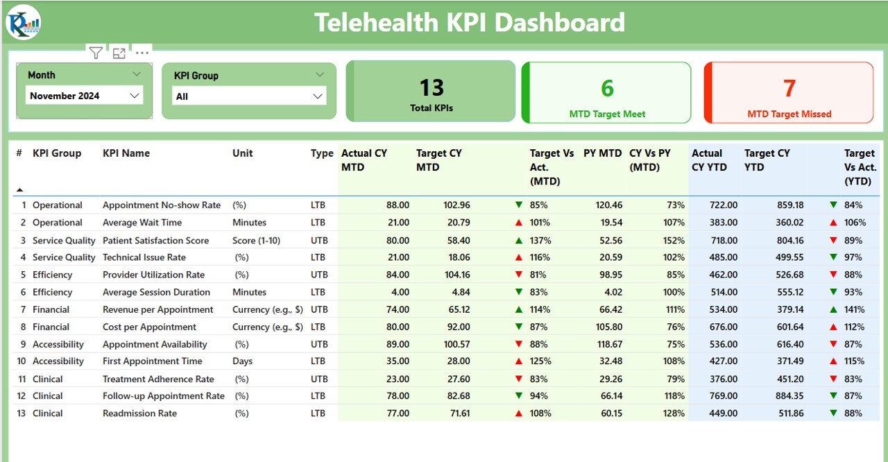
This is the main dashboard page that provides an overview of telehealth performance. It includes:
- Month and KPI Group Slicer: Allows users to filter data based on the selected month and KPI category.
- KPI Overview Cards: Displays three important metrics:
- Total KPI Count
- MTD Target Met Count
- MTD Target Missed Count
- Detailed KPI Table: Displays key metrics, including:
- KPI Number: Unique identifier for each KPI.
- KPI Group: Category to which the KPI belongs.
- KPI Name: Specific performance indicator being measured.
- Unit: Measurement unit (e.g., percentage, count, time).
- Type: Indicator of whether a lower value is better (LTB) or higher value is better (UTB).
- Actual CY MTD & Target CY MTD: Month-to-date (MTD) actual vs. target values.
- MTD Icon: Visual indicators (▲ for positive, ▼ for negative) showing KPI performance.
- Target vs. Actual (MTD) Percentage: Displays actual vs. target performance percentage.
- CY vs. PY (MTD): Comparison of the current year’s MTD values with the previous year.
- YTD Metrics: Year-to-date (YTD) actual, target, and previous year comparison values with performance icons.
Click to Telehealth KPI
KPI Trend Page
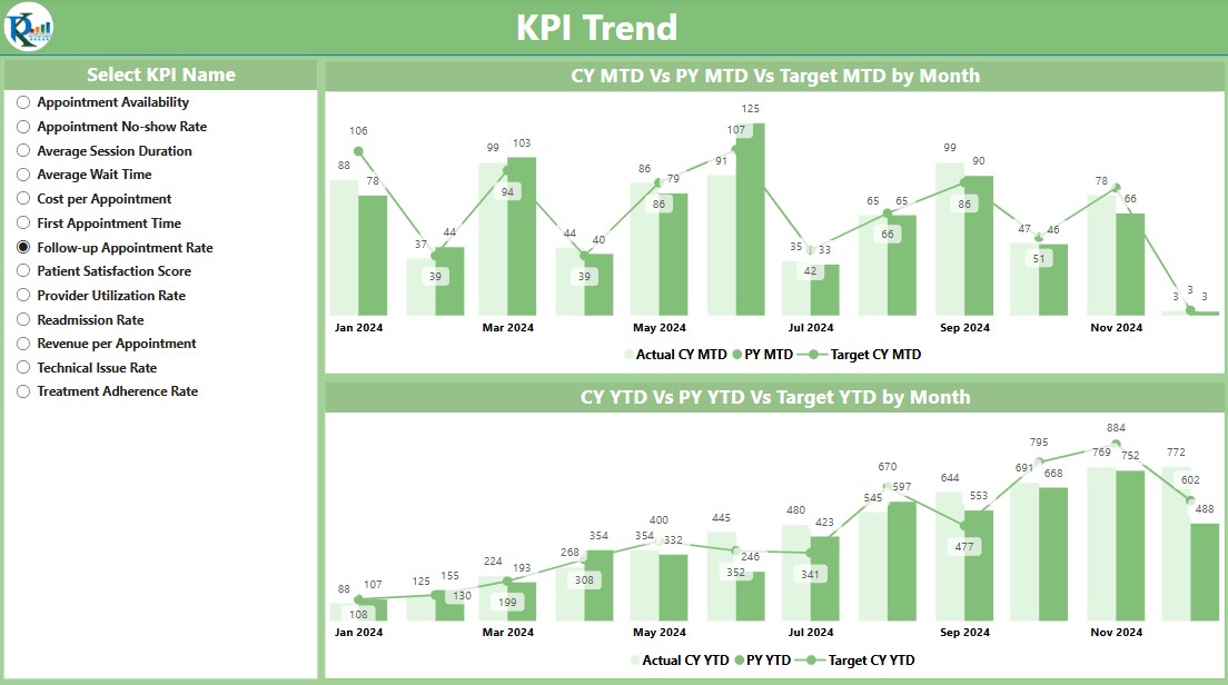
- This page provides trend analysis with two interactive combo charts that showcase:
- Actual Numbers for Current Year, Previous Year, and Targets
- MTD and YTD Comparisons
- Slicer to Filter by KPI Name
KPI Definition Page
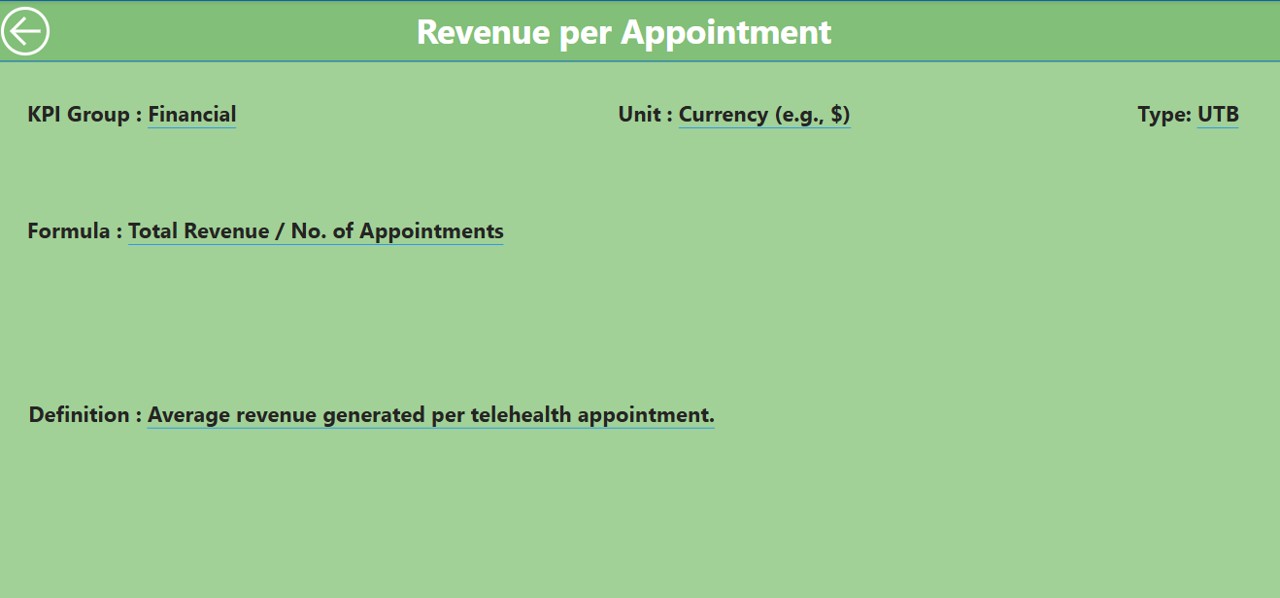
This hidden drill-through page provides an in-depth explanation of each KPI. Users can click through from the Summary Page to access KPI formulas and definitions. To navigate back, simply click the Back Button at the top left corner.
Data Source: Excel Integration
The dashboard pulls data from an Excel file, which contains three worksheets for easy data entry:
Click to Telehealth KPI
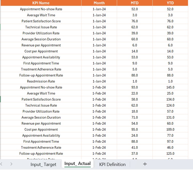
Input Actual Sheet:
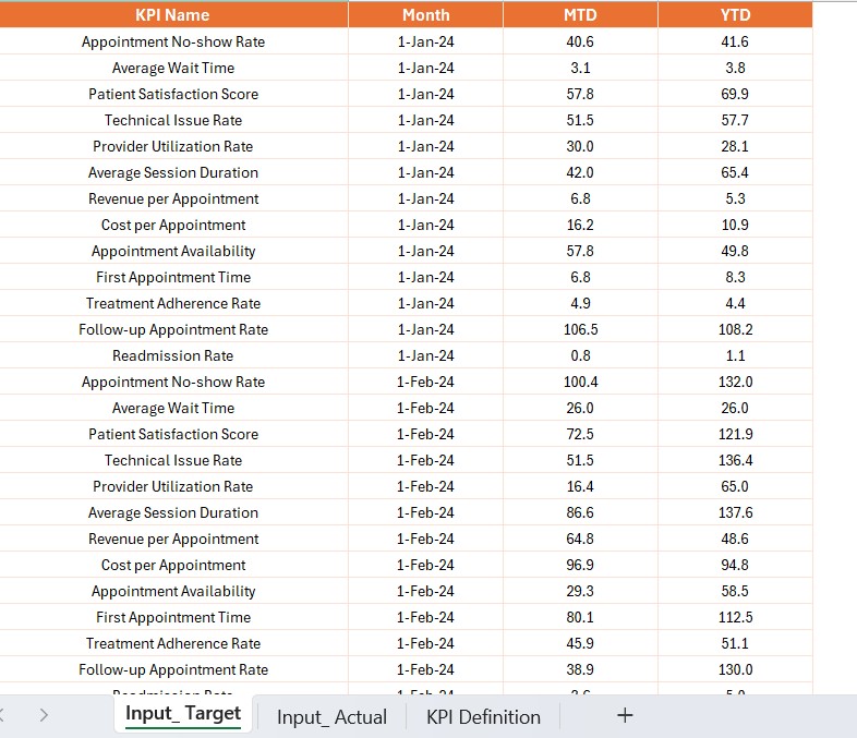
- Enter actual values for KPI Name, Month, MTD, and YTD.
Input Target Sheet:
- Enter target values for KPI Name, Month, MTD, and YTD.
KPI Definition Sheet:
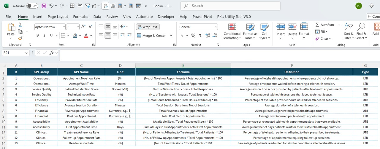
- Define KPI details, including KPI Number, Group, Name, Unit, Formula, and Type (LTB or UTB).
Advantages of Using a Telehealth KPI Dashboard
Real-Time Performance Monitoring
- Provides live insights into telehealth performance.
- Helps identify trends and performance gaps.
Data-Driven Decision Making
- Supports evidence-based decisions.
- Enhances strategic planning with actionable insights.
Improved Operational Efficiency
- Streamlines telehealth workflows.
- Ensures optimal resource utilization.
Better Patient Outcomes
- Enhances appointment scheduling and service quality.
- Reduces missed appointments and wait times.
Best Practices for Using the Telehealth KPI Dashboard
- Define Clear KPIs: Ensure that KPIs align with business objectives and provide valuable insights.
- Regularly Update Data: Keep the Excel data source updated to maintain dashboard accuracy.
- Use Filters and Drill-Through Features: Utilize slicers and drill-through options to analyze data effectively.
- Monitor Trends Over Time: Compare MTD and YTD values to track improvements or declines.
- Automate Data Refresh: Set up automatic data updates for real-time insights.
Click to Telehealth KPI
Conclusion
The Telehealth KPI Dashboard in Power BI is a powerful tool that helps healthcare providers optimize telehealth services. By leveraging real-time analytics, KPI tracking, and trend analysis, organizations can enhance efficiency, improve patient outcomes, and drive better decision-making.
Frequently Asked Questions (FAQs)
What is a Telehealth KPI Dashboard?
A Telehealth KPI Dashboard is a visual reporting tool used to track key performance indicators in telehealth services. It helps monitor service quality, efficiency, and patient care metrics.
How is data sourced for this dashboard?
The data is sourced from an Excel file, where users enter actual, target, and KPI definition data.
Can I customize the KPI Dashboard?
Yes! You can modify KPI names, units, and targets based on your organization’s requirements.
How does the drill-through feature work?
Users can click on a KPI in the Summary Page to drill through to the KPI Definition Page, where they can view detailed KPI formulas and descriptions.
Why is Power BI the best tool for this dashboard?
Power BI offers interactive visualizations, real-time data processing, and easy integration with Excel and other data sources, making it ideal for telehealth performance tracking.
Click to Telehealth KPI
Visit our YouTube channel to learn step-by-step video tutorials
View this post on Instagram