In the fast-evolving textile industry, the need for precise, real-time data visualization and analysis is more crucial than ever. The Textile Industry KPI Dashboard in Power BI is a comprehensive solution designed to empower businesses with actionable insights, helping them streamline operations and enhance productivity.
Click to buy Textile Industry KPI Dashboard in Power BI
What is the Textile Industry KPI Dashboard?
The Textile Industry KPI Dashboard is a ready-to-use tool built within Power BI, optimized for managing and analyzing key performance indicators (KPIs) specific to the textile sector. This dashboard pulls data from an organized Excel file, making it both accessible and highly efficient.
Click to buy Textile Industry KPI Dashboard in Power BI
Key Features of the Dashboard
The dashboard comprises three meticulously crafted pages within the Power BI desktop application, each tailored to display vital metrics and trends:
Summary Page:
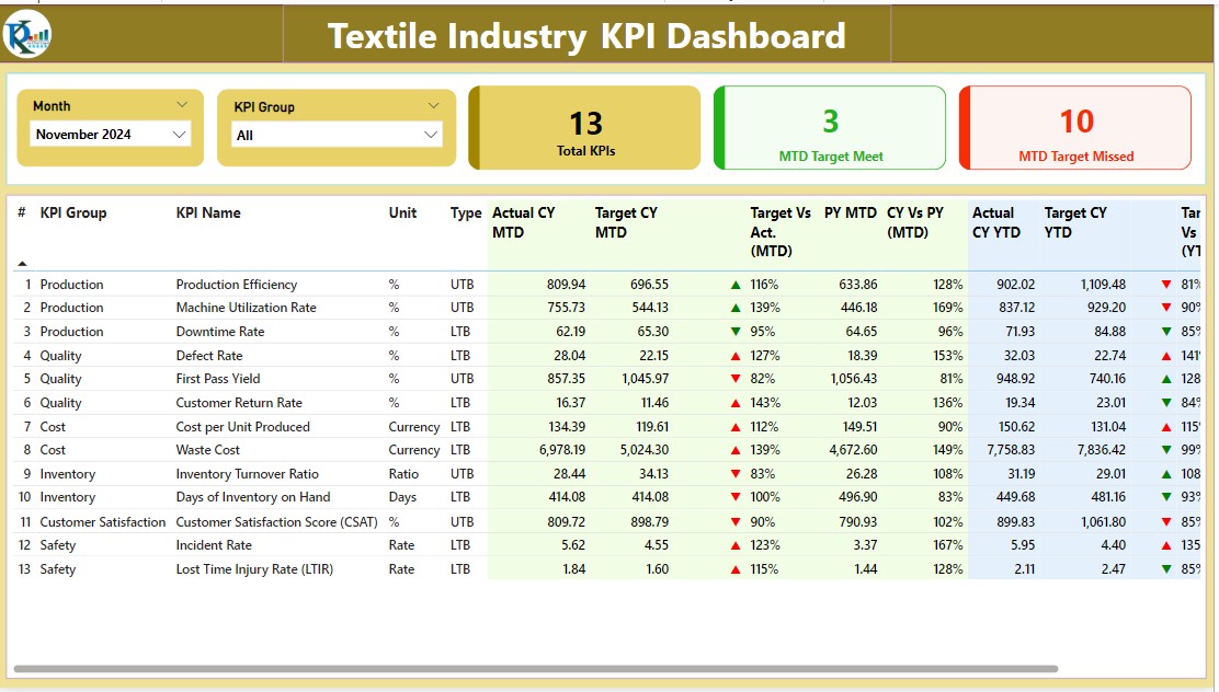
- Interactive Slicers: Choose data views by Month and KPI Group.
- KPI Cards: Visual representations for Total KPIs, Month-to-Date (MTD) Target Met, and MTD Target Missed.
- Detailed Performance Table: Displays data such as KPI Number, Name, Group, and performance icons, providing immediate insights into MTD and Year-to-Date (YTD) achievements versus targets.
Click to buy Textile Industry KPI Dashboard in Power BI
KPI Trend Page:
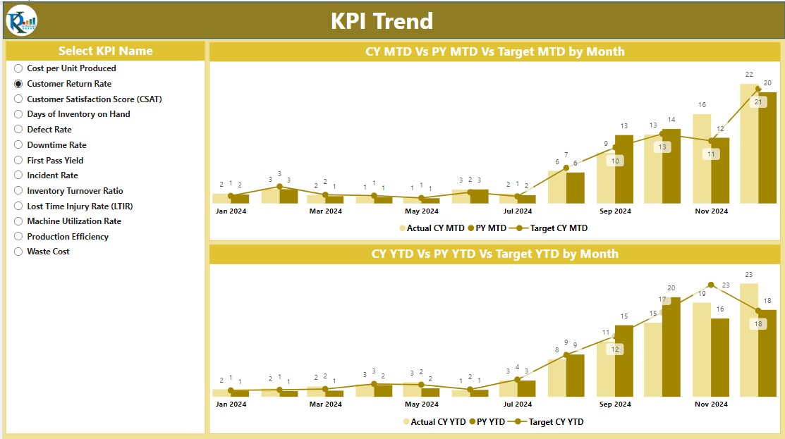
- Combo Charts: Track and compare Actual Numbers against Previous Year’s data and Targets for both MTD and YTD.
- KPI Selector: A slicer tool to filter data based on specific KPI names, enhancing focus and analysis precision.
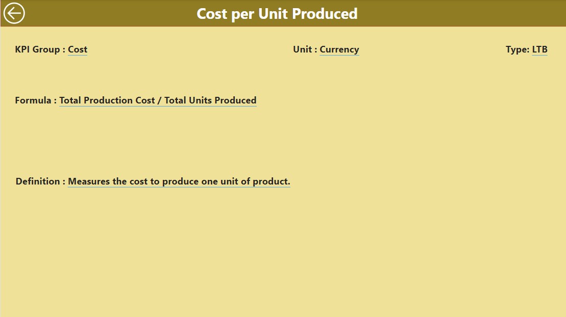
KPI Definition Page:
Click to buy Textile Industry KPI Dashboard in Power BI
Drill-Through Capability:
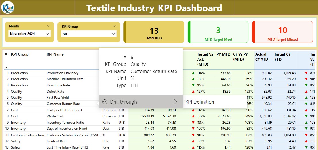
Though hidden, this page can be accessed from the Summary Page for detailed definitions and formulae of each KPI.
Advantages of the Textile Industry KPI Dashboard
- Enhanced Decision-Making: With real-time data visualization, stakeholders can make informed decisions quickly, adapting to market demands without delay.
- Performance Tracking: Easily monitor performance against historical data and set targets, identifying areas needing improvement.
- User-Friendly: Designed with user interaction in mind, the dashboard is intuitive and accessible for users at all technical levels.
Click to buy Textile Industry KPI Dashboard in Power BI
Best Practices for Using the Textile Industry KPI Dashboard
- Regular Data Updates: Ensure the underlying Excel file is regularly updated to maintain accuracy in reporting.
- Utilize Slicers: Make full use of slicers to view customized data sets that are most relevant to your analysis needs.
- Explore Trends: Regularly check the KPI Trend page to identify long-term trends and adjust strategies accordingly.
How to Implement the Dashboard Effectively
To get the most out of the Textile Industry KPI Dashboard, follow these steps:
Data Entry:
Input Actual Sheet Tab:
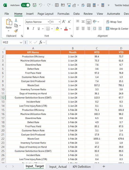
- Input actual KPI data including the Month, MTD, and YTD numbers.
Click to buy Textile Industry KPI Dashboard in Power BI
Input Target Sheet Tab:
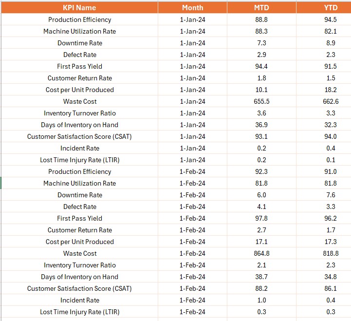
- Similarly, input target data for comparative analysis.
KPI Definition Sheet:
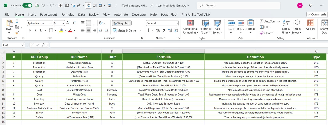
Fill in essential details like KPI Number, Group, Name, Unit, Formula, Definition, and Type.
Navigation and Usage:
Click to buy Textile Industry KPI Dashboard in Power BI
- Navigate through the dashboard using the interactive elements like slicers and back buttons to explore various data points and gain comprehensive insights.
Frequently Asked Questions (FAQs)
Q. How often should the data be updated in the Excel file?
For optimal results, update the data monthly or as new data becomes available.
Q. Can I customize the dashboard for different KPIs?
Yes, the dashboard is designed to be customizable. You can add or modify KPIs as needed in the Excel file and the Power BI report will reflect these changes.
Q. What should I do if the data shows consistent underperformance?
Investigate the specific KPIs and related processes. Consider setting up a review and adjustment period to address any operational inefficiencies.
Q. Is training required to use the Power BI dashboard?
Basic training on navigating Power BI is recommended, but the dashboard is designed to be intuitive for users with general technical skills.
Click to buy Textile Industry KPI Dashboard in Power BI
Visit our YouTube channel to learn step-by-step video tutorials
View this post on Instagram
Click to buy Textile Industry KPI Dashboard in Power BI
