Introduction
Are you struggling with visualizing budget variances in your Excel sheets? Well, worry no more! Our latest YouTube video, “Transform Excel Data with Arrows & Color Coding with Custom Formatting!”, takes you through an easy-to-follow, step-by-step guide on how to make your Excel data not only informative but also visually appealing.
The Essence of Custom Formatting in Excel
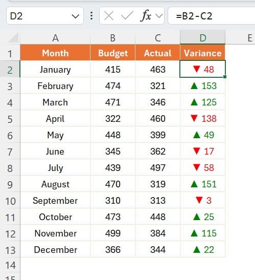
Imagine having your monthly budget and actual sales figures right in front of you, but with a twist. With our method, you’ll be able to see variances in a simple and intuitive way. This method uses red and green colors, along with arrows, to indicate whether you are over or under your budget. A green upward arrow for favorable variances and a red downward arrow for the opposite – how cool is that!
Getting Started with Your Data
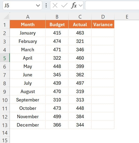
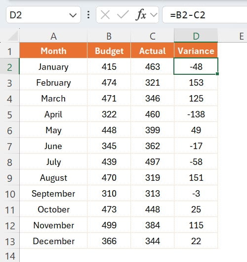
Our tutorial begins with the basics. You’ll have your months listed from January to December in column A, your budgeted sales numbers in column B, and actual sales numbers in column C. Sounds familiar, right? But here’s where the magic begins.
Step-by-Step Guide to Applying Custom Formatting
Adding a Variance Column:
First things first, add a new column D, titled ‘Variance’.
Inserting the Formula:
In cell D2, enter the formula =B2-C2. This calculates the difference between your budgeted and actual sales. Don’t forget to fill this formula down till row 13 to cover all months.
Opening Format Cells Window:
Select the range D2:D13 and press Ctrl + 1 shortcut key. This opens the ‘Format Cells’ window – your gateway to custom formatting.
Customizing Number Format:
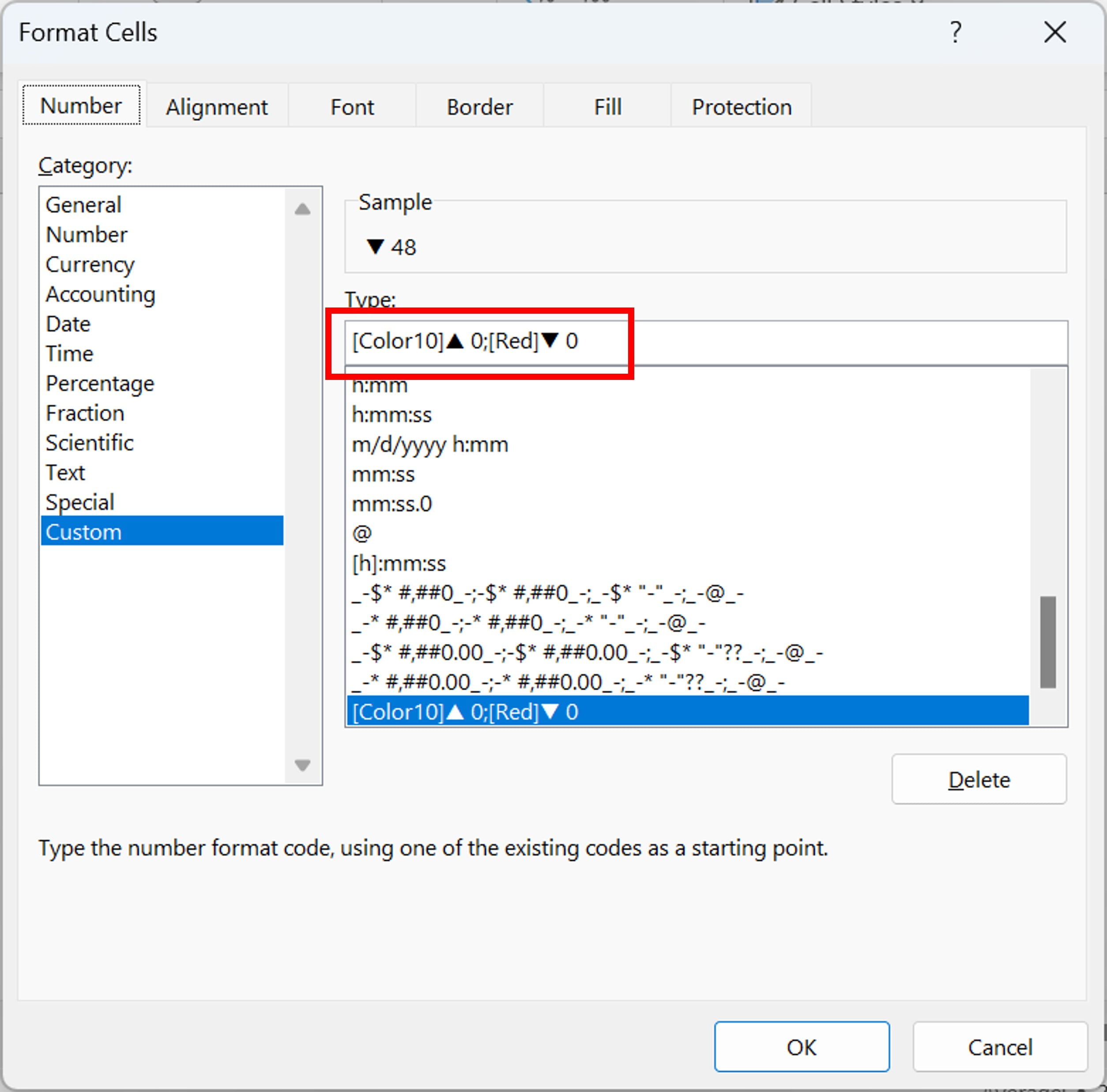
In the ‘Format Cells’ window, navigate to the ‘Number’ tab and click on ‘Custom’.
Entering the Magic Formula:
In the ‘Type’ box, input [Color10]▲ 0;[Red]▼ 0. This formula is the heart of our custom formatting.
Applying the Formatting:
Click ‘OK’, and voila! Your variance column will now show upward green arrows for positive variances and downward red arrows for negative variances.
Why This Method Rocks?
This method isn’t just about making your data look pretty. It’s about making it instantly readable and understandable. With just a glance, you can assess the financial health of each month. It’s perfect for presentations, reports, or just to keep a clearer track of your financial goals.
Conclusion
Gone are the days of mundane, colorless Excel sheets. With this simple yet powerful custom formatting technique, your Excel data will not only be more understandable but also more engaging. So, why wait? Check out our YouTube video, give this method a try, and transform your Excel data into a clear and colorful story of your financial journey!
Engage with Us!
Loved this tutorial? Have questions or suggestions? Drop your thoughts in the comments section of our YouTube video. Don’t forget to like, share, and subscribe for more such exciting Excel hacks!
Visit our YouTube channel to learn step-by-step video tutorials
Watch the step-by-step video tutorial:
Click here to download the practice file
