In this article, we will dive into the details of creating a UX/UI Design KPI Dashboard, explore key KPIs, and highlight best practices for utilizing this dashboard. Whether you are a product manager, UX/UI designer, or business leader, understanding and using this dashboard will help you optimize your design efforts, measure progress, and achieve better outcomes.
What is a UX/UI Design KPI Dashboard?
A UX/UI Design KPI Dashboard is a visual representation of key performance indicators (KPIs) used to track the effectiveness of user experience and user interface design. It provides actionable insights into how well a product is performing in terms of user interaction, satisfaction, and overall design efficiency.
By using a UX/UI Design KPI Dashboard, teams can:
- Track user engagement and satisfaction levels.
- Identify design bottlenecks and improve UI elements.
- Align design goals with business objectives.
Let’s explore the main features of this KPI dashboard:
Key Features of the UX/UI Design KPI Dashboard
The UX/UI Design KPI Dashboard is designed to be a comprehensive, ready-to-use tool that consolidates all the relevant KPIs related to UX/UI design. Below are the main components:
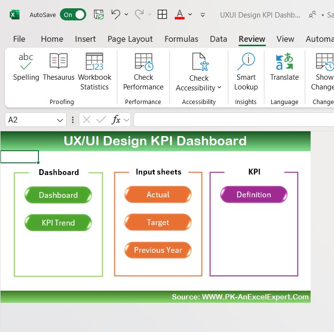
Home Sheet:
Serves as the index sheet, providing links to other worksheets.
Contains six buttons to navigate easily to respective sections of the dashboard.

Click to UX/UI Design KPI
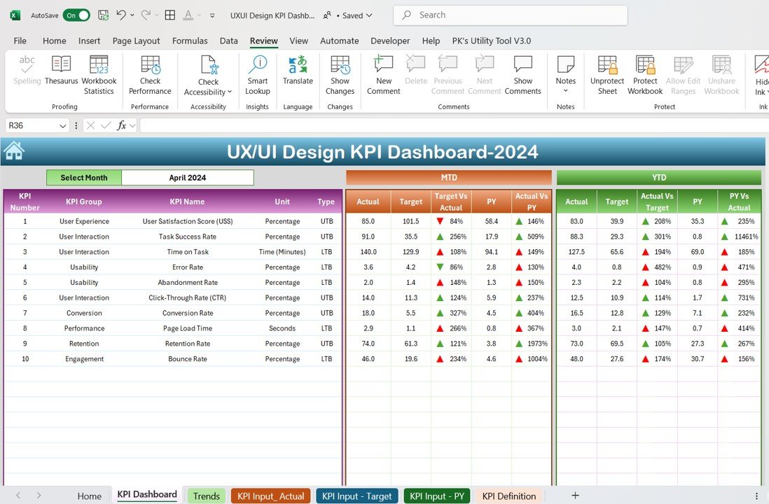
Dashboard Sheet Tab:
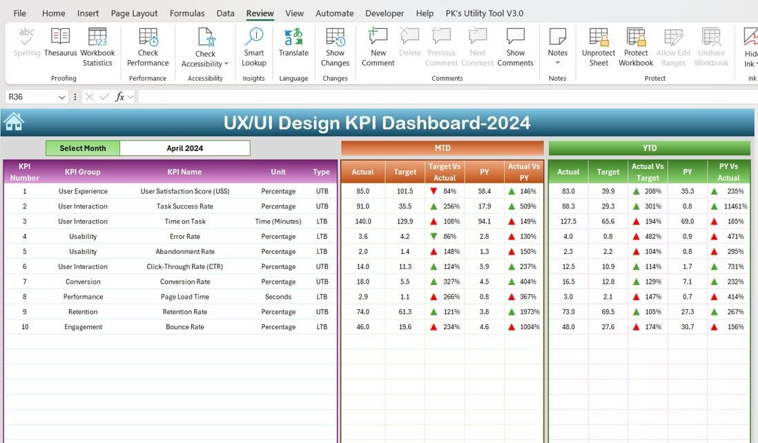
This is the main sheet, showing data for all KPIs.
Features a dropdown where you can select a month (located in range D3).
Displays MTD Actuals, Target, and Previous Year Data, as well as Target vs Actual and PY vs Actual with conditional formatting (up and down arrows).

Click to UX/UI Design KPI
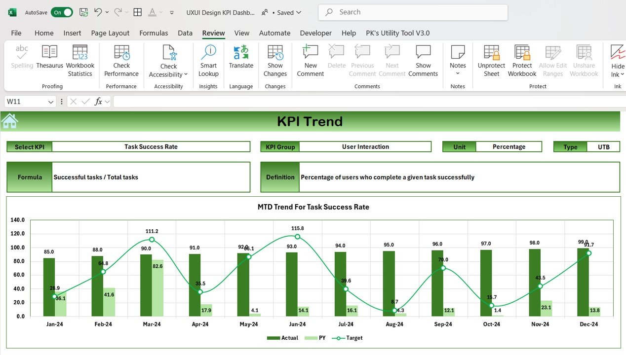
KPI Trend Sheet Tab:
Allows you to select a specific KPI from the dropdown (located in range C3).
Displays the KPI group, unit, type (whether “Lower the Better” or “Upper the Better”), formula, and definition.

Click to UX/UI Design KPI
Actual Numbers Sheet Tab:
Input actual numbers for YTD and MTD for a particular month.
The month is selectable in range E1, and you can update numbers for each month.

Click to UX/UI Design KPI
Target Sheet Tab:
Enter target values for each KPI (both MTD and YTD).
Keep track of monthly goals and ensure alignment with targets.

Previous Year Number Sheet Tab:
Record data for the previous year so comparisons can be made for progress tracking.

Click to UX/UI Design KPI
KPI Definition Sheet Tab:
Define each KPI by entering its name, group, unit, formula, and description.
Provides clarity and understanding of the KPIs being tracked.
Click to UX/UI Design KPI
Advantages of UX/UI Design KPI Dashboard
A UX/UI Design KPI Dashboard offers several advantages for product managers, designers, and stakeholders involved in digital product development. Some key benefits include:
- Data-driven Decision Making: With KPIs clearly displayed, teams can make informed decisions based on real-time data. This helps in improving design and identifying areas of improvement.
- Improved User Experience: Tracking KPIs such as Task Success Rate and User Satisfaction Score (USS) directly correlates to the quality of the user experience. By measuring these KPIs, design teams can improve user satisfaction.
- Faster Problem Identification: KPIs like Error Rate and Abandonment Rate help identify bottlenecks and problems in the user interface. These insights allow teams to address issues quickly.
- Benchmarking and Comparison: Comparing current data with Previous Year Data provides context and benchmarks for growth. This allows the team to set realistic targets for continuous improvement.
- Enhanced Collaboration: The UX/UI Design KPI Dashboard acts as a communication tool for different teams (designers, developers, business analysts) to collaborate efficiently. They can align on design improvements based on the data displayed on the dashboard.
Opportunities for Improvement in UX/UI Design KPIs
While tracking KPIs provides a valuable overview of design performance, there are always areas for further improvement. Here are a few opportunities:
- Personalized User Experience: As technology evolves, creating a personalized UX/UI experience based on user behavior and preferences can enhance engagement and satisfaction.
- Real-time Updates: Offering real-time data updates within the dashboard can improve the speed of decision-making and help teams act on issues immediately.
- User Testing and Feedback: Conducting regular user testing sessions and collecting feedback directly from users can provide valuable insights into areas that are not covered by traditional KPIs.
- Cross-platform Consistency: Ensuring the dashboard is mobile-friendly and accessible across different platforms will enhance its usability and increase adoption.
Best Practices for Using the UX/UI Design KPI Dashboard
To get the most out of your UX/UI Design KPI Dashboard, here are some best practices:
- Regularly Update Data: Ensure that all data inputs, such as Actual Numbers and Target Numbers, are updated regularly to reflect accurate, real-time information.
- Set Realistic KPIs: Set achievable and measurable KPIs that align with your design goals. Make sure they are directly related to user experience improvements.
- Utilize Conditional Formatting: Use conditional formatting (like up and down arrows) to quickly visualize the performance of each KPI. This allows for easier identification of areas that require attention.
- Keep Stakeholders Informed: Regularly share insights from the dashboard with stakeholders to keep them updated on progress and potential issues.
- Iterate and Improve: Use the data from your dashboard to make iterative improvements. The design process is continuous, and regular updates to the dashboard will help improve results over time.
Conclusion
In conclusion, a UX/UI Design KPI Dashboard is an invaluable tool for any team involved in digital product design. By tracking essential KPIs like User Satisfaction Score, Task Success Rate, and Page Load Time, you can optimize the user experience and interface design. The dashboard provides clear insights into design performance, highlights opportunities for improvement, and helps teams collaborate to deliver better digital products.
Frequently Asked Questions (FAQs)
1. What are the most important KPIs for UX/UI design?
The most important KPIs include User Satisfaction Score, Task Success Rate, Page Load Time, and Bounce Rate. These KPIs provide valuable insights into the usability and effectiveness of your design.
2. How often should the UX/UI Design KPI Dashboard be updated?
The dashboard should be updated regularly, ideally monthly, to ensure that the data reflects current user behavior and performance.
3. How can I improve the UX/UI of my digital product using the KPI dashboard?
By tracking KPIs like Error Rate and Abandonment Rate, you can identify problem areas and focus on improving them to enhance the overall user experience.
4. Can I customize the KPIs in the dashboard?
Yes, the dashboard allows customization. You can add or remove KPIs based on your design goals and the specific needs of your project.
5. Is this KPI dashboard suitable for both web and mobile designs?
Yes, this KPI dashboard is versatile and can be applied to both web and mobile design projects to track user experience across different platforms.
Visit our YouTube channel to learn step-by-step video tutorials
View this post on Instagram


