In today’s fast-paced digital world, user experience (UX) and user interface (UI) design play a crucial role in determining the success of a product or service. The design process not only impacts the user’s perception but also affects the overall usability and functionality of the application. In this context, tracking UXUI design performance becomes essential. This is where a UXUI Design KPI Dashboard in Power BI comes into play.
This dashboard enables you to monitor the most important KPIs (Key Performance Indicators) related to UX/UI design and ensures that the design process is on track to meet business goals. Whether you are a UX/UI designer, product manager, or team leader, having access to real-time data can help you make informed decisions and improve the design process.
In this article, we will explore the features, advantages, opportunities for improvement, best practices, and frequently asked questions about the UX/UI Design KPI Dashboard in Power BI.
Table of Contents
ToggleWhat is a UX/UI Design KPI Dashboard in Power BI?
A UX/UI Design KPI Dashboard in Power BI is a business intelligence tool designed to track and display key metrics related to the performance of UX/UI designs. Power BI, being a powerful data visualization platform, allows organizations to visualize the impact of design changes, user engagement, and other crucial metrics that influence user satisfaction and business outcomes.
The dashboard offers real-time data visualization, enabling teams to track KPIs, assess design effectiveness, and align design work with business objectives. By analyzing the KPIs, designers can continuously refine the design process to achieve the best user experience.
Key Features of the UX/UI Design KPI Dashboard in Power BI
The UX/UI Design KPI Dashboard in Power BI comes with a variety of features designed to provide a comprehensive view of your design performance. These features ensure that UX/UI designers and stakeholders can easily interpret data and make actionable decisions.
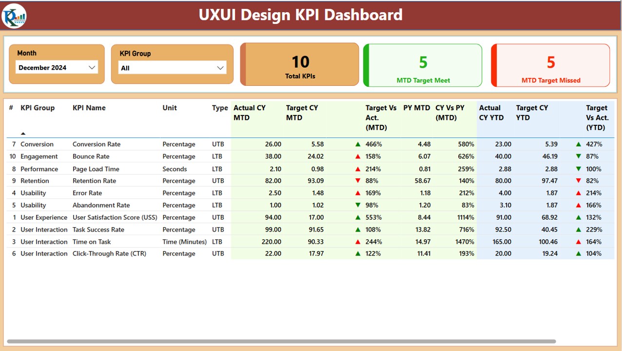
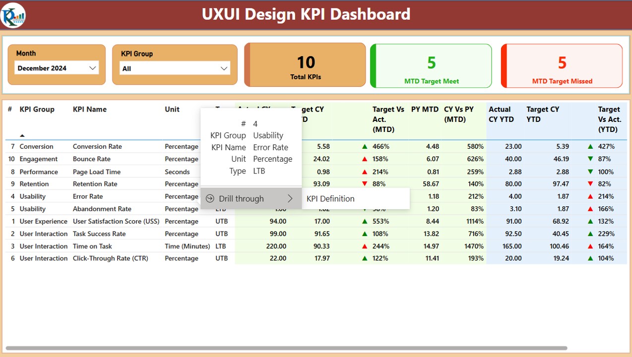
1. Summary Page
The Summary Page is the main dashboard of the Power BI file. Here’s an overview of the key elements displayed:
-
Month and KPI Group Slicer: These slicers allow users to filter data by month and KPI group, making it easier to analyze specific metrics.
-
Key Metrics Cards:
- Total KPIs Count: Displays the total number of KPIs being tracked.
- MTD Target Met Count: Shows the number of KPIs that met the target for the current month-to-date (MTD).
- MTD Target Missed Count: Displays the number of KPIs that failed to meet the target for MTD.
Detailed Table: Below the key metrics, a detailed table shows essential KPI data, including:
- KPI Number: The sequence number of the KPI.
- KPI Group: The category or group of the KPI.
- KPI Name: The name of the KPI.
- Unit: The unit of measurement for the KPI.
- Type (LTB/UTB): Indicates whether the KPI type is Lower the Better (LTB) or Upper the Better (UTB).
- Actual CY MTD and Target CY MTD: The actual and target values for the current year’s MTD.
- MTD Icon: A red or green arrow to indicate whether the KPI is meeting or missing the target.
- Target Vs Actual (MTD): The percentage comparison of actual vs. target values.
- PY MTD: MTD data for the same period in the previous year.
- CY Vs PY (MTD): A comparison of the current year’s MTD and the previous year’s MTD.
- Actual CY YTD and Target CY YTD: The actual and target values for the current year’s year-to-date (YTD).
- YTD Icon: A red or green arrow indicating the KPI’s YTD performance.
- Target Vs Actual (YTD): A percentage comparison of actual vs. target values for YTD.
- PY YTD: YTD data for the previous year.
- CY Vs PY (YTD): A comparison of the current year’s YTD and the previous year’s YTD.
Click to buy UXUI Design KPI Dashboard in Power BI
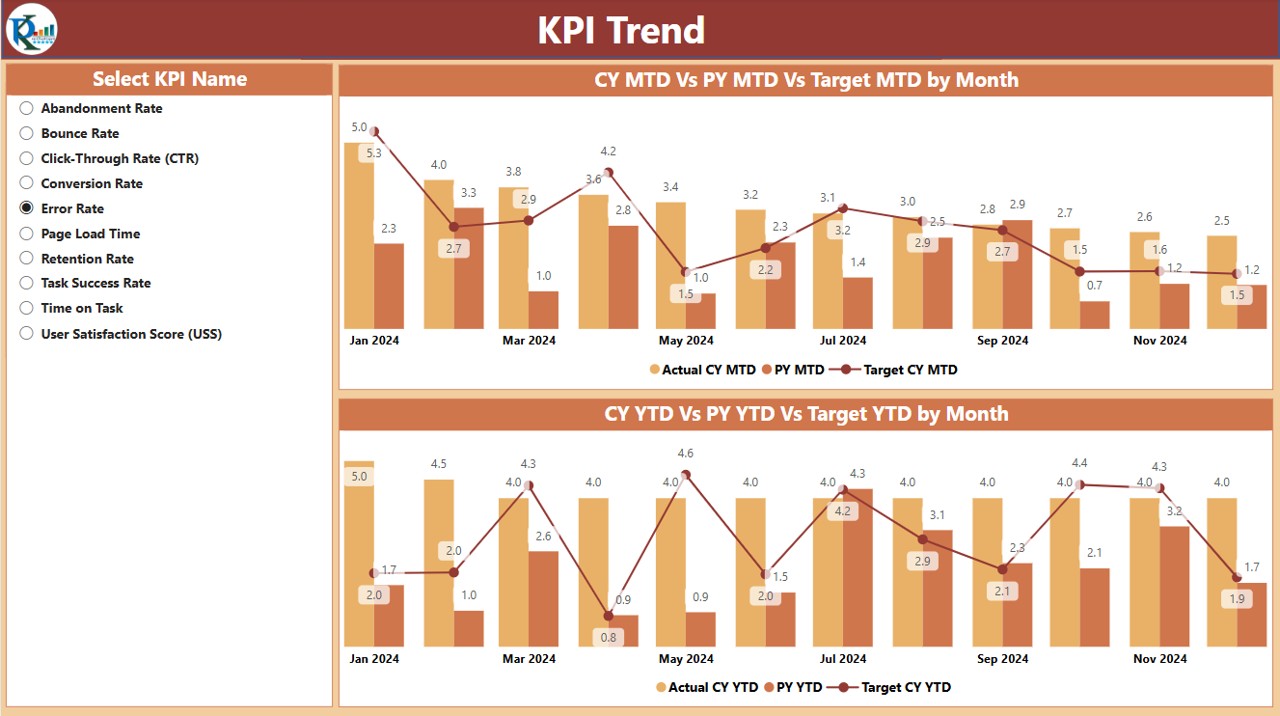
2. KPI Trend Page
The KPI Trend Page features two combo charts that display actual numbers for both MTD and YTD. These charts compare the current year’s actual data with the previous year’s data and target numbers. A slicer is included on the left side to allow users to filter the charts by KPI name.
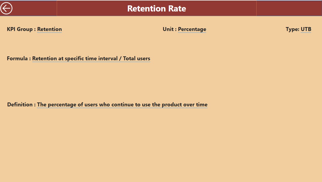
3. KPI Definition Page
The KPI Definition Page is a hidden, drill-through page that contains in-depth details about each KPI. This includes:
Click to buy UXUI Design KPI Dashboard in Power BI
-
Formula: The mathematical formula used to calculate the KPI.
-
Definition: A brief description of what the KPI measures.
To access this page, users can drill through from the summary page, and there is a back button to return to the main page.
4. Excel Data Source
The dashboard’s data comes from an Excel file, where you need to input three key worksheets:
-
Input_Actual Sheet: Here, enter the actual numbers for each KPI, month, MTD, and YTD values.
-
Input_Target Sheet: This sheet captures the target numbers for each KPI, month, MTD, and YTD values.
-
KPI Definition Sheet: This sheet includes essential information like KPI number, group, name, unit, formula, definition, and type (LTB/UTB).
Advantages of Using a UX/UI Design KPI Dashboard in Power BI
Click to buy UXUI Design KPI Dashboard in Power BI
There are several reasons why a UX/UI Design KPI Dashboard in Power BI is beneficial for designers, project managers, and stakeholders. Here are some of the primary advantages:
- Centralized Data Visualization: Power BI allows you to centralize all your UX/UI performance data into one place, making it easier to track and interpret. No more manually pulling data from multiple sources—everything is visualized in a single dashboard.
- Real-Time Data Monitoring: The ability to see real-time data means you can make quick decisions about the design process. Whether it’s adjusting the design to meet user needs or improving areas where KPIs are lagging, real-time data empowers you to act immediately.
- Improved Decision Making: With clear visuals, trend analysis, and comparisons, the dashboard helps stakeholders make data-driven decisions. You can monitor how design changes affect user behavior and satisfaction, which in turn can inform the next iteration of the design.
- Better Team Collaboration: With everyone having access to the same data, teams can collaborate more effectively. Designers, developers, and product managers can discuss KPIs and metrics with a clear understanding of where the design is excelling or where it needs improvement.
- Customizable and Scalable: Power BI dashboards are customizable, meaning you can adapt the dashboard to the unique KPIs that matter most to your organization. Whether you want to track user engagement, satisfaction, or other metrics, the dashboard can scale as your business needs evolve.
Opportunities for Improvement in UX/UI Design KPI Dashboard
While the UX/UI Design KPI Dashboard in Power BI is highly effective, there are always opportunities for improvement:
- Enhanced User Experience: Adding more interactivity, such as the ability to drill down into specific user segments or conduct cohort analysis, could further enhance the UX/UI design dashboard.
- Integration with User Feedback; Integrating qualitative data like user feedback or NPS scores can provide a fuller picture of the design’s effectiveness. Linking this data with quantitative KPIs would allow you to measure user sentiment alongside performance.
- Predictive Analytics: Leveraging Power BI’s machine learning capabilities to forecast future UX/UI trends could help anticipate issues before they arise. Predicting KPIs like user engagement or satisfaction based on historical data can enable proactive design changes.
- Mobile Accessibility; While Power BI is accessible via desktop, making the dashboard more mobile-friendly would allow design teams to track KPIs on the go. This would be especially useful for remote teams or those working in field conditions.
Best Practices for Using the UX/UI Design KPI Dashboard in Power BI
To make the most of your UX/UI Design KPI Dashboard in Power BI, consider these best practices:
- Set Clear and Relevant KPIs: Ensure that the KPIs you are tracking are aligned with business goals and directly related to the UX/UI design process. Avoid tracking irrelevant data points that do not contribute to decision-making.
- Regularly Review and Update the Dashboard: Update the data in the dashboard regularly, ensuring that the numbers reflect the most current design changes. Additionally, update the KPIs as business objectives evolve.
- Encourage Cross-Departmental Collaboration: Make the dashboard accessible to all teams involved in the design process, including marketing, development, and product teams. Collaborative discussions based on real-time data lead to more effective design decisions.
- Monitor Both MTD and YTD Metrics: Track both Month-to-Date (MTD) and Year-to-Date (YTD) metrics to get a comprehensive view of performance. While MTD gives you a snapshot of current trends, YTD helps you assess long-term progress.
Conclusion
Click to buy UXUI Design KPI Dashboard in Power BI
The UX/UI Design KPI Dashboard in Power BI is a powerful tool for any organization focused on improving user experience and user interface design. By centralizing data, tracking relevant KPIs, and providing real-time insights, this dashboard enhances decision-making, collaboration, and overall design quality.
With its detailed features and customizable nature, this Power BI dashboard helps you continuously monitor and optimize your UX/UI designs to meet business goals, improve user satisfaction, and stay ahead in the competitive digital landscape.
Frequently Asked Questions (FAQs)
1. What KPIs should I track in a UX/UI design dashboard?
Some key KPIs to track include user engagement, task success rate, time on task, error rate, NPS (Net Promoter Score), and customer satisfaction. These KPIs help assess the design’s effectiveness and overall user experience.
2. How often should I update the UX/UI design KPIs?
Ideally, you should update the KPIs monthly or quarterly, depending on how quickly changes occur in your design. Regular updates ensure that your dashboard reflects the most current data.
3. Can I integrate user feedback into the dashboard?
Yes, you can integrate user feedback into the dashboard. Adding metrics such as NPS, customer satisfaction, or user interviews can provide valuable qualitative data to complement your quantitative KPIs.
4. How can I use the dashboard to improve collaboration?
The dashboard can be shared across departments to encourage collaboration. By making the data accessible to designers, developers, and managers, everyone can work from the same set of KPIs, ensuring alignment and more effective decision-making.
5. What’s the benefit of tracking both MTD and YTD metrics?
Tracking both MTD (Month-to-Date) and YTD (Year-to-Date) metrics allows you to assess immediate trends as well as long-term performance. This combination gives you a fuller understanding of how your design is performing over time.
Visit our YouTube channel to learn step-by-step video tutorialsYoutube.com/@PKAnExcelExpert