In the water supply industry, efficiently tracking performance is crucial to ensure quality and reliable service. A Water Supply KPI Dashboard in Excel serves as a powerful tool for monitoring key metrics, helping companies stay on track with their goals. In this article, we’ll explore a feature-rich Water Supply KPI Dashboard template in Excel, covering the key functionalities, best practices, and opportunities for improvement.
Click to buy Water Supply KPI Dashboard in Excel
Key Features of the Water Supply KPI Dashboard
This Excel dashboard is structured with seven essential worksheets that provide a comprehensive overview of water supply KPIs. Here’s a breakdown of each tab:
Home Sheet
Click to buy Water Supply KPI Dashboard in Excel
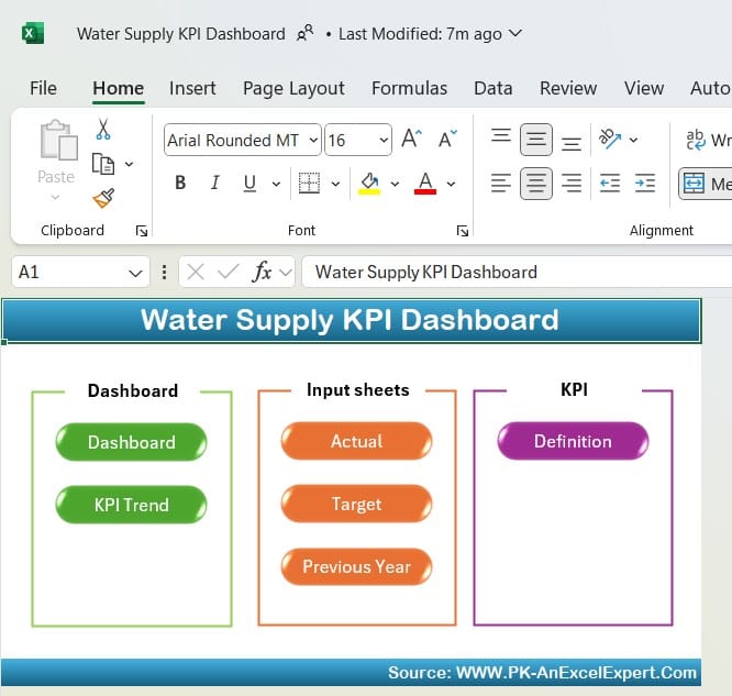
- The Home Sheet serves as an index page, allowing users to navigate between sheets easily. Six interactive buttons direct users to specific tabs, making the dashboard user-friendly and accessible.
Dashboard Sheet Tab
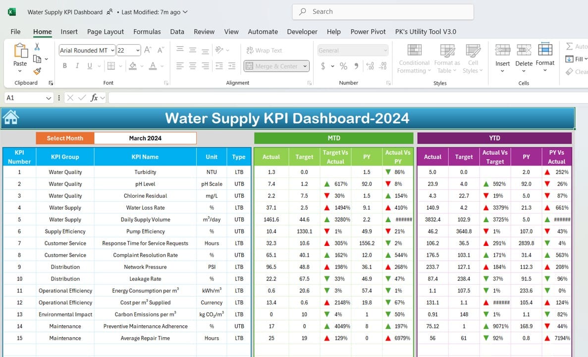
- This is the main dashboard tab, where all critical KPI data is displayed. Key features include:
- Month Selection (D3): A drop-down menu enables users to select a specific month, updating all displayed metrics automatically.
- MTD & YTD Metrics: Monthly and Year-to-Date (YTD) data for Actual, Target, and Previous Year (PY) performance.
- Target vs. Actual & PY vs. Actual Comparisons: With conditional formatting, up and down arrows indicate performance status.
- This sheet offers a holistic view of water supply metrics, making it easier to analyze performance trends.
KPI Trend Sheet Tab
Click to buy Water Supply KPI Dashboard in Excel
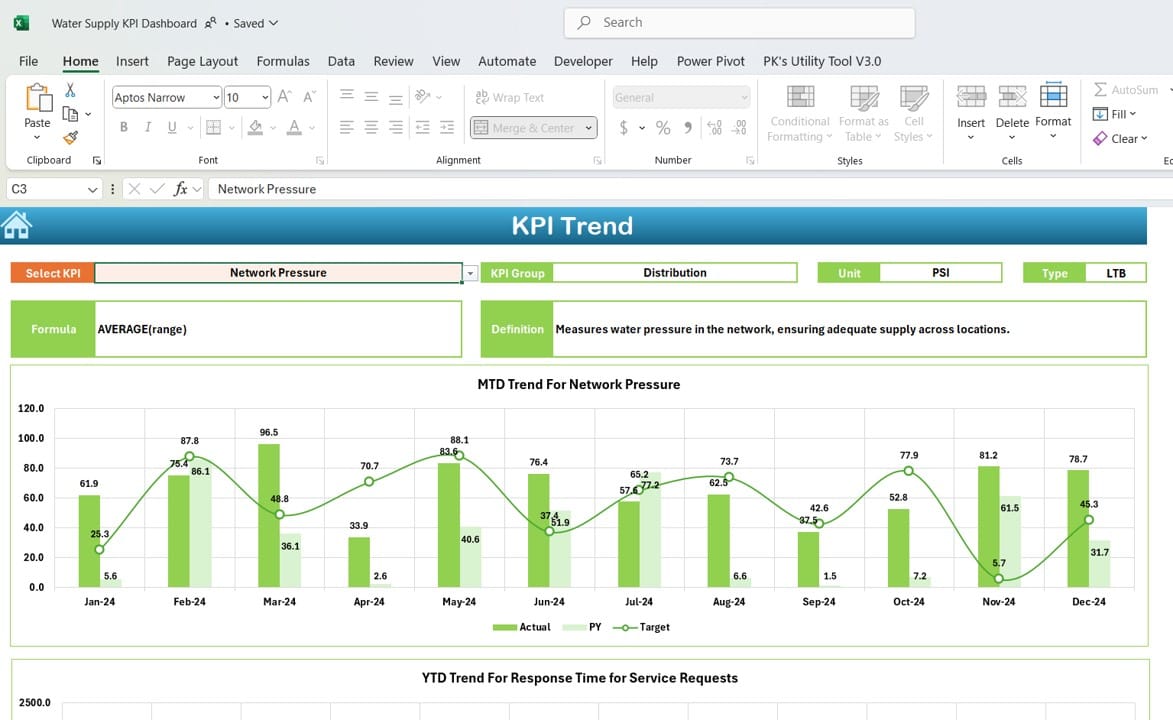
- The KPI Trend Sheet focuses on analyzing KPI trends over time. Key functionalities include:
- KPI Selection (C3): A drop-down allows users to select any KPI, displaying detailed information such as KPI Group, Unit, Type (whether Lower or Upper is better), Formula, and Definition.
- MTD and YTD Trend Charts: Visual representation of monthly and yearly trends for Actual, Target, and PY data.
- This sheet is ideal for tracking changes in key metrics, aiding in data-driven decision-making.
Actual Numbers Input Sheet
Click to buy Water Supply KPI Dashboard in Excel
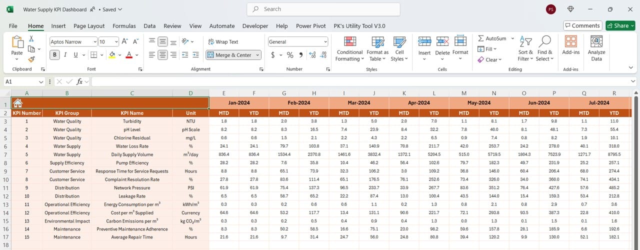
- This sheet is designed to input actual monthly data for both MTD and YTD.
- Month Selection (E1): Set the start month in this range to structure data for the entire year, allowing for streamlined data entry each month.
Target Sheet Tab
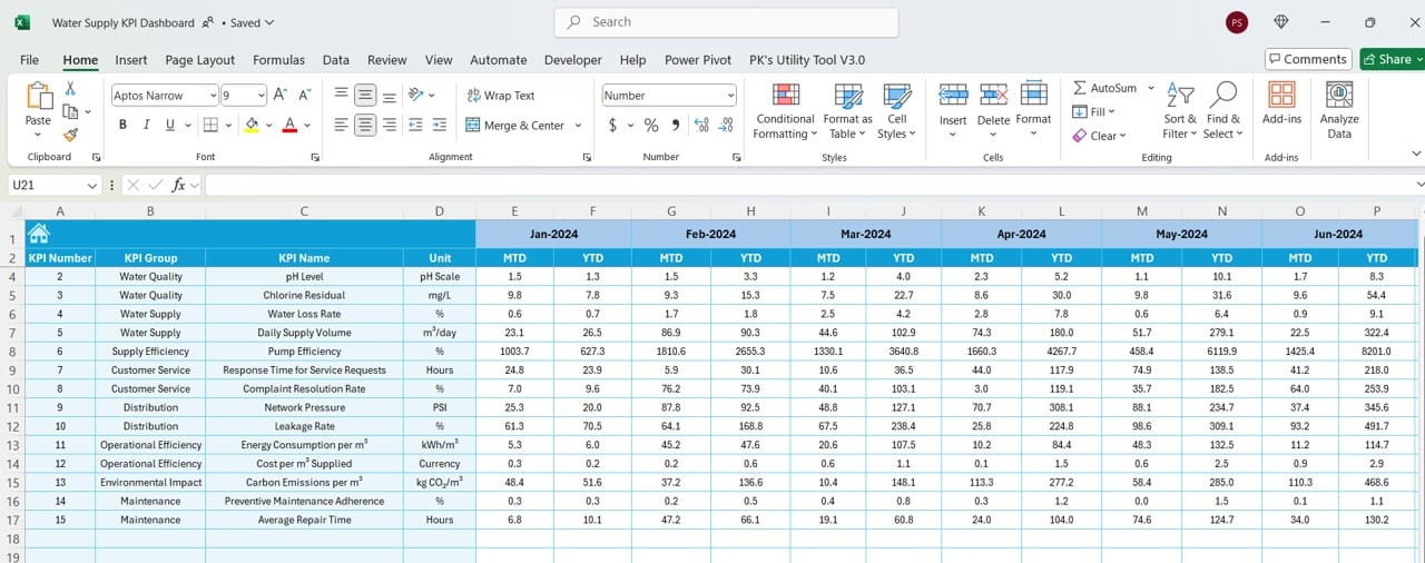
- The Target Sheet is where users set monthly and yearly targets for each KPI.
- With clearly defined targets, the dashboard calculates and displays the performance gap between actual values and targets, allowing quick assessments.
Previous Year Numbers Sheet Tab
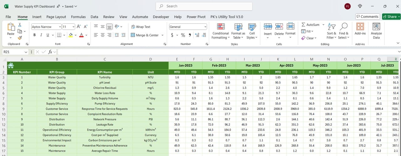
- This tab stores monthly data from the previous year, providing historical context to current performance.
- By comparing current data with the previous year’s metrics, users can identify growth trends, seasonality, and areas needing improvement.
KPI Definition Sheet Tab
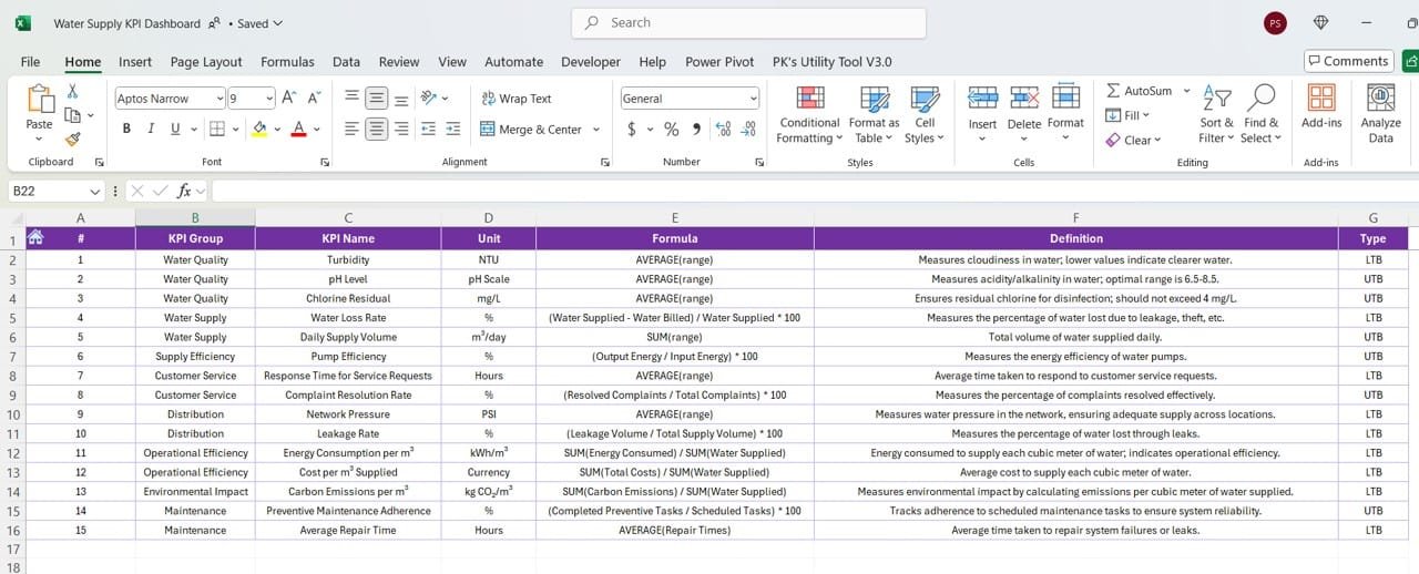
- In this tab, users can define each KPI by adding fields such as KPI Name, Group, Unit, Formula, and a brief Description.
- This documentation helps standardize KPIs and ensures a clear understanding of each metric among all users.
Click to buy Water Supply KPI Dashboard in Excel
Advantages of Using a Water Supply KPI Dashboard
A well-structured KPI dashboard offers numerous benefits, including:
- Centralized Data Visualization: Consolidates all relevant metrics in one place, making it easier to monitor performance at a glance.
- Enhanced Decision-Making: Visual trend analysis supports data-driven decisions and helps prioritize improvement areas.
- Time Efficiency: Saves time by automating calculations and formatting, reducing manual work.
- Customizability: Offers flexibility to modify targets and KPIs as per specific needs.
- Comparative Analysis: Enables historical comparison with previous year data, helping to spot trends and anticipate future performance.
Best Practices for the Water Supply KPI Dashboard
To maximize the benefits of the Water Supply KPI Dashboard, follow these best practices:
- Regularly Update Data: Ensure actual and target values are consistently updated to maintain dashboard accuracy.
- Utilize Conditional Formatting: Leverage conditional formatting features (such as up/down arrows) to highlight performance insights visually.
- Keep KPI Definitions Clear: Clearly define each KPI in the KPI Definition tab to avoid confusion.
- Monitor Key Trends Monthly: Regular trend analysis will help anticipate potential issues and make proactive adjustments.
- Prioritize User-Friendly Design: Simplify navigation using buttons and drop-down menus to enhance user experience.
Opportunities for Improvement in the Water Supply KPI Dashboard
While this dashboard is robust, there are always opportunities for improvement:
- Automated Data Import: Implementing automated data import from external sources could save time and reduce manual errors.
- Real-Time Updates: Linking the dashboard to live data sources, such as cloud databases, would enable real-time updates.
- Enhanced Visualization: Adding more advanced charts or visual aids could make data interpretation easier.
- User Training: Providing training on Excel functionalities can ensure that all team members understand how to use the dashboard effectively.
Building the Water Supply KPI Dashboard: Step-by-Step Guide
- Define Your KPIs: Start by identifying and listing your key water supply metrics, including both operational and quality measures.
- Organize Worksheets: Structure your dashboard with a home sheet, main dashboard sheet, and separate tabs for inputs, targets, trends, and definitions.
- Create Drop-Down Menus: For filters, such as month or KPI name, use Excel’s Data Validation tool to add drop-down lists.
- Add Conditional Formatting: Implement conditional formatting to emphasize critical metrics, such as Target vs. Actual comparisons.
- Design Charts for Trend Analysis: Use line charts for monthly and yearly trends on the KPI Trend sheet.
Click to buy Water Supply KPI Dashboard in Excel
Frequently Asked Questions
Q. What is a Water Supply KPI Dashboard?
A Water Supply KPI Dashboard is an Excel tool that consolidates key metrics relevant to water supply operations. It provides monthly and yearly comparisons to help companies monitor performance effectively.
Q. How often should I update the dashboard?
Ideally, update the dashboard monthly to capture accurate MTD and YTD metrics and compare them against targets and previous year data.
Q. Can I customize KPIs in this template?
Yes, this template is fully customizable. You can add or modify KPIs in the KPI Definition sheet to fit your specific requirements.
Q. Why are historical comparisons important in a KPI dashboard?
Comparing current data with previous years helps identify seasonal trends, growth patterns, and areas for improvement, which is essential for strategic planning.
Q. Is Excel suitable for building KPI dashboards?
Yes, Excel provides powerful tools for building interactive dashboards with formulas, charts, and conditional formatting, making it ideal for KPI tracking.
This comprehensive guide covers the essentials of a Water Supply KPI Dashboard in Excel, from features and best practices to implementation steps and opportunities for improvement. With this tool, you can take your water supply operations to the next level, ensuring high performance and continuous improvement.
Visit our YouTube channel to learn step-by-step video tutorials
View this post on Instagram
Click to buy Water Supply KPI Dashboard in Excel

