Wind energy plays a crucial role in the global transition to renewable energy. To monitor and optimize its performance, businesses rely on Wind Energy KPI Dashboards in Excel. This powerful tool consolidates key performance indicators (KPIs) into a visual and interactive interface, allowing users to track and analyze data effectively.
Click to Wind Energy KPI
In this guide, we will walk you through the features, advantages, and best practices for using a Wind Energy KPI Dashboard in Excel. We’ll also address some frequently asked questions to ensure you have a clear understanding of this tool’s potential.
Key Features of the Wind Energy KPI Dashboard
- The Wind Energy KPI Dashboard includes seven essential worksheets that make it comprehensive and user-friendly:
Home Sheet
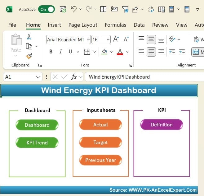
The Home Sheet serves as the index of the dashboard. It features six interactive buttons that allow users to navigate to different sections effortlessly. This sheet ensures users can access data and insights without confusion, saving valuable time.
Click to Wind Energy KPI
Dashboard Sheet Tab
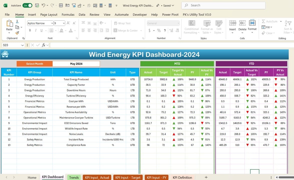
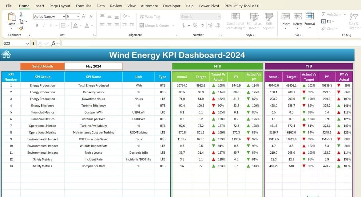
The Dashboard Sheet is the core of the KPI dashboard. Here’s what it offers:
- Month Selector: Located at range D3, this dropdown lets users choose a month, updating the entire dashboard dynamically.
- Key Metrics Display:
- MTD (Month-to-Date): Shows Actual, Target, and Previous Year (PY) data for selected KPIs, along with visual indicators like conditional formatting arrows for performance tracking.
- YTD (Year-to-Date): Similar metrics for yearly performance comparisons.
This sheet visually highlights trends and variations, enabling quick performance analysis.
Click to Wind Energy KPI
KPI Trend Sheet Tab
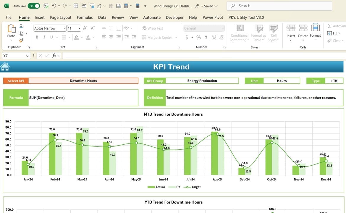
This sheet dives deeper into individual KPI performance.
- KPI Selection: Use the dropdown at range C3 to choose a specific KPI.
- Detailed KPI Insights: For the selected KPI, view:
- Group, Unit, Type (e.g., “Lower the Better” or “Upper the Better”), Formula, and Definition.
- Trend Charts: Visualize MTD and YTD trends for Actual, Target, and PY values to identify performance patterns.
Click to Wind Energy KPI
Actual Numbers Input Sheet
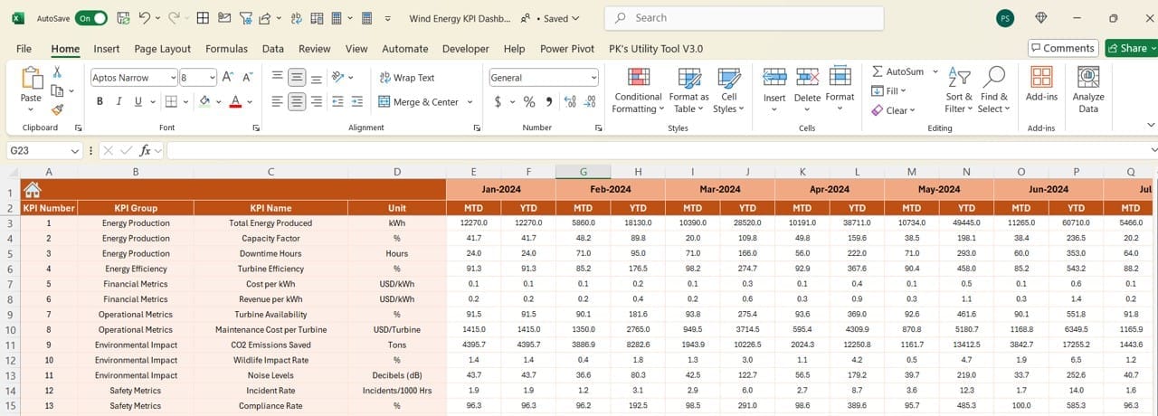
The backbone of the dashboard, this sheet allows users to input actual MTD and YTD data for specific months.
- Dynamic Month Configuration: Change the first month of the year in range E1 to reflect the desired timeframe.
This sheet keeps the dashboard updated with real-time data.
Target Sheet Tab
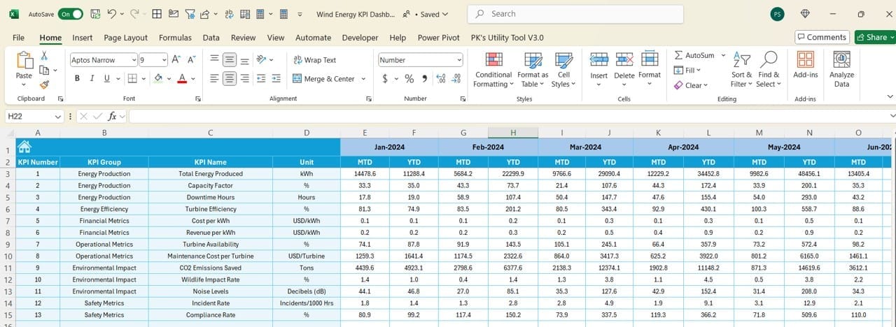
- In this sheet, users input monthly targets for MTD and YTD performance. Clear data input fields ensure no room for error, enhancing accuracy.
Click to Wind Energy KPI
Previous Year Numbers Sheet Tab
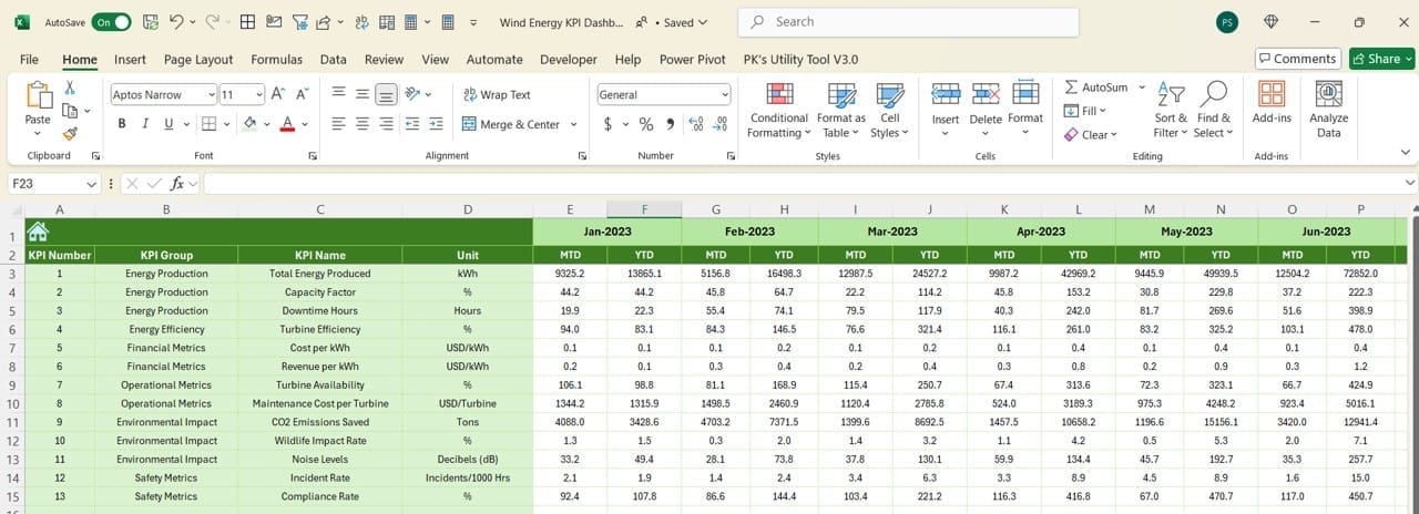
- This sheet stores PY data for each KPI, providing a basis for performance comparisons. Users can mirror the current year’s data entry format for consistency.
KPI Definition Sheet Tab
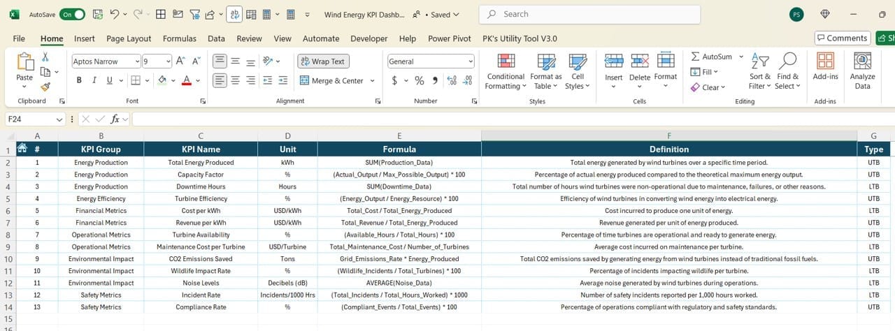
This reference sheet contains essential information about each KPI, such as:
- Name
- Group
- Unit
- Formula
- Definition
This tab ensures clarity, especially when sharing the dashboard with teams or stakeholders.
Advantages of the Wind Energy KPI Dashboard
- Centralized Data Tracking: All key performance indicators are organized in one place, streamlining monitoring and decision-making.
- Interactive Insights: Dropdowns and dynamic charts allow users to customize their view and explore data interactively.
- Visual Performance Analysis: Conditional formatting and trend charts make it easy to identify patterns and deviations in real-time.
- User-Friendly Design: The dashboard’s intuitive layout ensures that even non-technical users can navigate and interpret data effortlessly.
- Customizable for Different Use Cases: With editable input sheets and definitions, the dashboard can adapt to different organizational needs or specific KPIs.
Click to Wind Energy KPI
Best Practices for Using the Wind Energy KPI Dashboard
- Keep Data Updated Regularly: Inputting actual numbers and targets for each month is critical to maintain the accuracy of the dashboard.
- Verify Data Consistency: Ensure that the format for current-year and previous-year data entries aligns. This avoids discrepancies in comparisons.
- Utilize Trend Analysis: Leverage the KPI Trend Sheet to identify consistent patterns or anomalies. Use this insight to optimize operations.
- Customize Definitions for Clarity: Adapt the KPI definitions in the KPI Definition Sheet to match your organization’s terminology or standards.
- Train Users: Provide a quick overview or guide to stakeholders on how to use the dashboard. This ensures its potential is fully realized.
Conclusion
The Wind Energy KPI Dashboard in Excel is an indispensable tool for monitoring and optimizing wind energy operations. By consolidating data into a dynamic and visually appealing format, it empowers businesses to make informed decisions that drive efficiency and growth.
Click to Wind Energy KPI
Frequently Asked Questions (FAQs)
Q. What is a Wind Energy KPI Dashboard?
A Wind Energy KPI Dashboard is a visual tool that consolidates key performance indicators related to wind energy operations. It tracks metrics like production efficiency, downtime, and operational costs.
Q. Can I customize the KPIs in the dashboard?
Yes, you can customize the KPIs by modifying the data and definitions in the respective sheets, including the KPI Definition Sheet.
Q. How do I update data in the dashboard?
You can input updated data into the Actual Numbers Input Sheet, Target Sheet, and Previous Year Numbers Sheet. The dashboard dynamically reflects these updates.
Q. What software do I need to use this dashboard?
You only need Microsoft Excel to use this dashboard. Ensure you have a recent version to avoid compatibility issues with dropdowns and charts.
Q. Who can benefit from this dashboard?
Organizations involved in wind energy production, analysts, and decision-makers can benefit from this dashboard to monitor and optimize performance.
Click to Wind Energy KPI
Visit our YouTube channel to learn step-by-step video tutorials
View this post on Instagram
