Workforce planning is an essential process for organizations aiming to align their human resource strategies with their business goals. In a fast-paced, competitive market, effective workforce planning helps ensure that the right talent is available to meet the demands of the business. The Workforce Planning KPI Dashboard serves as a powerful tool for tracking and evaluating the key metrics that drive successful workforce strategies.
This article provides a detailed overview of the Workforce Planning KPI Dashboard, exploring its features, essential Key Performance Indicators (KPIs), and the best practices for using this tool effectively. You’ll also learn how to utilize this Excel template to optimize your workforce planning efforts, ensuring that every decision made is backed by accurate, actionable data.
What is a Workforce Planning KPI Dashboard?
A Workforce Planning KPI Dashboard is a tool that enables organizations to track and manage key workforce metrics in real-time. This dashboard is designed to help HR and management teams assess the current workforce’s performance, identify areas for improvement, and make data-driven decisions that align with long-term business objectives. The dashboard typically includes a range of KPIs, each representing a critical element of workforce planning, such as recruitment, retention, productivity, and skill development.
By using this dashboard, organizations can ensure that their workforce is strategically aligned with business goals, improve operational efficiency, and proactively address potential talent gaps.
Key Features of a Workforce Planning KPI Dashboard
The Workforce Planning KPI Dashboard template is built to be comprehensive and easy to use. It consists of seven essential worksheets that each play a critical role in evaluating and managing workforce performance:
1. Home Sheet
- This sheet serves as the index page and contains six buttons that allow users to quickly navigate to different sections of the dashboard. It offers easy access to all the data and insights within the workbook.
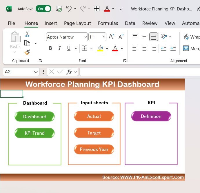
Click to Workforce Planning KPI
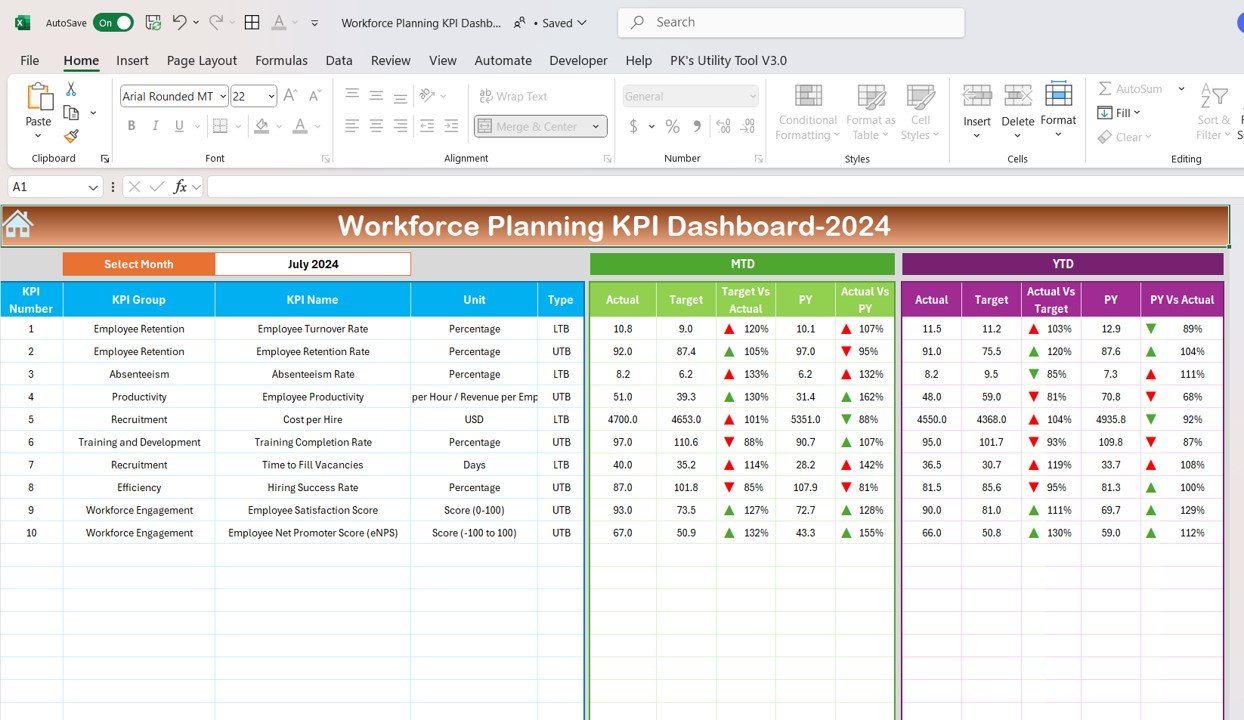
2. Dashboard Sheet Tab
- The main sheet of the dashboard where all KPIs are displayed.
- It includes features such as MTD (Month-to-Date), YTD (Year-to-Date), and Previous Year (PY) data comparisons.
- The dashboard automatically updates based on the selected month from a dropdown (Range D3). It uses conditional formatting with up and down arrows to visually indicate Target vs Actual and Previous Year vs Actual comparisons.
Click to Workforce Planning KPI
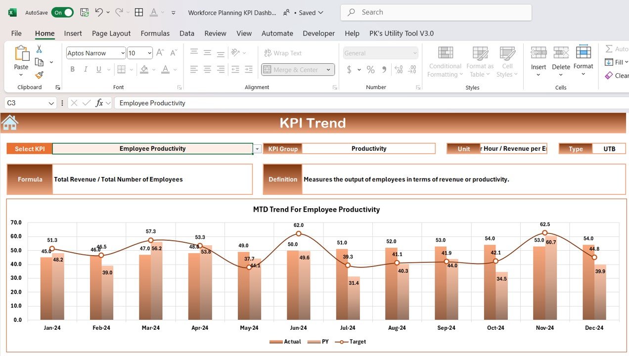
3. KPI Trend Sheet Tab
- This sheet allows users to select a specific KPI from a dropdown menu (Range C3) and view its trend over time.
- It provides detailed information on the KPI Group, Unit of Measurement, the type of KPI (whether Lower the Better or Upper the Better), along with the Formula and Definition of the selected KPI.
Click to Workforce Planning KPI
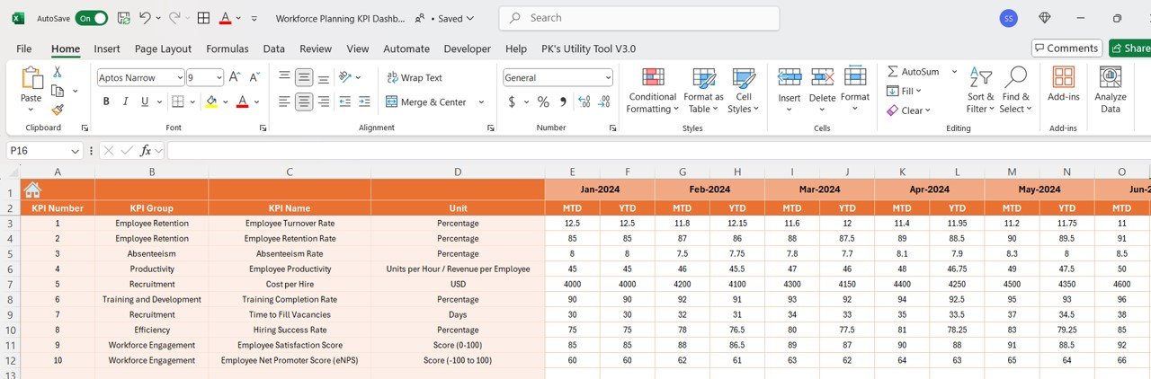
4. Actual Number Sheet Tab
- Users input the actual numbers for MTD and YTD performance for a particular month.
- The month can be adjusted using Range E1, ensuring that the data is updated accordingly.
Click to Workforce Planning KPI
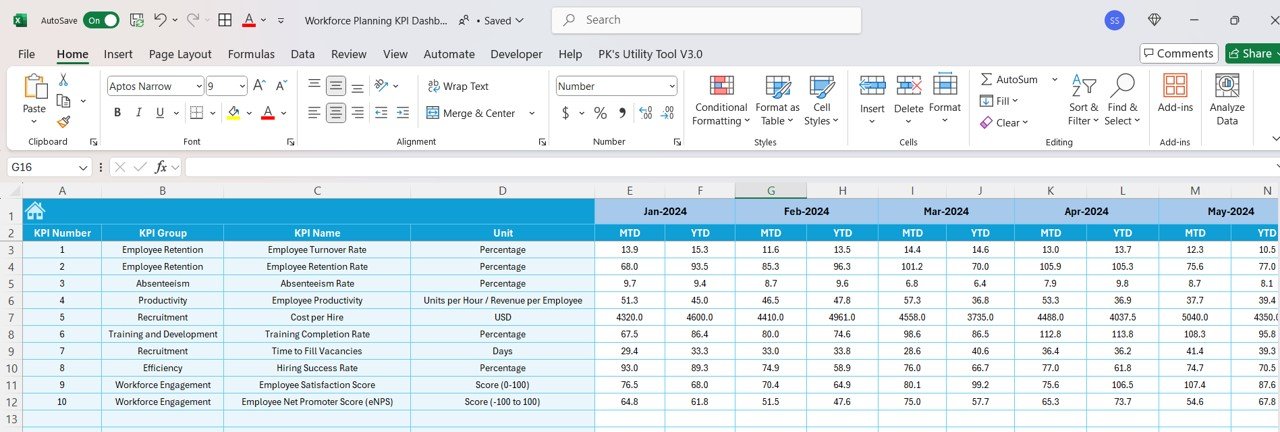
5. Target Sheet Tab
- This sheet allows users to enter target numbers for each KPI on both a MTD and YTD basis.
- By entering targets for each KPI, managers can track performance against preset goals.
Click to Workforce Planning KPI
6. Previous Year Number Sheet Tab
- This sheet holds the previous year’s data, enabling year-over-year comparisons.
- This helps organizations track their progress and identify trends over time.
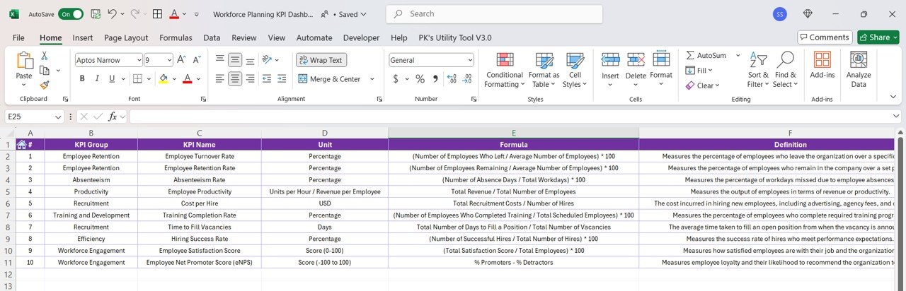
7. KPI Definition Sheet Tab
This sheet is dedicated to defining each KPI in detail. It includes the KPI Name, KPI Group, Unit of Measurement, Formula, and Definition.
Click to Workforce Planning KPI
Advantages of a Workforce Planning KPI Dashboard
A Workforce Planning KPI Dashboard provides several benefits for organizations seeking to optimize their workforce management strategies. Here are some key advantages:
- Real-Time Insights: Provides a live view of key workforce metrics, allowing managers to make timely decisions.
- Improved Decision-Making: With all relevant data in one place, managers can easily identify areas for improvement and take corrective actions swiftly.
- Strategic Alignment: Helps ensure that workforce strategies are aligned with the organization’s long-term goals and objectives.
- Increased Efficiency: By monitoring KPIs such as employee productivity and absenteeism, organizations can identify inefficiencies and improve operations.
- Enhanced Employee Retention: Tracking retention rates and understanding why employees leave can help HR teams implement better employee engagement and retention strategies.
Opportunity for Improvement in a Workforce Planning KPI Dashboard
While the Workforce Planning KPI Dashboard is an invaluable tool, there are always opportunities to improve its effectiveness. Consider the following areas for improvement:
- Advanced Data Analytics: Incorporate AI and machine learning to predict trends in employee turnover, absenteeism, and other KPIs.
- Integration with External Tools: Integrate the dashboard with other HR and business management tools (e.g., payroll systems, performance management software) for a more holistic view.
- Mobile Accessibility: Consider creating a mobile version of the dashboard so managers can access workforce data on the go.
- Employee Feedback: Include KPIs related to employee satisfaction and engagement to enhance retention efforts and overall workforce morale.
- Real-Time Updates: Implement more frequent data updates to provide the most current insights, especially for time-sensitive KPIs like Time to Fill Vacancies.
Best Practices for Using a Workforce Planning KPI Dashboard
To maximize the benefits of a Workforce Planning KPI Dashboard, organizations should adhere to the following best practices:
- Regularly Review KPIs: Ensure that KPIs are regularly reviewed and updated to reflect current workforce trends.
- Set Clear Goals: Establish clear targets for each KPI to track performance effectively and ensure alignment with business objectives.
- Use Data for Continuous Improvement: Leverage insights gained from the dashboard to refine workforce planning strategies and continuously improve processes.
- Train Users: Provide training for HR teams and managers on how to use the dashboard effectively, ensuring that data is correctly entered and interpreted.
- Encourage Transparency: Share dashboard insights with key stakeholders to foster transparency and collaboration in workforce planning efforts.
Frequently Asked Questions (FAQs)
What is the purpose of a Workforce Planning KPI Dashboard?
The Workforce Planning KPI Dashboard helps organizations track key metrics related to their workforce, including retention, productivity, and cost efficiency. By monitoring these metrics, organizations can make informed decisions to optimize their workforce and align human resources with business goals.
How do I use the Workforce Planning KPI Dashboard in my organization?
To use the dashboard, enter actual workforce data (e.g., employee turnover, training completion) into the respective sheets. Set target values for each KPI, and the dashboard will automatically track and display your organization’s performance.
How often should I update the KPIs in the dashboard?
It’s ideal to update the KPIs monthly or quarterly, depending on the frequency of workforce changes. Regular updates ensure that the data remains relevant and actionable.
How can the Workforce Planning KPI Dashboard help reduce employee turnover?
By monitoring KPIs such as Employee Turnover Rate and Employee Retention Rate, organizations can identify patterns and reasons for turnover. This enables HR teams to take proactive steps to improve employee engagement, satisfaction, and retention.
Conclusion
A Workforce Planning KPI Dashboard is a powerful tool that allows organizations to monitor and improve their workforce strategies in real time. By tracking critical metrics such as employee productivity, retention rates, and absenteeism, HR teams and managers can make data-driven decisions that align with business goals and ensure long-term success. By following best practices and continuously improving the dashboard, organizations can optimize their workforce planning efforts and drive greater operational efficiency.
Visit our YouTube channel to learn step-by-step video tutorials