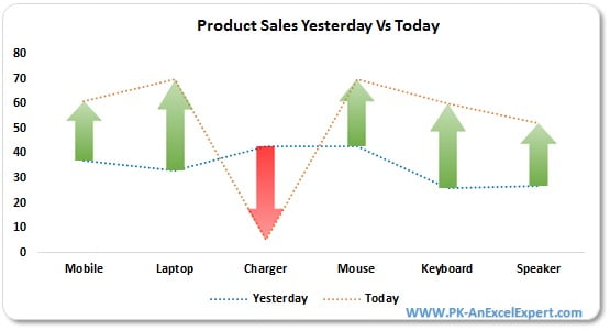
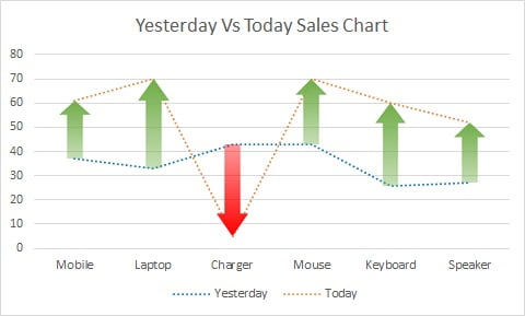
In this article you will learn how to create Yesterday Vs Today Sales Chart in Excel. In this chart we are displaying the green and red arrows. If Today’s sale is higher than the yesterday sales then there will be a Green arrow. If Today’s sale is lower than the yesterday sales then there will be a Red arrow
Gap between yesterday’s sales and today’s sales is displayed with size of arrows. If gap is bigger then the size of arrow will be bigger.
Steps have been given below to create this chart in MS Excel:
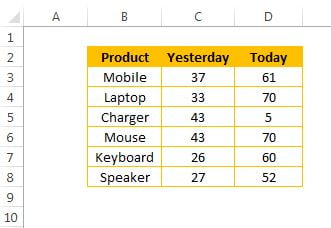
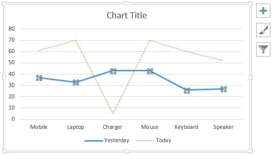
Below is the Product wise sales for yesterday and today for which we will create the chart.
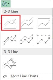
- Select the range (“B2:D8”)
- Go to Insert tab>>Charts>>Insert 2D Line Chart
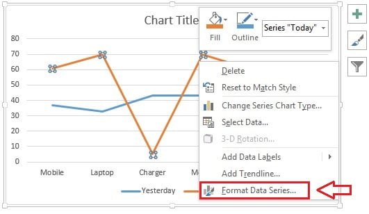
- After inserting the line chart we will format the lines.
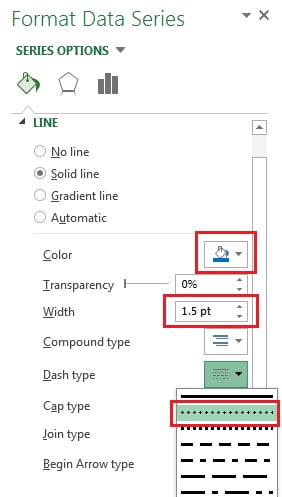
- Right click on first line and click on Format Data Series.
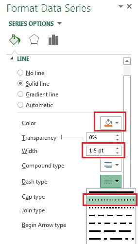
- In Format Data Series window select the Solid line under Line option
- Give the Orange color.
- Take Width as 1.5pt.
- Take Dash Type as Round Dot (second one)
- After doing the above setting our chart will look like below given image.
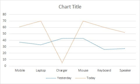
- Now select the second line and repeat the same activity.
- Take the blue color in place of orange.
- After formatting both lines, chart will look like below given image.
- Click on Chart Elements button(plus button of chart)
- Tick the Up/Down Bars check box.
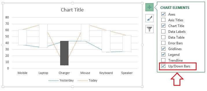
- Now we will put arrow in the the up/down bar.
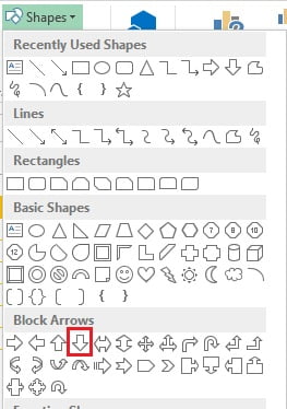
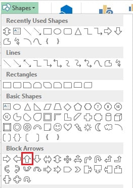
- Go to Insert >>Shapes>>Insert down arrow shape available under Block Arrows.
- Drag the arrow on the worksheet.
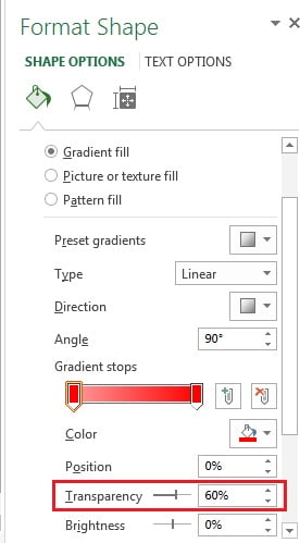
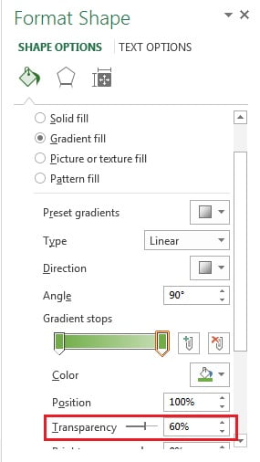
- Right click on the arrow shape and click on Format Shape.
- In Format Shape window, select Gradient Fill available under fill option.
- Take the 2 stops in gradient fill.
- Take Red color for first stop with 60% Transparency.
- Take Red color for second stop with 0% Transparency.
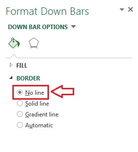
- Take shape border as No line.
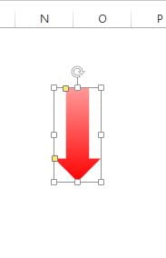
- Our arrow shape will look line below given image after doing the above settings.
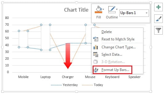
- Select this arrow shape and copy it (Press Ctrl+C)
- Now right click on the down bar in the chart and click on Format Down Bars.
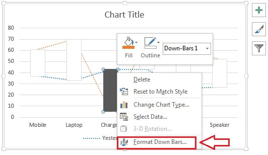
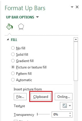
- In the Format Down Bars window select the Picture or texture fill option available under fill.
- Click on Clipboard available under Insert picture from.
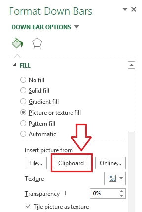
- Now select the No line under Border
Our chart will look like below given image.
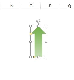
- Now insert a up arrow shape from the Insert >> Shapes>>Up Arrow.
- Drag the arrow on the worksheet.
- Right click on the arrow shape and click on Format Shape.
- In Format Shape window, select Gradient Fill available under fill option.
- Take the 2 stops in gradient fill.
- Take Green color for first stop with 0% Transparency.
- Take Green color for second stop with 60% Transparency.
- Take shape border as No line.
- Our arrow shape will look line below given image after doing the above settings.
- Select this arrow shape and copy it (Press Ctrl+C)
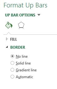
- Now right click on the up bar in the chart and click on Format Up Bars.
- In the Format Up Bars window select the Picture or texture fill option available under fill.
- Click on Clipboard available under Insert picture from.
- Now select the No line under Border
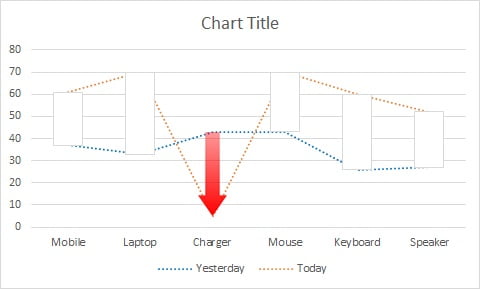
Our chart is ready now. We will give some chart title. It will look like below given image.
Click to buy Yesterday Vs Today Sales Chart
Visit our YouTube channel to learn step-by-step video tutorials
Video Tutorial for Yesterday Vs Today Sales Chart.
Click to buy Yesterday Vs Today Sales Chart